
Introduction
Visual analysis of data is a fundamental component of studies utilising single case designs (SCDs), allowing for in-depth evaluation of data across all conditions in a study (Kazdin, Reference Kazdin2010; Kennedy, Reference Kennedy2005). SCD research is rooted in the principle of baseline logic: each participant's performance is measured under a pre-intervention, or baseline, condition and is compared to his or her performance during the intervention condition. The term condition refers to a group of individual sessions or measurement opportunities that have a shared set of planned environmental features and procedures. The same dependent variable is measured repeatedly under two or more conditions, throughout the course of a study.
Visual analysis refers to the viewing and inspection of all available data (i.e., for all sessions in each condition) plotted on a line graph (i.e., time series data), and making determinations about behaviour changes based on the visible data characteristics. Any time condition changes occur (i.e., intervention is implemented), there is an opportunity for a potential demonstration of effect. When changes in the values of the dependent variables are observed contingent on this change, a basic demonstration of effect is reported. When this effect is replicated across identical baseline and intervention conditions at three different points in time in the same SCD study (direct replication), the presence of a functional relation is demonstrated; this decision is dichotomous (i.e., a functional relation is either present or absent). The extent to which an intervention is likely to be effective for persons outside the study is determined by obtaining similar results in other studies (systematic replication), which increases the external validity of findings (further answering for whom and under what conditions is an intervention appropriate) (Gast, Reference Gast, Gast and Ledford2014; Gast & Spriggs, Reference Gast, Spriggs, Gast and Ledford2014; Lane & Gast, Reference Lane and Gast2014). Although statistical analyses of data are generally summative in nature, visual analysis is critical for formative analysis, given that single case designs are dynamic (i.e., visual analysis is used throughout the study for making data-based decisions).
Historical Context
SCDs have long been used to assess effects of behavioural interventions, especially in special education; recently, they have become commonly used across intervention types, dependent variable types, and scholarly disciplines. Visual analysis is the historic and widely accepted method to interpret data from studies using SCDs (Horner, Swaminathan, Sugai, & Smolkowski, Reference Horner, Swaminathan, Sugai and Smolkowski2012), although calls for the use of supplementary analysis via quantitative metrics have occurred for many years (Jones, Weinrott, & Vaught, Reference Jones, Weinrott and Vaught1978; Kratochwill & Brody, Reference Kratochwill and Brody1978). Historical arguments against the use of visual analysis include lack of agreement between raters (DeProspero & Cohen, Reference DeProspero and Cohen1979), although appropriate training and expertise has been shown to lead to acceptable agreement (Kahng et al., Reference Kahng, Chung, Gutshall, Pitts, Kao and Girolami2010).
When Visual Analysis should be Used
Visual analysis is the standard method for analysing data from SCDs. Although some argue against the use of visual analysis altogether, most researchers who advocate for alternative methods (e.g., statistical analysis) promote their use as supplemental to visual analysis (Maggin & Odom, Reference Maggin and Odom2014). Regardless of the use of supplemental analyses, visual analysis should always be used, including in syntheses across studies. The use of visual analysis and supplemental measures (generally effect sizes) might be considered analogous to the procedures in between-groups comparison research wherein a researcher tests the significance of differences between conditions (Is there an effect?; visual analysis), and then calculates the magnitude of the difference (How big is the effect?; SCD effect size). However, because magnitude of effect is less important than consistency across potential demonstrations of effect, visual analysis continues to be critical in the assessment of outcomes in studies using SCD. In general, effect size analyses can help us to determine the magnitude of behaviour change but are not helpful in determining whether a believable effect exists (e.g., the presence of a functional relation).
Although appropriate statistical analysis of SCD data allows for quantification of the magnitude of behaviour change, visual analysis allows for ongoing assessment of behaviours across conditions, detection of potential threats to internal validity, and evaluation of consistency of change. Thus, visual analysis should be used to make condition change decisions and detect threats to internal validity (formative analysis); following study completion, it should be used to determine whether a functional relation exists (summative analysis). Research showing inconsistent agreement among lesser-trained visual analysts (Ledford, Wolery, Meeker, & Wehby, Reference Ledford, Wolery, Meeker and Wehby2012) also suggests that SCD researchers should (1) follow a consistent set of visual analysis guidelines, such as those suggested below; (2) explicitly report visual analysis methods and the training or expertise of the visual analysts; and (3) explicitly report the characteristics that led to a determination of a functional relation (or no functional relation).
Conducting Systematic Visual Analysis
Data Display
The purpose of graphs is to display as much information as possible as clearly and efficiently as possible—‘which gives to the viewer the greatest number of ideas in the shortest time with the least ink in the smallest space’ (Tufte, Reference Tufte2001, p. 11). Accurate visual analysis of graphic data depends on displaying complete data without distortion or bias (Dart & Radley, Reference Dart and Radley2017 ).
Graphing SCD data
Many options are available when presenting serial SCD data (e.g., cumulative graph), but contemporary standards and practicality generally dictate use of a line graph to represent change over time. A line graph allows for formative evaluation of performance across sessions, as well as summative evaluation when reviewing data collected across conditions in a study. In contrast, exclusively summative measures such as bar graphs (often used in group comparison or pre–post research paradigms) are not conducive to comprehensive visual analysis because these types of graphs only provide a quantitative summary of performance using a pre- and post-test format. Thus, when reporting data collected within a SCD it is critical to plot data from each session within each condition on a line graph, which allows for reliable analysis of data characteristics within and between conditions.
Each condition shown on a line graph is differentiated using A–B–C notation (Gast & Spriggs, Reference Gast, Spriggs, Gast and Ledford2014). Traditionally, the A condition refers to the pre-intervention or baseline condition, and the B condition the intervention condition. Each subsequent condition introduced during a study is labelled in sequential alphabetical order (e.g., C, D), with the exception of parametric variations of the independent variable, which are labelled as prime (B’), or a combination of treatments, identified by combining notation labels (e.g., BC, CD, BCD). Thus, a typical withdrawal design with two baseline conditions and two interventions conditions is referred to as an A–B–A–B design and a multitreatment design with two iterations of different intervention conditions is referred to as an A–B–C–B–C design. The notation is used less often with other designs (e.g., multiple baseline designs), but it remains critical to consider because there must be at least three potential demonstrations of effect between the same two conditions in every design. Thus, an A–B–A–C design does not meet this criterion, and neither does a multiple baseline design with one intervention introduced in two tiers and a second intervention introduced in the third tier (i.e., there must be three A–B comparisons in a multiple baseline design, with B representing the same intervention).
When constructing a line graph, the ordinate scale (y-axis) represents a previously identified metric (e.g., number of aggressive behaviours). Each data point indicates the extent to which the dependent variable occurs based on this metric (y-axis) across observations, days, or sessions (abscissa or x-axis). The intersection of the ordinate scale and the abscissa is represented by a geometric shape (marker); the markers are connected by a line, and this collection of data points is referred to as a data path. A single type of geometric shape represents each dependent variable (e.g., a single behaviour for one participant). The data points in a data path are not connected across condition changes; instead, a vertical line indicates a condition change in order to separate each data path into segments according to condition. When constructing line graphs for a study (a) include no more than three data paths on each line graph (increases the likelihood of reliable analysis) (Cooper, Heron, & Heward, Reference Cooper, Heron and Heward2007), (b) ensure ordinate scales are equal across all line graphs, and (c) ensure the proportion of the ordinate scale to the abscissa allows for discrimination between data points (e.g., ratio of 2:3 for graphs that include a few data points and 1:3 for graphs that include many data points; ensures data are not misleading to readers). When the y-value has a defined maximum (e.g., 100% correct or 100% of intervals), the entire range should be represented on the graph to avoid misleading readers (Dart & Radley, Reference Dart and Radley2017). Finally, line graphs may be constructed using software such as Microsoft Excel or Microsoft PowerPoint; graph construction is beyond the scope of this paper, but instructions are available elsewhere (Barton & Reichow, Reference Barton and Reichow2012; Vanselow & Bourret, Reference Vanselow and Bourret2012). Figure 1 shows an example of appropriate SCD data display.
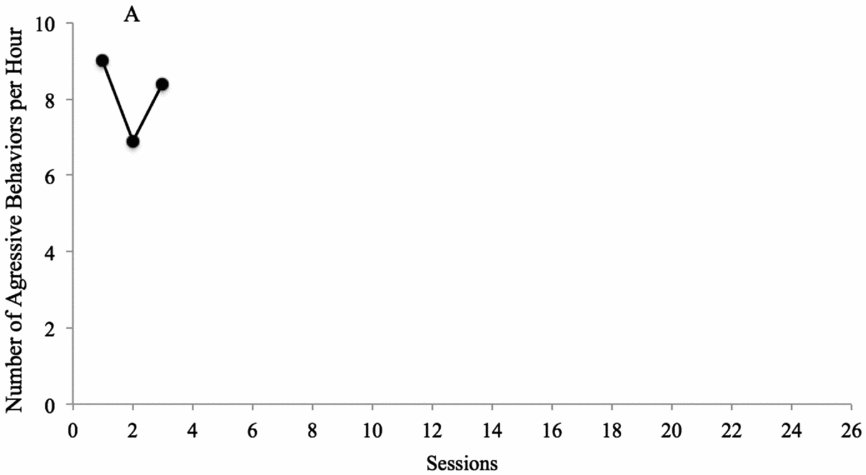
FIGURE 1: Applied Example Number of aggressive behaviours per hour for Billy. As shown in the figure, the dependent variable is the number of aggressive behaviours per hour, and the y-axis ranges from 0 to 10. The x-axis depicts the time unit, which is ‘sessions’ in this case (typically true in single case research; Ledford, Severini, Zimmerman, & Barton, Reference Ledford, Severini, Zimmerman and Barton2017). The data points are depicted by filled in circles, and the condition is labelled with ‘A’ (baseline). This graph has a ration of approximately 1:2; if the study is relatively short (e.g., 14 sessions), the graph may need to be resized to approximately 2:3 but if it is much longer (e.g., 40 sessions), it might be appropriate to resize the graph to something closer to 1:3. The importance of ratio is that data points be neither ‘stretched’ along the x-axis nor so close together that they are difficult to differentiate.
Formative Analysis
One strength of visual analysis is that it can be used for formative analysis—it allows researchers to make data-based decisions during ongoing studies. This is consistent with most clinical objectives and procedures, which often include making adaptations or modifications when a client does not make adequate progress towards a goal and discontinuing treatment on a goal once adequate progress had been made. Graphing and inspecting data as it is collected also allows for researchers to determine when conditions should be introduced, while decreasing potential threats to internal validity related to history, maturation, carryover effects, or regression to the mean (Crano & Brewer, Reference Crano and Brewer2002; Gast, Reference Gast, Gast and Ledford2014; Kazdin, Reference Kazdin2010). Although guidelines for summative analyses are somewhat well-established (cf. Council for Exceptional Children, 2014; Lane & Gast, Reference Lane and Gast2014; WWC, 2013), guidelines for formative analysis have not been widely published.
Level
In SCD research, experimenters are most often interested in changes in the amount of behaviour that occurs—that is, the level of the behaviour. In between-groups research (e.g., randomised controlled trials), differences in levels are almost always conceptualised as mean differences, but the relatively small number of data points in SCD research makes the mean particularly susceptible to outliers. Moreover, because SCD research involves repeated, and often continuous, measurement rather than pre- and post-assessments, the difference in level often occurs following a period of time in which the change is primarily characterised as a change in trend. For example, a child who performs a task with 0% accuracy in baseline may also perform that task with 0% accuracy during the first intervention session, followed by steady increases (10%, 20%, 30%, 40%, 50%) until mastery (100% accuracy) is reached. Thus, the mean level would not characterise intervention data well. For formative analysis purposes, there are two questions related to within-condition level and between-condition level:
-
(1) Is the level in the current condition sufficiently stable for a reliable prediction of value assuming the condition is not changed (i.e., within-condition level)? If it is, and you have at least three measurement occasions (data points), it is prudent to change conditions.
-
(2) Is there a level change between the current condition and the adjacent previous condition (i.e., between-condition level)? If yes, you have one demonstration of effect (i.e., change in behaviour that occurs concurrently with the condition change, in the expected direction).
For multiple baseline and multiple probe designs, changes in level between conditions are complicated because not only must data change when the intervention is applied to each tier, but it also must not change when the intervention is applied to subsequent tiers. For example, in the third tier of a multiple baseline design, data must remain at similar levels (a) during initial baseline sessions, (b) after intervention is applied to the first tier, and (c) after intervention is applied to the second tier. If data change in a later tier when intervention is applied to a different tier, this might suggest generalisation across tiers (for designs with multiple behaviours or contexts), contamination (e.g., for designs with multiple participants, the implementer may have used the intervention during baseline for participants assigned to later tiers), or history effects (e.g., something outside the study caused behaviour change). It is imperative to visually analyse data in all tiers before intervening in any tier—this is referred to as vertical analysis. If within-condition changes in level occur in any tier, continue in the current conditions until level is stable, and then intervene in the next tier.
Although SCD researchers are most often interested in the level of data in terms of change, two additional features often expected in SCD data—trend and variability—are also critical for assessing behaviour change via visual analysis.
Trend
Trend (or slope) refers to movement in the data over time, with specific attention given to the direction of a data path within and between conditions, commonly referred to as an accelerating, decelerating, or zero-celerating trend along the ordinate scale. Trend is further characterised as therapeutic or contra-therapeutic, depending on the purpose of the study (e.g., a decelerating trend is therapeutic when introducing an intervention to decrease verbal aggression, but a decelerating trend is contra-therapeutic when introducing an intervention for increasing the number of bites eaten independently). A within-condition analysis of trend is necessary to avoid premature introduction or removal of an intervention. For example, suppose under baseline conditions a participant is displaying an accelerating trend in a therapeutic direction; in this case, it is not necessary to intervene, given that improvement is likely due to maturation or influenced by factors independent of the study. Similarly, under intervention conditions, if data indicate a zero-celerating trend during initial treatment sessions, but an accelerating trend during subsequent treatment is present, it is recommended to continue collecting data to ensure such improvement continues in a therapeutic direction (i.e., behaviour change is clinically significant). Finally, when comparing adjacent conditions, a basic demonstration of effect is observed when directionality shifts across conditions. Thus, trend is often of interest because trends are present in typical learning patterns (e.g., acquisition). Moreover, trends occurring outside of intervention conditions (e.g., in baseline conditions) may be indicative of threats to internal validity (maturation) (Gast, Reference Gast, Gast and Ledford2014; Kazdin, Reference Kazdin2010).
Variability
Variability refers to the extent to which data points are similar in regards to value (ordinate scale). Generally, data points are considered stable when approximately 80% of values are within +25% of the median value in a given condition (sometimes referred to as a stability envelope) (Lane & Gast, Reference Lane and Gast2014). Data that are considerably variable in baseline are problematic because as mentioned above, it impedes your ability to accurately predict the level of the next data point, given no change in condition (see Figure 2). This, in turn, limits your conclusions about whether an observed change in level is a result of the variability of the data or the change in condition. If data are considerably variable during baseline conditions, you should continue data collection until data are stable. Alternatively, if you have a strong a priori assumption that the condition change will result in a large level change and variability in baseline was expected, you can collect at least five data points and then intervene. If data change in level, are less variable, and do not overlap with baseline, you can be confident changes occurred due to changes in condition. If data remain variable or the intervention condition includes considerable data points that overlap with the data points in baseline, your confidence is decreased. Although changes in variability alone could theoretically be of practical importance (e.g., improving consistency of checking blood sugar for a patient with diabetes) and could result in a determination of a functional relation, we are not aware of any published SCD studies in which decreased variability was the primary treatment goal.
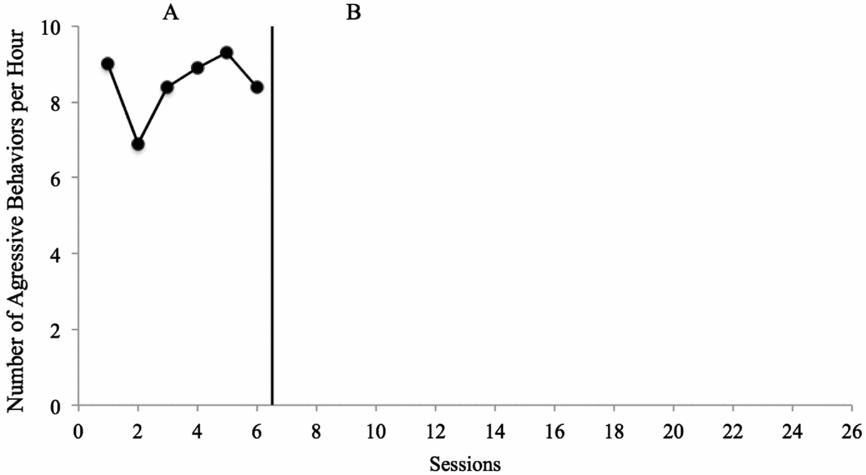
FIGURE 2: Applied Example Number of aggressive behaviours per hour for Billy. In Figure 1, the first three data points in the baseline (A) condition were plotted. The data were somewhat variable (see previous figure), with the patient with aggressive behaviour engaging in 7–9 aggressive behaviours per hour. Because the researcher is not convinced she could predict ‘about’ where the next data point might fall, she decides to collect at least three more data points. After those three data points are collected, as shown in this figure, she determines that the data are predictably high in level and somewhat variable, with no trend (e.g., approximately 0 slope). Thus, she decides to implement the initial intervention condition.
Formative analysis summary
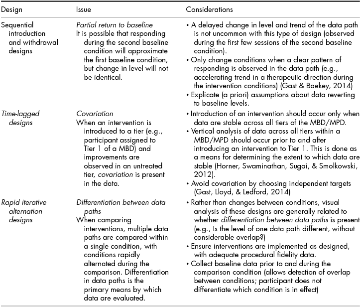
Readers should note that although suggested minimums exist regarding the number of data points in each condition (e.g., 5 data points; What Works Clearinghouse, 2013), decisions about changing conditions should be made by assessing the data for level, trend, and variability. It is only appropriate to change conditions after collecting a minimum number of data points and characterising the level, trend, and variability of the data. Table 1 includes information related to common baseline data patterns and resulting decisions about condition changes. As Table 1 depicts, formative decisions about continuing baseline conditions or introducing the intervention condition should include assessment of level, trend, and variability. These data characteristics are critical regardless of design type; however, some specific considerations are notable for particular designs. These design-specific considerations are described in Table 2.
TABLE 1 Using Visual Analysis to Make Condition Change Decisions
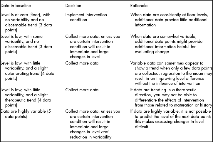
Note: All decisions are based on data that are low in baseline and that researchers intend to increase during intervention conditions. Rules can also be applied for data intended to change in the opposite direction.
TABLE 2 Design-Specific Considerations for Visual Analysis
Summative Analysis: Between Conditions
Three additional data characteristics should be considered, in addition to level, trend, and variability—including consistency of data within conditions and of changes between conditions, overlap of data in adjacent conditions, and immediacy of change in data following condition changes.
Consistency
Consistency refers to the extent to which data patterns are the same within like conditions (e.g., in both baseline conditions in an A–B–A–B design; in baseline conditions for all participants in a multiple baseline across participants design) and the extent to which changes (in level, trend, or variability) are the same for each potential demonstration of effect. In SCD research, the critical factor in determining a functional relation is the consistency of behaviour change between conditions; consistent but small changes in level between conditions are superior to inconsistent changes of larger magnitude. Sometimes inconsistencies are expected; for example, in A–B–A–B designs, we may expect the dependent variable to fail to fully reverse to baseline levels (for an example of this in the published literature, see Ahearn, Clark, MacDonald, & Chung, Reference Ahearn, Clark, MacDonald and Chung2007). When determining whether a functional relation occurred, the most important question is whether lack of consistency in data patterns and changes between conditions impedes confidence that differences in data between conditions occurred due to condition changes and only condition changes.
Overlap
Overlap refers to the extent to which data from one condition are at the same level as data from an adjacent condition; it may helpful to think of overlap as the proportion of data points in the intervention condition that are not improved relative to baseline. Because level is often the data change that is most important to interventionists, it is perhaps not surprising that early attempts to quantify visual analysis of change between conditions were based on the degree to which data were non-overlapping in the expected direction, since non-overlap of data often corresponds with differences in level (PND; Scruggs, Mastropieri, & Casto, Reference Scruggs, Mastropieri and Casto1987). Thus, the degree to which overlap occurs is important, since it speaks to level change, although PND and other attempts to quantify overlap are highly sensitive to procedural parameters (Pustejovsky, Reference Pustejovsky2016a); that is, the extent to which overlap-based metrics correspond with changes in level is highly dependent on study procedures in addition to outcomes. Nonetheless, overlap between conditions can be accessed via visual analysis by posing and answering the following questions:
-
(1) What is the extent of the overlap between conditions (e.g., how many data points between conditions are at about the same level)?
-
(2) Does the degree of overlap change over time?
-
(3) Is overlap consistent between comparisons?
-
(4) Was overlap expected a priori?
-
(5) Does overlap impede confidence in a functional relation?
Question (5) is critical, despite its somewhat subjective nature. Confidence should be decreased when many data points in adjacent conditions are at approximately the same level, overlap does not decrease over time, overlap was not expected, and the overall change in level is small. Note that overlap-based metrics like PND only characterise overlap based on the first consideration; all of the others are reliant on visual analysis.
Immediacy
Immediacy is the extent to which data change simultaneously with a condition change. When analysing immediacy between conditions, the following questions should be considered:
-
(1) Is there an immediate and abrupt change in the dependent variable?
-
(2) If not, is there a delayed increase in the dependent variable (gradual therapeutic change in level and trend or a change that occurs several sessions after the condition change) and
-
(3) Is this pattern of responding replicated across similar conditions? For example, if a participant displays a delayed response to the intervention and all other participants display an immediate and abrupt change in the target behaviour, researchers need to first ensure procedures and data collection occurred as intended and then assess the idiosyncrasies of that condition compared to others (e.g., implementer; pre-intervention characteristics of participants).
Some interventions might reliably lead to delayed increases in the dependent variable. Although immediate changes are preferable, non-immediate changes can still result in a functional relation determination if delayed or gradual changes were expected and these delayed/gradual changes were consistent across demonstrations (e.g., in all tiers of a multiple baseline design). Thus, immediacy considerations are dependent on visual analysis, but also on a researcher's knowledge of the participants, independent variables, and dependent variables.
Summative Analysis: Functional Relation Determination and Statistical Analysis
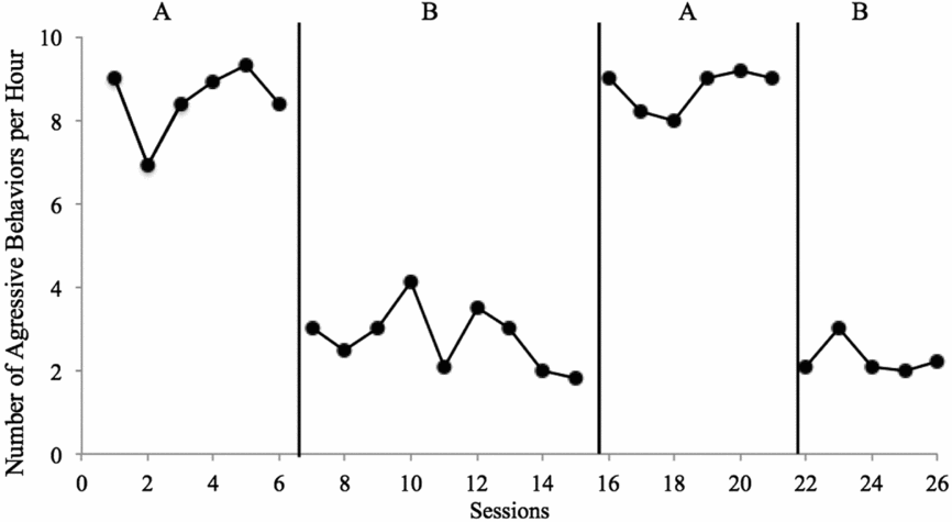
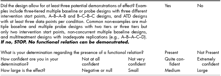
The above description regarding level, trend, variability, consistency, overlap, and immediacy is designed to assist the reader in evaluating SCD research for the purposes of formative analysis. These same characteristics can be used to determine whether changes are indicative of experimental control—a demonstration that the changes observed are the result of the planned conditions changes and only those changes. For example, when engaging in formative analysis, researchers might consider variability because they need to make a decision whether to collect more data in the current condition. Following study completion (or when analysing data from a study conducted by someone else), you should analyse the variability of the data to determine whether within-condition data patterns decrease confidence that a causal relation exists. A worksheet designed to help assist with summative visual analysis decisions can be found in the appendix. The worksheet contains a series of Yes/No questions regarding data characteristics; responses that are positive (indicative of a potential functional relation) are in the middle column; responses that are negative (indicative of a potential problem preventing determination of a functional relation) are in the far right column. In the second section, based on responses about the data, you can determine whether a functional relation exists (Yes/No), rate the confidence in your decision (on a scale of 1–4), and provide an estimate of the size of the effect (negative/null, small, medium, large). Based on the data in Figure 3, we would make the determination that Yes there is a functional relation, and that we are Extremely Confident in our decision, due to the consistency of data patterns within and across conditions, immediate changes in level following all condition changes, lack of overlapping data points, and no concerns with variability or trends that influence our decision. Note that the size of the effect need not impact confidence in conclusions—consistent small effects can be equally convincing as consistent larger effects and may be more convincing than large effects that are variable.

FIGURE 3: Applied Example Number of aggressive behaviours per hour for Billy. As shown in the figure, four conditions were completed, with three potential demonstrations of effect (A→B, B→A, A→B). Level, trend, and variability: In both A conditions, data were somewhat stable, with a zero-celerating trend and high level. In the first B condition, data were somewhat variable, with a slight decelerating trend and low level; in the second B condition, data were stable and low, with a zero-celerating trend. Consistency: Data patterns were consistent across baseline conditions, with the first being slightly more variable; similarly, data patterns were consistent across intervention conditions, with the first being slightly more variable and with a shallow decelerating trend. Similarly, changes in data were consistent and in the expected direction, with large changes in level for all three changes in conditions. Overlap: There were no overlapping data between A and B conditions; all baseline data were in excess of 6 aggressive behaviours per minute and all intervention data were at or below approximately 4 aggressive behaviours per minute. Immediacy: All condition changes resulted in immediate changes in level; the first data point in each condition was different in level than data point in the preceding condition, in the expected direction.
A number of statistical procedures are also available for quantifying level, trend, variability, and overlap in SCD data. Below, we detail a few of the more common procedures. No one metric is likely to comprehensively characterise behaviour change in SCDs in lieu of visual analysis but quantitative metrics can be helpful for summarising data characteristics.
Level
There are a number of statistics designed to characterise the average level of behaviour occurrence, including mean and median values. The mean value is calculated by adding all data values and dividing by the number of data points. However, a considerable weakness of using the mean is its sensitivity to outlying values, which is particularly a problem in SCD research because generally only a few data points are collected per condition. The median value is the middle value of a set of data points (i.e., the centremost value when all data values are ranked from lowest to highest). Although standard deviation is reported in most group comparison studies, SCD researchers have historically reported a range of values (i.e., the minimum and maximum values) to quantify the variability of data within a condition. We should note that none of these statistics are appropriate when quantifying the level of data within a condition if trends are present.
Trend
Traditional trend or regression lines are inappropriate for SCD research, given the relative dearth of data points within a condition. Instead, the split middle procedure is sometimes used to quantify within-condition trends. To conduct the split middle procedure, median values within each adjacent condition (A–B) are identified and used to generate trend lines. Within each condition, the data path is divided in half. For example, if there are 7 data points within the A condition, divide the number of data points by 2 and add .5 to the quotient to obtain the mid-date (or median session along the x-axis; this calculation indicates that the fourth session is the mid-date). If there are an odd number of data points, the mid-date and corresponding value along the ordinate are omitted from further calculations. For the remaining points along the data path, this calculation is repeated to identify the mid-date of each half (3 divided by 2 plus .5 indicates the second session is the mid-date for each half of the data path along the x-axis). Next, identify the mid-rate, or median value, along the ordinate (or y-axis) for each half of the data path. Continuing with the above example, if the values of the first half of the data path are 28%, 16%, and 32% for sessions 1–3, the median value is 28%; this process should be repeated for the second half of the data path. The intersections of the mid-date and mid-rate for each half of the data path are identified on the graph and a trend line is created. The expectation in the baseline condition is the data path is moving in a contra-therapeutic or zero-celerating direction and, as such, if additional data points were collected, the trend line would continue in the same direction under those conditions. Once the trend line is identified it should be moved so that half the data points fall above and below the line. The procedure is repeated for the intervention condition, with directionality compared between conditions (see Lane & Gast, Reference Lane and Gast2014 for detailed instructions).
Variability
As noted above, the range of data values within a condition (i.e., minimum and maximum values) can serve as one metric of characterising data variability; however, this is only appropriate when no trends are present. A stability envelope can be calculated for data with or without trends present. Stability is commonly defined as 80% of values within +25% of the median value within a condition. For example, suppose a baseline condition consists of 8 data points and the values along the ordinate range from 15% to 35% (ordinal rank = 9, 10, 15, 15, 25, 32, 35, 35). First, identify the median value; since there are an even number of data points, add the fourth and fifth values and divide by 2 to obtain a quotient of 20 (identify the median value on the graph and draw a horizontal line within condition). Second, multiply the quotient by .25 (i.e., 25%), which yields a value of 5. Thus, the stability envelope is 15–25% (identify each value along the ordinate and draw additional horizontal lines to denote the stability envelope), with a median value of 20%. Finally, calculate the percentage of data points that fall on or within the stability envelope (three data points [15, 15, 25] divided by 8 multiplied by 100 = 37.5%, indicating data are not stable). The same stability envelope is applied to the intervention condition. When trends are present, the stability envelope can be superimposed along the trend line obtained using the split-middle method discussed earlier, rather than the median (Gast & Spriggs, Reference Gast, Spriggs, Gast and Ledford2014; Lane & Gast, Reference Lane and Gast2014).
Overlap
Numerous overlap metrics have been developed, though none are appropriate to serve as an ‘effect size’, as described above. However, they can be used to describe the degree of overlap between conditions, which is one data characteristic that we use in visual analysis. Other sources are available that describe calculations for a number of the metrics (Pustejovsky, Reference Pustejovsky2016a; Wolery, Busick, Reichow, & Barton, Reference Wolery, Busick, Reichow and Barton2010); here, we will describe the use of the percentage of non-overlapping data (PND) and the non-overlap of all pairs (NAP). We choose these metrics because PND is widely used and easy to understand, while NAP is less sensitive to outliers (when compared to PND) and less sensitive to procedural variations (when compared to PND and other metrics; Pustejovsky, Reference Pustejovsky2016a).
When calculating PND, first identify the highest value along the ordinate for the baseline condition, assuming the goal of the intervention is to increase a socially appropriate behaviour (otherwise indicate the lowest value along the ordinate). In the intervention condition, draw a horizontal line through the condition to indicate the most extreme value of the baseline condition; this serves as a visual analysis tool for determining the number of data points that are above this line (or below this line, if the purpose is to decrease behaviour). Count the number of values in the intervention condition that are more extreme than the identified value in baseline condition and divide that sum by the total number of data points in the intervention condition and multiple by 100; this yields PND for the intervention condition when compared to baseline (e.g., if the highest value of the baseline condition is 25% and 14 of 16 data points in the intervention condition are above 25%, PND calculations would yield 87.5%) (Gast & Spriggs, Reference Gast, Spriggs, Gast and Ledford2014; Lane & Gast, Reference Lane and Gast2014).
In contrast, NAP yields a percentage obtained by conducting a series of pairwise comparisons of values from the baseline and intervention condition (Pustejovsky, Reference Pustejovsky2016a). First, identify all possible pairs of data points by multiplying the number of data points in the baseline condition by the number of data points in the intervention condition (e.g., 5 data points in baseline and 7 in the intervention condition would yield 35 comparisons). Each value in the baseline condition would be compared to each value in the intervention condition and coded as overlapping with a data point in the baseline condition (scored as 1), non-overlapping (scored as 0), or a tie (scored as .5). For example, when comparing the first data point in a baseline condition (15%) to all possible data points in an intervention condition (sequential order: 14%, 13%, 15%, 20%, 25%, 30%, 45%), the following scores would be obtained: 1, 1, .5, 0, 0, 0, 0 = 2.5. This process would be repeated for all remaining comparisons, with all coded values summed (overlap sum) and subtracted from the total number of comparisons and multiplied by 100 (Parker, Vannest, & Davis, Reference Parker, Vannest and Davis2011). Free programmes for calculating PND, NAP, and other metrics are available (Pustejovsky, Reference Pustejovsky2016b).
Visual Analysis: Dissemination and Synthesis
Recent guidelines related to SCD research (Tate et al., Reference Tate, Perdices, Rosenkoetter, Wakim, Godbee, Togher and McDonald2013, Reference Tate, Perdices, Rosenkoetter, McDonald, Togher, Shadish and Vohra2016) emphasise the importance of explicitly reporting procedures used to analyse data, including visual analysis. Clear reporting of procedures increases replicability and improves the extent to which consumers understand the techniques that were used to draw conclusions regarding functional relations between the independent and dependent variables.
Reporting Visual Analysis Procedures and Results
Difficulties with visual analysis include the lack of consistent reporting of procedures and results. Unfortunately, reporting of visual analysis in SCD research is generally insufficient (Barton, Meadan, & Fettig, Reference Barton, Meadan and Fettig2017). Often, SCD researchers simply report the presence of a functional relation, describe behaviour changes, or characterise the data according to a single characteristic (e.g., condition means). This is problematic for a number of reasons: (a) it reduces the ability to conduct data analysis in a systematic and consistent manner across studies; (b) visual analysis results across studies are not comparable; (c) it is not possible to determine the rationale behind a functional relation determination in the case of a disagreement; (d) it often leads to overreliance on one data characteristic—generally overlap or level; and (e) it can decrease reliability between observers, a noted problem with visual analysis (DeProspero & Cohen, Reference DeProspero and Cohen1979).
Synthesising Results within and across Studies
Visual analysis produces a binary decision for each SCD (i.e., a functional relation exists or does not exist). One way to synthesise results across a number of designs is to report a success rate (e.g., percentage of designs in which a functional relation is demonstrated divided by a total number of designs). Of course, this metric has similar problems as other synthesis methods, including meta-analysis—notably that inclusion of only peer-reviewed articles may increase the likelihood of over-estimating success (e.g., non-effects are less likely to be published; Shadish, Zelinsky, Vevea, & Kratochwill, Reference Shadish, Zelinsky, Vevea and Kratochwill2016; Tincani & Travers, Reference Tincani and Travers2017). To minimise this risk, include grey literature in systematic syntheses (Ledford, Lane, & Tate, Reference Ledford, Lane, Tate, Ledford and Gast2018).
Additional supplemental analyses can be used to characterise other aspects of the data (e.g., magnitude of change). There are a number of statistical analyses designed to estimate effect sizes for SCD data, including overlap-based metrics (Wolery, Busick, Reichow, & Barton, Reference Wolery, Busick, Reichow and Barton2010) and mean-based metrics (Shadish, Hedges, Horner, & Odom, Reference Shadish, Hedges, Horner and Odom2014). Many of these metrics were developed for group research (i.e., randomised controlled trials) and modified to increase appropriateness for SCD data (Hedges, Pustejovsky, & Shadish, Reference Hedges, Pustejovsky and Shadish2012; Pustejovsky, Reference Pustejovsky2017). We caution against using overlap-based metrics given known weaknesses (Pustejovsky, Reference Pustejovsky2016a; Wolery, Busick, Reichow, & Barton, Reference Wolery, Busick, Reichow and Barton2010; Yoder, Ledford, Harbison, & Tapp, Reference Yoder, Ledford, Harbison and Tapp2017). When mean-based statistics are used, they should be used secondary to visual analysis, and with explicit acknowledgment of potential flaws (e.g., Between Case Standardised Mean Difference [BC-SMD] is sensitive to session length and recording system; Pustejovsky, Reference Pustejovsky2016a). Visual analysis can determine whether a functional relation exists between the independent and dependent variables; mean-based statistics can be used to describe the magnitude of change. Because effect sizes generally focus on one data characteristic (sometimes controlling for others) and do not consider data characteristics that could compromise internal validity (e.g., baselines with a therapeutic trend), they are unlikely to provide a comprehensive description of changes in data between conditions.
Conclusions
Visual analysis of data is a long-standing tradition in the field of SCD research and continues to be the recommended method for determining presence of a functional relation. Application of advanced statistical analyses continues to be a controversial topic, with some indicating that such methods should be equal to or even supersede visual analysis. Although we applaud progress and continued study of such methods, we feel that visual analysis should continue to be the leading method for analysing SCD data given its strength in formative analysis and comprehensive nature (e.g., not relying solely on one data characteristic). In addition, when conducting SCD studies, it is important to report how data were visually analysed; such precision allows for transparency when consumers review a manuscript, and allows for replication of procedures in future studies. Finally, this paper provided multiple considerations for evaluating SCD data characteristics, but it is important for those with limited experience with visual analysis to practice and for experts to explicitly train others in utilising these tools. When training and in practice, independent assessment (i.e., interobserver agreement) of graphs using visual analysis is one potential tool for decreasing variability in functional analysis conclusions, particularly if one observer is blind or uninvolved in the research study. Although visual analysis is a complex skill, it is possible to systematically apply and report its use. In fact, we would argue that doing so is critical for improving the applicability and importance of single case research.
Financial Support
This research received no specific grant from any funding agency, commercial or not-for-profit sectors.
Conflict of Interest
Jennifer R. Ledford has no conflicts of interest to disclose. Justin D. Lane has no conflicts of interest to disclose. Katherine E. Severini has no conflicts of interest to disclose.
Ethical Standards
This manuscript did not involve human participants.
Appendix: Visual Analysis Worksheet
Part 1: Characteristics of Data

Part 2: Conclusions Regarding Functional Relation
The visual analysis worksheet is intended for completion for each dependent variable in each design; in some manuscripts, multiple designs are present. For example, in an article with an A–B–A–B designs for each of two participants, one worksheet should be completed for each design. In an article with one multiple baseline design across participants, with two dependent variables (DVs), one worksheet should be completed for each DV.