

This chapter first defines data science, its primary objectives, and several related terms. It continues by describing the evolution of data science from the fields of statistics, operations research, and computing. The chapter concludes with historical notes on the emergence of data science and related topics.
1.1 Definitions
Data science is the study of extracting value from data – value in the form of insights or conclusions.
A data-derived insight could be:
◦ a hypothesis, testable with more data;
◦ an “aha!” that comes from a succinct statistic or an apt visual chart; or
◦ a plausible relationship among variables of interest, uncovered by examining the data and the implications of different scenarios.
A conclusion could be in an analyst’s head or in a computer program. To be useful, a conclusion should lead us to make good decisions about how to act in the world, with those actions taken either automatically by a program, or by a human who consults with the program. A conclusion may be in the form of a:
◦ prediction of a consequence;
◦ recommendation of a useful action;
◦ clustering that groups similar elements;
◦ classification that labels elements in groupings;
◦ transformation that converts data to a more useful form; or
◦ optimization that moves a system to a better state.
Insights and conclusions often arise from models, which are abstractions of the real world. A model can explain why or how something happens and can be tested against previously unseen inputs. This is shown schematically in Figure 1.1.

Figure 1.1 From data in the world, we build a model of some aspects of it, reason about the model to draw conclusions, and check that these conclusions correspond to what happens in the world. The better the model, the better the correspondence between the model’s conclusions and the real world. Dashed arrows denote the mapping between world and model, and solid arrows are within the world or model.
Of course, scientists and lay people have used data and models for centuries. Today’s data science builds on this usage. But it differs from classical data use due to the scale it operates at and its use of new statistical and computational techniques.
There is still no consensus on the definition of data science. For example, the Journal of Data Science in its initial issue says “By ‘Data Science’ we mean almost everything that has something to do with data”; Mike Loukides, co-author of Ethics and Data Science, says “Data science enables the creation of data products” (Reference LoukidesLoukides, 2011); Cassie Kozyrkov, Google’s Chief Decision Scientist, says “Data science is the discipline of making data useful” (Reference KozyrkovKozyrkov, 2018). We believe our definition is consistent with other definitions and that it is usefully prescriptive.
If a retailer tracks a billion customer transactions, analyzes the data, and learns something that improves their sales, that’s a data science insight. If the retailer then automatically recommends to customers what to buy next, that’s a data science conclusion enabled by a model, perhaps one that uses machine learning.
Data science touches all of society. We will highlight many applications in transportation, the Web and entertainment, medicine and public health, science, financial services, and government. However, there are many others in the humanities, agriculture, energy systems, and virtually every field. In recognition of data science’s cross-disciplinary nature, this book presents data science issues from multiple points of view.
1.1.1 Data Science – Insights
Data science offers insights by permitting the exploration of data. The data may show a trend suggesting a hypothesis in the context of a model that leads to useful conclusions – which themselves can be tested with more data. A trend might indicate that two (or more) things are correlated, meaning the variables are related to each other, such as smoking and cancer. A potential correlation is an insight, and a hypothesis that can be tested. The data may even suggest the possibility of an underlying causal relationship, which occurs when one thing causes another – smoking causes cancer, though cancer does not cause smoking. Or perhaps a conclusion is not obvious, but can be explored with many what-if analyses that also draw on more data.
Insights are facilitated by interactive tools that simplify this exploration and let us benefit from vast amounts of data without bogging down and missing the forest for the trees:
Tools to help us gain insight start with data transformation, which converts units, merges names (such as “Ohio” and “OH”), combines data sources, and removes duplicates, errors, and outliers.
Tools to automate experiments by providing integrated modeling capabilities that simplify creation, execution, exploration, and record keeping.
Tools that offer interactive capabilities that guide us to non-obvious conclusions.
Pioneering data scientist John Tukey said “The simple graph has brought more information to the data analyst’s mind than any other device” (Reference TukeyTukey, 1962), but modern visualization offers many other beautiful and useful ways to gain insight. However, graphs must be scrutinized very carefully for meaning.
As an example of a graph that provides some insight but that also leads to many questions, the scatter plot in Figure 1.2 shows the relationship between mortality and COVID-19 vaccination rates during the US delta variant wave. It shows four series of points representing different time periods ranging from delta’s beginning mid-2021 to its late 2021 end. Each point represents the vaccination rate and number of COVID-19 deaths in each of the 50 states and the District of Columbia. We show regression lines for each of the four series of data – each line represents the linear equation that best fits the data. Critical analysis would be served with error bars for each data point, but this information was unavailable.
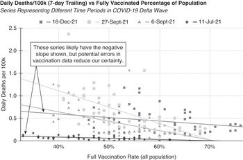
Figure 1.2 Each point shows the seven-day trailing average daily COVID-19 mortality of 50 US states and the District of Columbia plotted against their respective vaccination rates at the end of the time period. This data (though not this visual) was copied from the New York Times “Coronavirus in the U.S.: Latest Map and Case Count” during the period represented by this graph (New York Times, 2020). The New York Times itself gathered this data from government authorities, and this limited data was likely to be comparable across regions and time periods. US CDC data (not shown) reported state totals that vary from New York Times’ data, but the trend lines are very similar.
The 6-Sep-21 and 27-Sep-21 series data were from the peak of the wave, and they tilt strongly down and to the right, meaning that higher state vaccination rates were strongly correlated with lower death rates. The 11-Jul-21 and 16-Dec-21 regressions (beginning and ending of the wave) showed small negative slopes, but reports of the CDC’s imprecision in vaccination reporting (Reference WingroveWingrove, 2021) sufficiently concerned us to demonstrate a good visualization practice by providing a prominent warning on the graph. Clearly, this data’s association of vaccination rate on mortality declined after the delta wave crested. During the five-month period, the chart also shows that vaccination rates increased by about 13% (absolute).
This data and our prior understanding of vaccine biochemistry lead us strongly to believe there is an underlying causal relationship – that vaccinations reduce the risk of deaths. (The US Centers for Disease Control and Prevention (CDC) COVID Data Tracker provides even stronger evidence of a causal relationship (CDC, 2020).) However, Figure 1.2 does not provide conclusive insight, as there could be other explanations for some of the effects. States differ along many relevant variables other than vaccination rate, such as population age, density, and prior disease exposure. This is not a randomized controlled experiment where each state was randomly assigned a vaccination rate. The reasons the curve flattened at the end of the wave may not be because of reduced vaccine efficacy against the delta variant but rather because of the impact of behavioral changes, changes in the locale of the wave as it spread across different states, increase in immunity from prior exposure, waning vaccine efficacy over time, and the very beginning of the follow-on omicron wave.
A data scientist could gain further insight from the analysis of outliers. If not an artifact of the data, the twin 1.6 per 100k points that came from Florida, for example, may result from disease in the state’s large at-risk elderly population. Data scientists could construct and evaluate many hypotheses from this graph using additional data and visualization techniques. But data scientists need to exercise caution about the quality of individual data points.
The US omicron wave, which followed the delta wave, showed a different regression line. While Figure 1.2 does not illustrate this, state per capita mortality and vaccination rates became positively correlated for a brief period in mid-January 2022, though just slightly so. There are many possible explanations for this, such as the specifics of the omicron mutation and the earlier arrival of the variant in vaccinated states. The reversal, and indeed this chart, reminds us to scrutinize data and visualizations carefully and to exercise due caution, recognizing the limitations of the data and its presentation. Section 11.4 discusses this topic further.
1.1.2 Data Science – Conclusions
Let’s look at some examples of our six types of conclusions from the beginning of Section 1.1. Conclusions can be embedded in programs or serve to provide insight to a data analyst.
◦ Predict how a protein will fold, based on its structure.
◦ Autocomplete user input, based on the characters typed so far.
◦ Recommend a song, based on past listening.
◦ Suggest possible medical therapies, based on laboratory results.
◦ Show an ad to a user, based on their recent web searches.
◦ Assign labels to photos (e.g., “cat” or “dog”).
◦ Identify a bird’s species, from its song.
◦ Determine if a client is satisfied or unsatisfied, via sentiment analysis.
◦ Label email as spam.
◦ Find the optimal location to build a new warehouse based on minimizing supplier/consumer transportation costs.
◦ Schedule product manufacturing to maximize revenue based on predicted future demand.
◦ Translate a sentence from Chinese to English.
◦ Convert astronomical images to entities.
◦ Cluster together similar images of cancerous growths to help doctors better understand the disease.
◦ Cluster email messages into folders.
Models that generate these conclusions may be clear box or opaque box. A clear box model’s logic is available for inspection by others, while an opaque box model’s logic is not. The “opaque box” term can also apply to a model whose operation is not comprehensible, perhaps because it relies on machine learning. Context usually clarifies whether opacity refers to unavailability, incomprehensibility, or both.
This book is filled with many examples of using data to reach conclusions. For example, Chapter 4 leads off by discussing data-driven spelling correction systems, which may classify words into correct or mispelled variants (perhaps underlining the latter), recommend correct spellings (“did you mean, misspell?”), or automatically transform an error into a correct spelling. Returning to the mortality insight discussion that concluded the previous section, we also discuss COVID-19 mortality prediction in greater detail, but we will see this is hard to do even when there is much more data available.
1.1.3 Scale
Some data science success is due to new techniques for analysis, and new algorithms for drawing conclusions. But much is due to the sheer scale of data we can now collect and process (Reference Halevy, Norvig and PereiraHalevy et al., 2009).
As examples of the size of data collections as of 2021: There are 500 billion web pages (and growing) stored in the Internet Archive. The investment company Two Sigma stores at least a petabyte of data per month. YouTube users upload 500 hours of video per minute (Reference HaleHale, 2019). The SkyMapper Southern Sky Survey is 500 terabytes of astronomical data; and the Legacy Survey of Space and Time is scheduled to produce 200 petabytes in 2022 (Reference Zhang and ZhaoZhang & Zhao, 2015). See Table 1.1, which describes the scale of data, with representative examples.
Table 1.1 Scale of data and representative examples.
| Size | Example | ||
|---|---|---|---|
| 103 | kB | kilobyte | A half page of text, or a 32 × 32 pixel icon |
| 106 | MB | megabyte | The text of two complete books, or a medium-resolution photo |
| 109 | GB | gigabyte | An hour-long HD video, 10 hours of music, or the Encyclopaedia Britannica text |
| 1012 | TB | terabyte | One month of images from the Hubble Space Telescope or a university library’s text |
| 1015 | PB | petabyte | Five copies of the 170 million book Library of Congress print collection |
| 1018 | EB | exabyte | Twenty copies of the 500 billion page Internet Archive, or two hours of data at the planned rate of the Square Kilometer Array telescope in 2025 |
| 1021 | ZB | zettabyte | World’s total digital content in 2012, or total internet traffic in 2016 |
Data science grows rapidly because of a virtuous cycle whereby its impact leads to more data production (often from increased usage), more research and development and impact as the application improves, and then even more data. (While “virtuous cycle” is a commonly used term to describe this feedback loop, not all effects are beneficial, and we both recognize and discuss the cycle’s negative effects as well.)
The World Wide Web was developed in the mid-1990s. It resulted in a vast collection of informative web pages, and enabled the agglomeration of data about user interactions with these pages. The Web’s extremely broad data led to novel consumer services and disrupted entire industries. Recommendation engines, as used at Amazon and eBay, became feasible (Reference Schafer, Konstan and RiedlSchafer et al., 2001), web search continuously improved, and social networks emerged (Reference boyd and Ellisonboyd et al., 2007).
Big data refers to techniques for conceiving, designing, and developing vast amounts of information and operating systems that can gather, store, and process it. In 1994, the book Managing Gigabytes assumed that a gigabyte was big data. In 2021, a sub-$1000 laptop holds a terabyte of data, big data is measured in petabytes, and annual worldwide hard disk sales are measured in zettabytes.
Data science focuses on big data, but many of its techniques are equally beneficial for small data. Scatter plots and other visualization techniques often work better for a hundred data points than for a trillion.
Small and big data are often combined for a richer understanding. For example, a company with big data from website clicks might also recruit a few subjects for an in-depth user-experience assessment. They are asked questions such as: “What did you think of the user interface?” “How easy was it to accomplish this task?” “When you were trying to find the cheapest product, did you notice the ‘sort by price’ button?”
1.2 The Emergence of Data Science
Data science emerged from combining three fields. For the purposes of this book, we define them as follows:
Statistics is the mathematical field that interprets and presents numerical data, making inferences and describing properties of the data.
Operations research (OR) is a scientific method for decision-making in the management of organizations, focused on understanding systems and taking optimal actions in the real world. It is heavily focused on the optimization of an objective function – a precise statement of a goal, such as maximizing profit or minimizing travel distance.
Computing is the design, development, and deployment of software and hardware to manage data and complete tasks. Software engineering gives us the ability to implement the algorithms that make data science work, as well as the tools to create and deploy those algorithms at scale. Hardware design gives us ever-increasing processing speed, storage capacity, and throughput to handle big data.
Some of data science’s most important techniques emerged from work across disciplines. While we include machine learning within computing, its development included contributions from statistics, pattern recognition, and neuropsychology. Information visualization arose from statistics, but has benefited greatly from computing’s contributions.
We will look at each of these topics in more detail, and then review the key terminology from them in Table I.1 to Table I.5 at the end of this part.
1.2.1 Statistics
Some of the key ideas from the field of statistics date back over a thousand years to Greek and Islamic mathematicians. The word statistics is derived from the Latin word for state. Statistics originally studied data about the state’s tables of census data listing who is alive, who died, and who to tax, such as The Statistical Account of Scotland of 1794 by Sir John Sinclair (Reference SinclairSinclair, 1794). His inscription to the work is telling. Taken from Cicero, it argued that “to counsel on national affairs, one needs knowledge of the make-up of the state” (Reference Cicero, Sutton and RackhamCicero, n.d.). Even today, the perspective provided by the old tables is valuable: Sinclair’s data, compared with current US Centers for Disease Control and Prevention data, vividly illustrates a 1000-fold decrease in childhood mortality over 250 years.
Soon after Sinclair published his accounts, statistics moved from just tabulating data to making inferences. For example, statisticians could count how many houses there are in a city, survey some to determine the average number of people per house, and then use that to estimate the total population. This estimate is an inexact inference, but much cheaper than an exact census of every household. Statistics, as it was understood in Sinclair’s time, blossomed to become mathematical statistics, now focused on the mathematical methods that infer from the particular (e.g., a small dataset) to the general.
Work on inferencing began even earlier in physics and astronomy. For example, in the 16th century, astronomer Tycho Brahe collected detailed data on planetary positions. In 1621 Johannes Kepler analyzed that data, applied regression analysis to counteract errors, and wrote down the laws of planetary motion. The laws accurately predicted how the planets moved, but didn’t explain why. That was left to Isaac Newton, who in 1687 showed that Kepler’s Laws derived from the universal principle of gravitation.
In the early 1900s, statisticians such as R. A. Fisher developed methodologies for experiment design that made it easier to analyze experiments and quantify errors in fields such as sociology and psychology, where there is more uncertainty than in orbital mechanics (Reference FisherFisher, 1935).
In a 2001 article, statistician Leo Breiman captured the (then) difference between the mindset of most statisticians and the emerging field of data science (Reference BreimanBreiman, 2001). He argued that most statisticians belonged to a data modeling culture that assumes:
There is a relatively simple, eternally true process in Nature (such as the orbits of planets due to the universal law of gravitation).
Data reflects this underlying process plus some random noise.
The statistician’s job is to estimate a small number of parameter values leading to a parsimonious model with the best fit to the data (for example, assuming the model equation F = Gm1m2/r2, estimating G = 6.674 × 10⁻¹¹). The physicist, with the support of the statistician, can then examine the model to gain insight and make predictions.
Breiman contrasts this with the algorithmic modeling culture, which allows for complex and not as easily understood models (e.g., neural networks, deep learning, random forests), but which can make predictions for a broader range of processes. Making predictions in complex domains with many variables is the core of modern data science. While simple equations work exceedingly well in fields such as mechanics, they do not in fields like sociology and behavioral psychology – people are complicated. Breiman surmised that only about 2% of statisticians in 2001 had adopted algorithmic modeling, thus illustrating the need to broaden statistics and move towards what we now call data science.
Since the 2001 publication of Breiman’s article, statisticians are now increasingly focusing on data science challenges, and the gap has diminished between algorithms and models. In part, this is because the scale of data has changed – 50 years ago a typical statistical problem had 100 to 1000 data points, each consisting of only a few attributes (e.g., gender, age, smoker/non-smoker, and sick/healthy). Today, these numbers can reach into the millions or billions (e.g., an image dataset with 10 million images, each with a million pixels).
In summary, statistics’ and data science’s objectives have become well aligned, and additional statistically inspired work will improve data science. Data science will undoubtedly pull both mathematical and applied statistics in new directions, some of which are discussed in the National Science Foundation (NSF) Report, Statistics at a Crossroads (Reference He, Madigan, Yu and WellnerHe et al., 2019).
1.2.2 Visualization
Graphing has been relevant to statistics since at least the 1700s because it offers insight into data. William Playfair felt that charts communicated better than tables of numbers, and he published excellent time-series plots on economic activity in 1786 (Reference PlayfairPlayfair, 1786). John Snow, the father of epidemiology, used map-based visuals to provide insight into the mid-1800s London cholera outbreaks (Boston University School of Public Health, 2016). Florence Nightingale, recognized as the founder of modern nursing, was also a visualization pioneer. In collaboration with William Farr, she used pie charts and graphs of many forms to show that poor sanitation, not battle wounds, caused more English soldiers to die in the Crimean War. Her work led to a broader adoption of improved sanitary practices (Reference AndrewsAndrews, 2019; Reference RehmeyerRehmeyer, 2008).
New approaches to showing information graphically have grown rapidly in the field of information visualization. Its goal is to “devise external aids that enhance cognitive abilities,” according to Don Norman, one of the field’s founders (Reference NormanNorman, 1993). Stu Card, Jock Mackinlay, and Ben Shneiderman compatibly define the field as “the use of computer-supported, interactive, visual representations of data to amplify cognition” (Reference Card, Mackinlay and ShneidermanCard et al., 1999). These scientists all believed interacting with the right visualization greatly amplifies the power of the human mind. Even the simple graph in Figure 1.2 brings meaning to 204 data points (which include data from tens of millions of people) and clarifies the impact of vaccination on mortality.
Because of the enormous improvements in both computational capabilities and display technology, we now have continually updated, high-resolution, multidimensional graphs and an incredibly rich diversity of other visuals – perhaps even virtual reality (Reference BrysonBryson, 1996). Today, visualization flourishes, with contributions from multidisciplinary teams with strong artistic capabilities (Reference Steele and IliinskySteele & Iliinsky, 2010; Reference TufteTufte, 2001).
The resulting visuals can integrate the display of great amounts of data with data science’s conclusions, allowing individuals to undertake what-if analyses. They can simultaneously see the sensitivity of conclusions to different inputs or models and gain insight from their explorations.Footnote 1 Visualizations targeted at very specific problems in the many application domains addressed by data science can bring data science to non-data science professionals and even the lay public.
The public media regularly use interactive visualizations to reinforce and clarify their stories, for example, the vast number of COVID-19 charts and graphs presented during the pandemic. Computer scientists apply visualization in an almost recursive way to illustrate complex data-science-related phenomena such as the workings of neural networks. If successful, these visualizations will first improve data science and then visualization itself.
In addition to focusing on visuals, the field of visualization must also catalyze ever-improving tools for creating them. Some platforms are for non-programming users of data science in disciplines such as financial analysis and epidemiology. Other platforms are for programmers with sophisticated data science skills. In both cases, we can use data science to guide users in interactive explorations: suggesting data elements to join and trends to plot, and automatically executing predictive models.
A word of warning: Visuals are powerful, and so amplify the perception of validity of what they show. A timeline showing an occurrence frequency trending in one direction appears conclusive, even if the graph’s points were inconsistently or erroneously measured. Pictures may evoke a notion of causality where there is none. Visualization’s power is such that great care must be taken to generate insight, not spurious conclusions. For more on this, see Section 11.4 on “Communicating data science results.”
We wanted to conclude this section by showing some compelling visualizations, but the best ones almost invariably use color and interactivity, both of which are infeasible in this black-and-white volume. Instead, we refer the reader to the visualizations on sites such as Our World in Data (Global Change Data Lab, n.d.) and FlowingData (Reference YauYau, n.d.).
1.2.3 Operations Research
While statistics is about making inferences from data, the field of operations research focuses on understanding systems and then creating and optimizing models that will lead to better, perhaps optimal, actions in the world. Applications are optimizing the operations of systems such as computer and transportation networks, facilities planning, resource allocation, commerce, and war fighting. This emphasis on optimization leading to action, as well as its problem-solving methodology, strongly ties operations research to data science.
Operations research was named by UK military researchers Albert Rowe and Robert Watson-Watt, who in 1937 and the lead-up to World War II were optimizing radar installations. Soon after, the principles and methods of the field were applied to business and social services problems.
In the 1800s, long before the field was named, Charles BabbageFootnote 2 advocated for scientific analysis to optimize public services such as rail transportation and postal delivery (Reference SodhiSodhi, 2007). Research by Babbage and by Rowland Hill led to the invention of postage stamps. With continuing growth in the scale of centrally managed societal systems and improvements in applied mathematics, operations research grew greatly in the 20th century. In part, this was due to its applicability to complex, large-scale warfare.
Operations research applies many models and mathematical techniques to a wide variety of application domains. For example:
The traveling salesperson problem (TSP) tries to find the shortest route that lets a salesperson pass through each city that needs to be visited exactly once and then to return home (Reference CookCook, 2012). Operations researchers model TSP with a network (or graph) where cities are nodes and labeled edges represent the paths and distances between cities. Solutions need to consider that there are an exponentially large number of possible routes. Various techniques have been applied: Dynamic programming is elegant, provides an optimal solution, but only works well when there are a small number of nodes (Reference Held and KarpHeld & Karp, 1962). Hybrid techniques, which typically combine linear programming and heuristics, work better for larger networks, though they may only provide the approximate answers that many applications need (Concorde, n.d.).
A resource allocation problem tries to achieve a project’s goal at minimum cost by optimizing resource use. Consider a baker with a fixed supply of ingredients, a set of recipes that specify how much of each ingredient is needed to produce a certain baked good, and known prices for ingredients and finished products. What should the baker bake to maximize profit? Linear programming is often used for resource allocation problems like this.
The newsvendor problem is similar to the resource allocation problem, but with the added constraint that newspapers are published once or twice a day and lose all value as soon as the next edition comes out (Reference Petruzzi and DadaPetruzzi & Dada, 1999). The newsvendor needs to stock its papers by estimating the “best” amount, sometimes guessing from daily demand. “Best” here depends on the sales price, the unit cost paid by the seller, and the unknown customer demand. Estimating demand from data is tricky due to seasonal effects, the actual news of the day, and the simple fact that we never know true demand when supplies sell out. Could we have sold another 10, 20, or perhaps zero?
An additional complexity is the more copies a paper sells, the more it can charge for advertising, so insufficient inventory also reduces advertising revenue. Thus, if the optimization were to be done by the newspaper, there is a primary metric (direct profit on paper sales) as well as a secondary metric (total circulation). We will see examples of similar optimization trade-offs in the examples of Part II.
Operations research has a theoretical side, with a stable of mathematical modeling and optimization techniques, but it has always focused on practical applications. Its methodology begins with creating a model of how a system works, and often defining an objective function to define the goals. It continues with capturing the relevant data to calibrate the model, and results in algorithms that generate the best possible results. The field focuses on the rigorous analysis of results with respect to a particular model, and has expertise in simulation that is often used to calibrate or test optimization algorithms.
Traditionally, operations research operated in a batch mode, where there was a one-time data collection process, after which models were built, calibrated, analyzed, and optimized. The resultant improvement blueprint was then put into practice.
Today, we can continually collect data from a real-time system, feed it into a model, and use the model’s outputs to continually optimize a system. This system could be a transportation network, pricing within a supermarket, or a political campaign. This online mode scenario (or continual optimization) became feasible when computer networks and the Web made real-time information broadly available (Reference Spector, Eberspächer and HertzSpector, 2002).
Operations research techniques can be of great use to data scientists. As data science applications grow in complexity and importance, it becomes important to rigorously demonstrate the quality of their results. Furthermore, simulations may be able to generate additional valuable data.
In summary, operations research approaches are already infused in data science. Its objectives, models, algorithms, and focus on rigor are crucial to one of data science’s most important goals: optimization. In return, data science’s techniques and problems are driving new research areas in operations research, including reinforcement learning and decision operations.
1.2.4 Computing
The breadth of the field of computing has contributed deeply to data science. In particular, these five computing subfields have had major impact:
Theoretical computer science provides the fundamental idea of an algorithm – a clearly specified procedure that a computer can carry out to perform a certain task – and lets us prove properties of algorithms.
Software engineering makes reliable software systems that let an analyst be effective without having to build everything from scratch.
Computer engineering supplies the raw computing power, data storage, and high-speed communications networks needed to collect, transmit, and process datasets with billions or trillions of data points.
Machine learning (ML) makes it possible to automatically construct a program that learns from data and generalizes to new data. Its deep learning subfield allows these learned programs to transform input data into intermediate representations through multiple (deep) levels, instead of mapping directly from input to output.
Artificial intelligence (AI) creates programs that take appropriate actions to achieve tasks that are normally thought of as requiring human intelligence. Robot actions are physical; other AI programs take digital actions. Most current AI programs use machine learning, but it is also possible for programmers to create AI programs using not what the program learns, but what the programmers have learned.
We are frequently asked to compare the fields of artificial intelligence and data science. One clear difference is that data science focuses on gaining value in the form of insights and conclusions, whereas AI focuses on building systems that take appropriate, seemingly intelligent actions in the world. With less focus on gaining insight, AI doesn’t put as much emphasis on interacting with data or exploring hypotheses. Consequently, it pays less attention to statistics, and more attention to creating and running computer programs. Another key difference is that data science, by definition, focuses on data and all the issues around it, such as privacy and security and fairness. The kind of AI that focuses on data also deals with these issues, but not all AI focuses on data.
However, a clear comparison of AI and data science is complex because AI has come to have different meanings to different people: As one example, AI is often used synonymously with machine learning. While we do not agree that those terms should be equated, data science clearly has a broader focus than just machine learning. As another example, AI is sometimes used to connote techniques aimed at duplicating human intelligence, as in John McCarthy’s 1956 introductory definition at a Dartmouth Workshop: “Machines that can perform tasks that are characteristic of human intelligence.” While we again do not agree with the narrowness of this definition, data science has broader goals.
A major reason that computing has had such an impact on data science is that empirical computing augmented computing’s traditional focus on analytical and engineering techniques:
Computer scientists and programmers initially put their efforts into developing algorithms that produced provably correct results and engineering the systems to make them feasible. For example, they took a clear set of the rules for keeping a ledger of deposits and withdrawals, and they deduced the algorithms for computing a bank account’s balance. There is a definitive answer that, barring a bug, can be computed every time.
Empirical computing derives knowledge from data, just as natural sciences do. Science is built on results derived from observation, experimentation, data collection, and analysis. The empirical computing approach is inductive rather than deductive, and its conclusions are contingent, not definitive – new data could change them. Kissinger et al. frame a related discussion on AI (which, as practiced today, is empirical) and notes it is “judged by the utility of its results, not the process used to reach those results” (Reference Kissinger, Schmidt and HuttenlocherKissinger et al., 2021). Below are example areas where the application of empirical methods led to advances.
Information retrieval is the study and practice of organizing, retrieving, and distributing textual information. It blossomed in the 1970s, as text was increasingly stored in digital form. Gerard Salton developed data-driven approaches for promoting information based on usage pattern feedback (Reference SaltonSalton, 1971). For example, his system learned when a user searches a medical library for [hip bone], that [inguinal] and [ilium] are relevant terms. It also learned which results most users preferred, and promoted those to other users. These techniques played a large role in the development of today’s web search engines.
A/B experimentation became pervasive in computing with the rise of the World Wide Web (Reference Kohavi, Tang and XuKohavi et al., 2020). Suppose a company detects that a page on their website confuses their customers. They perform an experiment by creating a version of the page with a different wording or layout and show it to, say, 1% of their users. If the experiment shows that the modified version B page performs better than the original version A page, they can replace the original page with version B. Then they can make another experiment starting from a new version B, and so on. Thus, whether done automatically or under human control, the website can continually improve. Notably, improvements lead to more usage, more usage generates more data, and more data allows for more site improvements. We will return in Chapter 14 to the benefits and risks of this classic virtuous cycle.
Problems with inherent uncertainty, such as speech recognition, machine translation, image recognition, and automated navigation, saw markedly improved performance as more empirical data was applied. Every day, billions of people use these improved applications, which are regularly enhanced via the analysis of data. Even systems programming – the software that controls operating systems, storage, and networks – has benefited from machine learning algorithms that learn patterns of usage and optimize performance.
The very usability of systems has been revolutionized by advances in human computer interaction (HCI), which leverages experimental techniques to ascertain what user interfaces are both useful and natural. HCI’s hard-won gains revolutionized computer use, moving computers from a specialized tool for experts to nearly universal adoption. We discuss many examples of the applicability of data science in Chapter 4 and Chapter 5.
Advances in computing hardware made the big data era possible. Transistor density has doubled every two years or so, as predicted by Gordon Moore in his eponymous Moore’s Law (Reference MooreMoore, 1965). The first commercially produced microprocessor, the Intel 4004 from 1971, had 2000 transistors and a clock rate of 0.7 MHz. Modern microprocessors have 10 million times more transistors and a clock speed that is 10,000 times faster. Overall, computers in 2021 are about a trillion times better in performance per dollar than 1960 computers.Footnote 3
Improvements in all computation-related aspects made systems cost less yet be more usable for more applications by more people. Increases in performance let more sophisticated algorithms run. More storage lets us store the Web’s vast amount of data (particularly image and video), create powerful neural networks, and implement other knowledge representation structures. When the first neural networking experiments were done, they were limited by the amount of data and computational power. By the 1990s, those limitations began to disappear; web-scale data and Moore’s Law facilitated machine learning.
This steady stream of research results and demonstrable implementation successes have propelled computing beyond its roots in theory and engineering to empirical methods. The pace of discovery picked up as Moore’s Law provided computational, communication, and storage capacity; the Web provided vast data; and accelerated research in high-performance algorithms and machine learning yielded impressive results. Engineers have adapted to this change in computational style with new, fit-for-purpose processor and storage technologies. Key events in computing, illustrated by the timeline in Table 1.2, helped pave the way to data science.
Table 1.2 Key events in computing’s contribution to data science*.
| Year | Description | Person or entity | Paper or event |
|---|---|---|---|
| 1950 | The value of learning by a founder of the field of computing | Alan Turing | Computing machinery and intelligence (Reference TuringTuring, 1950) |
| 1955 | Successful application of learning to checkers | Arthur Samuels | Some studies in machine learning using the game of checkers (Reference SamuelSamuel, 1959) |
| 1965 | The computational fuel: Moore’s Law | Gordon Moore | Cramming more components onto integrated circuits (Reference MooreMoore, 1965) |
| 1971 | Early use of data in search | Jerry Salton | Relevance feedback and the optimization of retrieval effectiveness (Reference SaltonSalton, 1971) |
| 1982 | Growth of use of data in computer–human interaction (CHI) | ACM: Bill Curtis, Ben Shneiderman | Initiation of ACM CHI Conference (ACM CIGCHI, n.d.; Reference Nichols and SchneiderNichols & Schneider, 1982) |
| 1986 | Reignition of neural network machine learning | David Rumelhart, Geoffrey Hinton | Learning representations by back-propagating errors (Reference Rumelhart, Hinton and WilliamsRumelhart et al., 1986) |
| Early 1990s | Birth of the World Wide Web | Tim Berners-Lee et al. | Information management: a proposal (Reference Berners-LeeBerners-Lee, 1990) |
| 1996 | Powerful new data-driven technique for search | Sergey Brin and Larry Page | The anatomy of a large-scale hypertextual web search engine (Reference Brin and PageBrin & Page, 1998) |
| Mid-1990s | Emergence of social networks | Various | Geocities, SixDegrees, Classmates, … |
| 1998 | Emergence of data in search advertising | GoTo/Overture | GoTo, renamed Overture and later acquired by Yahoo, launched internet search advertising |
| 2007 | Cloud computing: powering data science | Amazon | Announcing Amazon Elastic Compute Cloud – beta (Amazon Web Services, 2006) |
| 2010 | Growth in GPU usage for neural network processing | Various | Large-scale deep unsupervised learning using graphics processors (Reference Raina, Madhavan and NgRaina et al., 2009) |
| 2011 | Demonstration of power of data on a gameshow | IBM | Jeopardy victory (Reference MarkoffMarkoff, 2011) |
| 2012 | Practical demonstration of neural networks in image recognition | Alex Krizhevsky, Ilya Sutskever, Geoffrey E. Hinton | ImageNet classification with deep convolutional neural networks (Reference Krizhevsky, Sutskever and HintonKrizhevsky et al., 2012) |
| 2012 | Deployment of neural networks in speech recognition | Geoffrey Hinton et al. | Deep neural networks for acoustic modeling in speech recognition: the shared views of four research groups (Reference Hinton, Deng and YuHinton et al., 2012) |
| 2018 | Demonstration of reinforcement learning in games | DeepMind: David Silver et al. | A general reinforcement learning algorithm that masters chess, Shogi, and Go through self-play (Reference Silver, Hubert and SchrittwieserSilver et al., 2018) |
| 2019 | Large-scale, deep generative models | Various | BERT (Reference Devlin, Chang, Lee and ToutanovaDevlin et al., 2019), GPT-3 (Reference Brown, Mann and RyderBrown et al., 2020), Turing-NLG (Reference RossetRosset, 2020), and other models |
* This timeline places the birth of key technical ideas, important use cases, and necessary technological enablements. Note that the publication dates in the right-hand column may differ from the year of impact in the left-hand column.
Lest there be any remaining question on the importance of empirical computing, college student demand for data science courses and programs is on the rise worldwide. Berkeley’s introductory data science course (Data 8) enrolled fewer than 100 students in the fall of 2014 when the course was first introduced. In spring 2019, enrollment had grown to over 1,600 students. At the same time, computer science students are increasingly specializing in machine learning, a core data science component. From co-author Alfred’s experience leading intern programs at IBM, Google, and investment firm Two Sigma, machine learning internships started becoming popular in 2001 and have become the most asked for specialization. At the major machine learning conference, NeurIPS, attendance grew eight-fold from 2012 to 2019, when 13,000 attended.
1.2.5 Machine Learning
Machine learning, a subfield of computing, is the field with the most overlap with data science. It can be broken down into three main approaches:
Supervised learning trains on a set of (input, output) pairs, and builds a model that can then predict the output for new inputs. For example, given a photo collection with each photo annotated with a subject class (e.g., “dog,” “person,” “tree”), a system can learn to classify new photos. This task is called a classification; the task of predicting an output from a continuous range of numbers is called regression.
Unsupervised learning trains on data that has not been annotated with output classes. For example, given a photo collection, a model can learn to cluster dog pictures together in one class and people pictures in another, even if it does not know the labels “dog” and “person.” Internally, the model may represent concepts for subparts such as “torso” and “head.” Such a model may invent classes that humans would not normally use. The task of grouping items into classes (without labels for the classes) is called clustering.
Reinforcement learning builds a model by observing a sequence of actions and their resulting states, with occasional feedback indicating whether the model has reached a positive or negative state. For example, a model learns to play checkers not by being told whether each move is correct or not, but just by receiving a reward (“you won!”) or punishment (“you lost!”) at the end of each training game.
Another way to categorize machine learning models is to consider whether the model is focused on learning the boundary between classes, or learning the classes themselves:
A discriminative model answers the question: “Given the input x, what is the most likely output y?” Sometimes this is explicitly modeled as finding the output y that maximizes the probability P(y | x), but some models answer the question without probabilities.
A generative model answers the question: “What is the distribution of the input?” Or sometimes: “What is the joint distribution of input and output?” Sometimes this is an explicit model of P(x) or P(x, y), and sometimes the model can sample from the distribution without explicitly assigning probabilities.
For example, if the task is to label the language in a sentence as being either Danish or Swedish, a discriminative classifier model could do very well simply by recognizing that Swedish has the letters ä, ö, and x, while Danish uses æ, ø, and ks. With a few more tricks, the model could correctly classify most sentences, but it could not be said to know very much about either language. In contrast, a generative classifier model would learn much more about the two languages, enough to generate plausible sentences in either language. Some generative models can answer other questions, such as: “Is this sentence rare or common?” However, a discriminative model, being simpler, can be easier to train and is often more robust.
As another example, if we trained models on images of birds labeled with their species, a discriminative model could output the most probable species for a given image. A generative model could do that, and could also enumerate other similar birds; or, if parts of the bird were obscured in the image, could fill in the missing parts.
The most common methodology for machine learning follows these steps (Reference Amershi, Begel and BirdAmershi et al., 2019):
1. Collect, assess, clean, and label some data.
2. Split the data into three sets.
3. Use the first set, the training set, to train a candidate model.
4. Use the second set, the validation set (also known as the development set or dev set) to evaluate how well the model performs. It is important that the dev set is not part of the training; otherwise, it would be like seeing the answers to the exam before taking it.
5. Repeat steps 3 and 4 with several candidate models, selecting different model classes and tweaking hyperparameters, the variables that control the learning process.
6. Evaluate the final model against the third set, the test set, to get an unbiased evaluation of the model.
7. Deploy the model to customers.
8. Continuously monitor the system to verify that it still works well.
We will cover many applications of machine learning in Part II; here we introduce three major areas of use:
Computer vision (CV) processes images and videos and has applications in search, autonomous vehicles, robotics, photograph processing, and more. Most current CV models are deep convolutional neural networks trained on large, labeled image and video datasets in a supervised fashion.
Natural language processing (NLP) parses, manipulates, and generates text. NLP is used for translation, spelling and grammar correction, speech recognition, email filtering, question answering, and other applications. Most current NLP models are large transformer neural networks which are pre-trained on unlabeled text corpora using unsupervised learning. Then, they are fine-tuned on a smaller and narrower task, often with supervised learning. As of 2022, NLP models are in a state of rapid improvement and are nearing parity with humans on many small tasks. However, they suffer from inconsistency, an inability to know what they don’t know, and tremendous computational complexity.
Robotics makes intelligent decisions on the control of autonomous machines and has applications in agriculture, manufacturing, logistics, and transportation. The forefront of robotics research relies on reinforcement learning, in which robots are trained by a combination of simulated and real-world rewards.
Machine learning has proven useful to all of these areas, but there are challenges, such as adversarial attacks, potential bias, difficulty in generating explanations, and more. These are discussed in Part III.
It is clear that machine learning and statistics have a large overlap with data science in goals and methods. What are their differences?
Statistics emphasizes data modeling. Designing a simple model that attempts to demonstrate a relationship in the data and leads to understanding. It traditionally focused on modest amounts of numerical data (though this has been changing), and it is increasingly tackling other types of data.
Machine learning emphasizes algorithmic modeling. Inventing algorithms that handle a wide variety of data, and lead to high performance on a task. The models may be difficult to interpret.
Data science focuses on the data itself. Encouraging the use of whatever techniques lead to a successful product (these techniques often include statistics and machine learning). Data science operates at the union of statistics, machine learning, and the data’s subject matter (e.g., medical data, financial data, and astronomical data).
Machine learning also distinguishes itself from statistics by automatically creating models, without a human analyst’s considered judgment. This is particularly true for neural network models. In these, the inputs are combined in ways that lead to predicting outputs with the smallest amount of error. The combinations are not constrained by an analyst’s preconceptions.
The deep learning subfield uses several layers of neural networks, so that inputs form low-level representations, which then combine to form higher-level representations, and eventually produce outputs. The system is free to invent its own intermediate-level representations. For example, when trained on photos of people, a deep learning system invents the concepts of lines and edges at a lower level, then ears, mouths, and noses at a higher level, and then faces at a level above that.
1.2.6 Additional History
The erudite mathematician and statistician John Tukey set forth many of data science’s foundational ideas in his 1962 paper “The future of data analysis” and 1977 book Exploratory Data Analysis (Reference TukeyTukey, 1962, Reference Tukey1977). Tukey made a strong case for understanding data and drawing useful conclusions, and for how this was different from what much of statistics was doing at the time. He was two-thirds of the way to data science, missing only the full scale of modern computing power.
In 2017, Stanford Professor of Statistics David Donoho, in a follow-on piece to the aforementioned “The future of data analysis,” made the case that the then-recent changes in computation and data availability meant statisticians should extend their focus (Reference DonohoDonoho, 2017). His sketch of a “greater data science curriculum” has many places where statistics plays a large role, but others where computing and other techniques are dominant. These thoughts were echoed by others in a Royal Statistical Society Panel of 2015 (Royal Statistical Society, 2015). More recently, data science curricula such as Berkeley’s effectively integrate these key topics (Reference Adhikari, Denero and JordanAdhikari et al., 2021; Reference SpectorSpector, 2021).
Tukey used the term data analysis in 1962 (Reference TukeyTukey, 1962). The term data science became popular around 2010,Footnote 4 after an early use of the term by the statistician William Cleveland in 2001, the launches of Data Science Journal in 2002 and The Journal of Data Science in 2003, and a US National Science Board Report in 2005Footnote 5 (National Science Board, 2005). The term big data dates back to the late 1990s (Reference Halevy, Norvig and PereiraHalevy et al., 2009; Reference LohrLohr, 2013), perhaps first in a 1997 paper by Michael Cox and David Ellsworth of the NASA Ames Research Center (Reference Cox and EllsworthCox & Ellsworth, 1997).
Related terms go back much further. Automatic data was used for punch-card processing in the 1890 US census (using mechanical sorting machines, not electronic computers). Data processing entered common parlance in the 1950s as digital computers made data accumulation, storage, and processing far more accessible.
While we associated A/B testing with the rise of the World Wide Web, its use is far older. In 1923, Claude C. Hopkins, who with Albert Lasker founded the modern advertising industry, wrote “Almost any question can be answered quickly and finally by a test campaign.”
In 1950, Alan Turing laid out many key ideas of artificial intelligence and machine learning in the article “Computing machinery and intelligence” (Reference TuringTuring, 1950). However, the terms themselves arrived a bit later: artificial intelligence was coined in 1956 for a workshop at Dartmouth College (Dartmouth, 2018) and machine learning was popularized in 1959 by IBM Researcher Arthur Samuel in an article describing a program which learned checkers by playing games against itself (Reference SamuelSamuel, 1959). Neural networks were first explored in the 1940s and 1950s by Hebb (see Reference MorrisMorris, 1999), McCulloch and Pitts (see Reference McCulloch and PittsMcCulloch & Pitts, 1943), and Rosenblatt (see Reference RosenblattRosenblatt, 1958). Deep learning (in its current form, for neural networks) was coined in 2006 (Reference Hinton, Osindero and TehHinton et al., 2006).


