
It’s my bad friend Kent … Kent works at the Central Statistics Bureau. He knows how many litres of milk Norwegians drink per annum and how often people have sex. On average that is.
The Charisma Casualty: A Scientist in Need of an Apology and the Question He Dreads
Look at that miserable student in the corner at the party. He could be my younger self. He was doing well until she asked the dreaded question: ‘What are you studying?’ At such a moment what would one not give for the right to a romantic answer: ‘Russian’, perhaps, or ‘drama’. Or a coldly cerebral one: ‘philosophy’ or ‘mathematics’ or even ‘physics’. Or to pass oneself as a modern Victor Frankenstein, a genetic engineer or a biochemist. That is where the action will be in this millennium. But statistics?
The 1990 French film Tatie Danielle, a dark comedy about a misanthropic, manipulative and downright nasty old lady, was advertised by posters stating ‘you don’t know her, but she loathes you already’. Of most people one might just as well say, ‘you’ve never studied statistics but you loathe it already’. You know already what it will involve (so many tonnes of coal mined in Silesia in 1963, so many deaths from TB in China in 1978). Well, you are wrong. It has nothing, or hardly anything, to do with that. And if you have encountered it as part of some degree course, for no scientist or social scientist escapes, then you know that it consists of a number of algorithms for carrying out tests of significance using data. Well, you are also wrong. Statistics, like Bill Shankly’s football, is not just a matter of life and death: ‘Son, it’s much more important than that.’
Statistics Are and Statistics Is
Statistics singular, contrary to the popular perception, is not really about facts; it is about how we know, or suspect, or believe, that something is a fact. Because knowing about things involves counting and measuring them, then it is true that statistics plural are part of the concern of statistics singular, which is the science of quantitative reasoning. This science has much more in common with philosophy (in particular epistemology) than it does with accounting. Statisticians are applied philosophers. Philosophers argue how many angels can dance on the head of a pin; statisticians count them.
Or rather, count how many can probably dance. Probability is the heart of the matter, the heart of all matter if the quantum physicists can be believed. As far as the statistician is concerned this is true whether the world is strictly deterministic as Einstein believed or whether there is a residual ineluctable indeterminacy. We can predict nothing with certainty but we can predict how uncertain our predictions will be – on average, that is. Statistics is the science that tells us how.
Quacks and Squares
I want to explain how important statistics is. For example, take my own particular field of interest, pharmaceutical clinical trials: experiments on human beings to establish the effects of drugs. Why, as a statistician, do I do research in this area? I don’t treat patients. I don’t design drugs. I scarcely know a stethoscope from a thermometer. I have forgotten most of the chemistry I ever knew and I never studied biology. But I have successfully designed and analysed clinical trials for a living. Why should it be that the International Conference on Harmonisation’s guidelines for Good Clinical Practice, the framework for the conduct of pharmaceutical trials in Europe, America and Japan, should state ‘The sponsor should utilize qualified individuals (e.g. biostatisticians, clinical pharmacologists and physicians) as appropriate, throughout all stages of the trial process, from designing the protocol and CRFs and planning the analyses to analyzing and preparing interim and final clinical trial reports’?1 We know why we need quacks but these ‘squares’ who go around counting things, what use are they? We don’t treat patients with statistics, do we?
High Anxiety
Of course not. Suppose that you have just suffered a collapsed lung at 35 000 ft and, the cabin crew having appealed for help, a ‘doctor’ turns up. A PhD in statistics would be as much use as a spare statistician at a party. You damn well want the doctor to be a medic. In fact, this is precisely what happened to a lady travelling from Hong Kong to Britain in May 1995. She had fallen off a motorcycle on her way to the airport and had not realized the gravity of her injuries until airborne. Luckily for her, two resourceful physicians, Professor Angus Wallace and Dr Tom Wang, were on board.2
Initially distracted by the pain she was experiencing in her arm, they eventually realized that she had a more serious problem. She had, in fact, a ‘tension pneumothorax’ – a life-threatening condition that required immediate attention. With the help of the limited medical equipment on board plus a coat hanger and a bottle of Evian water, the two doctors performed an emergency operation to release air from her pleural cavity and restore her ability to breathe normally. The operation was a complete success and the woman recovered rapidly.
This story illustrates the very best aspects of the medical profession and why we value its members so highly. The two doctors concerned had to react quickly to a rapidly developing emergency, undertake a technical manoeuvre in which they were probably not specialized and call not only on their medical knowledge but on that of physics as well: the bottle of water was used to create a water seal. There is another evidential lesson for us here, however. We are convinced by the story that the intervention was necessary and successful. This is a very reasonable conclusion. Amongst factors that make it reasonable are that the woman’s condition was worsening rapidly and that within a few minutes of the operation her condition was reversed.
A Chronic Problem
However, much of medicine is not like that. General practitioners, for example, busy and harassed as they are, typically have little chance of learning the effect of the treatments they employ. This is because most of what is done is either for chronically ill patients for whom no rapid reversal can be expected or for patients who are temporarily ill, looking for some relief or a speedier recovery and who will not report back. Furthermore, so short is the half-life of relevance of medicine that if (s)he is middle-aged, half of what (s)he learned at university will now be regarded as outmoded, if not downright wrong.
The trouble with medical education is that it prepares doctors to learn facts, whereas really what the physician needs is a strategy for learning. The joke (not mine) is that three students are asked to memorize the telephone directory. The mathematician asks ‘why?’, the lawyer asks ‘how long have I got?’ and the medical student asks ‘will the Yellow Pages also be in the exam?’ This is changing, however. There is a vigorous movement for evidence-based medicine that stresses the need for doctors to remain continually in touch with developments in treatment and also to assess the evidence for such new treatment critically. Such evidence will be quantitative. Thus, doctors are going to have to learn more about statistics.
It would be wrong, however, to give the impression that there is an essential antagonism between medicine and statistics. In fact, the medical profession has made important contributions to the theory of statistics. As we shall see when we come to consider John Arbuthnot, Daniel Bernoulli and several other key figures in the history of statistics, many who contributed had had a medical education, and in the medical specialty of epidemiology many practitioners can be found who have made important contributions to statistical theory. However, on the whole it can be claimed that these contributions have arisen because the physician has come to think like a statistician: with scepticism. ‘This is plausible, how might it be wrong?’ could be the statistician’s catchphrase. In the sections that follow, we consider some illustrative paradoxes.
A Familiar Familial Fallacy?
‘Mr Brown has exactly two children. At least one of them is a boy. What is the probability that the other is a girl?’ What could be simpler than that? After all, the other child either is or is not a girl. I regularly use this example on the statistics courses I give to life scientists working in the pharmaceutical industry. They all agree that the probability is one-half.
One could argue they are wrong. I haven’t said that the older child is a boy. The child I mentioned, the boy, could be the older or the younger child. This means that Mr Brown can have one of three possible combinations of two children: both boys, elder boy and younger girl, or elder girl and younger boy, the fourth combination of two girls being excluded by what I have stated.
But of the three combinations, in two cases the other child is a girl so that the requisite probability is
 . This is illustrated as follows.

This example is typical of many simple paradoxes in probability: the answer is easy to explain but nobody believes the explanation. However, the solution I have given is correct.
Or is it? That was spoken like a probabilist. A probabilist is a sort of mathematician. He or she deals with artificial examples and logical connections but feels no obligation to say anything about the real world. My demonstration, however, relied on the assumption that the three combinations boy–boy, boy–girl and girl–boy are equally likely and this may not be true. In particular, we may have to think carefully about what I refer to as data filtering. How did we get to see what we saw? The difference between a statistician and a probabilist is that the latter will define the problem so that this is true, whereas the former will consider whether it is true and obtain data to test its truth.
Suppose we make the following assumptions: (1) the sex ratio at birth is 50:50; (2) there is no tendency for boys or girls to run in a given family; (3) the death rates in early years of life are similar for both sexes; (4) parents do not make decisions to stop or continue having children based on the mix of sexes they already have; (5) we can ignore the problem of twins. Then the solution is reasonable. (Provided there is nothing else I have overlooked!) However, the first assumption is known to be false, as we shall see in the next chapter. The second assumption is believed to be (approximately) true but this belief is based on observation and analysis; there is nothing logically inevitable about it. The third assumption is false, although in economically developed societies the disparity in the death rates between sexes, although considerable in later life, is not great before adulthood. There is good evidence that the fourth assumption is false. The fifth is not completely ignorable, since some children are twins, some twins are identical and all identical twins are of the same sex. We now consider a data set that will help us to check our answer.
In an article in the magazine Chance, in 2001, Joseph Lee Rogers and Debby Doughty attempted to answer the question ‘Does having boys or girls run in the family?’3 The conclusion that they came to is that it does not, or, at least, if it does that the tendency is at best very weak. To establish this conclusion they used data from an American study: the National Longitudinal Survey of Youth (NLSY). This originally obtained a sample of more than 12 000 respondents aged 14–21 years in 1979. The NLSY sample has been followed up from time to time since. Rogers and Doughty used data obtained in 1994, by which time the respondents were aged 29–36 years and had had 15 000 children between them. The same data that they used to investigate the sex distribution of families can be used to answer our question.
Of the 6089 NLSY respondents who had had at least one child, 2444 had had exactly two children. In these 2444 families the distribution of children was: boy–boy, 582; girl–girl, 530; boy–girl, 666; and girl–boy, 666. If we exclude girl–girl, the combination that is excluded by the question, then we are left with 1914 families. Of these families, 666 + 666 = 1332 had one boy and one girl, so the proportion of families with at least one boy in which the other child is a girl is 1332/1914 ≃ 0.70. Thus, in fact, our requisite probability is not
as we previously suggested, but
 (approximately).
Or is it? We have moved from a view of probability that tries to identify equally probable cases – what is sometimes called classical probability – to one that uses relative frequencies. There are, however, several objections to using this ratio as a probability, of which two are particularly important. The first is that a little reflection shows that it is obvious that such a ratio is itself subject to chance variation. To take a simple example, even if we believe a die to be fair we would not expect that whenever we rolled the die six times we would obtain exactly one 1, 2, 3, 4, 5 & 6. The second objection is that even if this ratio is an adequate approximation to some probability, why should we accept that it is the probability that applies to Mr Brown? After all, I have not said that he is either an American citizen who was aged 14–21 in 1971 or has had children with such a person, yet this is the group from which the ratio was obtained.
The first objection might lead me to prefer a theoretical value such as the
 obtained by our first argument to the value of approximately
 (which is, of course, very close to it) obtained by the second. In fact, statisticians have developed a number of techniques for deciding how reasonable such a theoretical value is. We shall consider one of these in due course, but first draw attention to one further twist in the paradox.
Child’s Play
I am grateful to Ged Dean for pointing out that there is another twist to this paradox. Suppose I argue like this. Let us consider Mr Brown’s son and consider the other child relative to him. This is either an older brother or a younger brother or an older sister or a younger sister. In two out of the four cases it is a boy. So the probability is one-half after all.
This disagrees, of course, with the empirical evidence I presented previously but that evidence depends on the way I select the data: essentially sampling by fathers rather than by children. The former is implicit in the way the question was posed, implying sampling by father, but as no sampling process has been defined you are entitled to think differently.
To illustrate the difference, let us take an island with four two-child families, one of each of the four possible combinations: boy–boy, boy–girl, girl–boy and girl–girl. On this island it so happens that the oldest child has the name that begins with a letter earlier in the alphabet. The families are:
Let us choose a father at random. There are three chances out of four that it is either Bob, Charles or Dave, who each have at least one son. Given that the father chosen has at least one boy there are two chances out of three that the father is either Charles or Dave and therefore that the other child is a girl. So, there is a probability of two-thirds that the other child is a girl. This agrees with the previous solution.
Now, however, let us choose a child at random. There are four chances out of eight that it is a boy. If it is a boy, it is either Fred or Pete or Andrew or Zack. In two out of the four cases the other child is a boy.
To put it another way: given that the child we have chosen is a boy, what is the probability that the father is Bob? The answer is ‘one-half ’.
A Likely Tale*
We now consider the general problem of estimating a probability from data. One method is due to the great British statistician and geneticist R. A. Fisher (1890–1962) whom we shall encounter again in various chapters in this book. This is based on his idea of likelihood. What you can do in a circumstance like this, he points out, is to investigate each and every possible value for the probability from 0 to 1. You can then try each of these values in turn and see how likely the data are given the value of the probability you currently assume. The data for this purpose are that of the 1914 relevant families: in 1332 the other child was a girl and in 582 it was a boy. Let the probability in a given two-child family that the other child is a girl, where at least one child is male, be P, where, for example, P might be
 or
or
 or indeed any value we wish to investigate. Suppose that we go through the 1914 family records one by one. The probability of any given record corresponding to a mixed-sex family is P and the probability of it corresponding to a boys-only family is (1 − P). Suppose that we observe that the first 1332 families are mixed sex and the next 582 are boys only. The likelihood, to use Fisher’s term, of this occurring is P × P × P ··· P, where there are 1332 such terms P, multiplied by (1 − P ) × (1 − P ) × (1 − P ) ··· (1 − P ), where there are 582 such terms. Using the symbol L for likelihood, we may write this as

Now, of course, we have not seen the data in this particular order; in fact, we know nothing about the order at all. However, the likelihood we have calculated is the same for any given order, so all we need to do is multiply it by the number of orders (sequences) in which the data could occur. This turns out to be quite unnecessary, however, since whatever the value of P, whether
 ,
,
 or some other value, the number of possible sequences is the same so that in each of such cases the number we would multiply L by would be the same. This number is thus irrelevant to our inferences about P and, indeed, for any two values of P the ratio of the two corresponding values of L does not depend on the number of ways in which we can obtain 1332 mixed-sex and 582 two-boy families.
It turns out that the value of P that maximizes L is that which is given by our empirical proportion, so we may write Pmax = 1332/1914. We can now express the likelihood, L, of any value of P as a ratio of the likelihood L max corresponding to Pmax. This has been done and plotted against all possible values of P in Figure 1.1. One can see that this ratio reaches a maximum one at the observed proportion, indicated by a solid line, and tails off rapidly either side. In fact, for our theoretical answer of
, indicated by the dashed line, the ratio is less than
 . Thus, the observed proportion is 42 times more likely to occur if the true probability is Pmax = 1332/1914 than if it is the theoretical value of
 suggested.
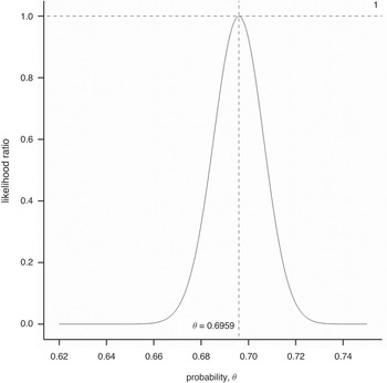
Figure 1.1 Likelihood ratio for various values of the probability of the other child being a girl given the NLSY sample data.
An Unlikely Tail?
This is all very well, but the reader will justifiably protest that the best fitting pattern will always fit the data better than some theory that issues a genuine prediction. For example, nobody would seriously maintain that the next time somebody obtains a sample of exactly 1914 persons having exactly two children, at least one of which is male, they will also observe that in 1332 cases the other is female. Another, perhaps not very different proportion would obtain and this other proportion would of course not only fit the data better than the theoretical probability of
 , it would also fit the data better than the proportion 1332/1914 previously observed.
In fact, we have another data set with which we can check this proportion. This comes from the US Census Bureau National Interview Survey, a yearly random sample of families. Amongst the 342 018 households on which data were obtained from 1987 to 1993, there were 42 888 families with exactly two children, and 33 365 with at least one boy. The split amongst the 33 365 was boy–girl, 11 118; girl–boy, 10 913; and boy–boy, 11 334. Thus, 22 031 of the families had one boy and one girl and the proportion we require is 22 031/33 365 ≃ 0.66, which is closer to the theoretical value than our previous empirical answer. This suggests that we should not be too hasty in rejecting a plausible theoretical value in favour of some apparently better-fitting alternative. How can we decide when to reject such a theoretical value?
This statistical problem of deciding when data should lead to rejection of a theory has a very long history and we shall look at attempts to solve it in the next chapter. Without entering into details, here we consider briefly the approach of significance testing which, again, is particularly associated with Fisher, although it did not originate with him. This is to imagine for the moment that the theoretical value is correct and then pose the question ‘if the value is correct, how unusual are the data?’
Defining exactly what is meant by ‘unusual’ turns out to be extremely controversial. One line of argument suggests, however, that if we were to reject the so-called null hypothesis that the true probability is
 , then we have done so where the observed ratio is 1332/1914, which is higher than
 , and would be honour-bound to do so had the ratio been even higher. We thus calculate the probability of observing 1 332 or more mixed-sex families when the true probability is
 . This sort of probability is referred to as a ‘tail area’ probability and, sparing the reader the details,4 in this case it turns out to be 0.00337. However, we could argue that we would have been just as impressed by an observed proportion that was lower than the hypothesized value
 as by finding one that was higher, so we ought to double this probability. If we do, we obtain a value of 0.0067. This sort of probability is referred to as a ‘P-value’ and is very commonly (many would say far too commonly) found in scientific, in particular medical, literature.
Should we reject or accept our hypothesized value? A conventional ‘level of significance’ often used is 5% or 0.05. If the P-value is lower than this the hypothesis in question is ‘rejected’, although it is generally admitted that this is a very weak standard of significance. If we reject
 , however, what are we going to put in its place? As we have already argued, it will be most unlikely for the true probability to be exactly equal to the observed proportion. That being so, might
 not be a better bet after all? We shall not pursue this here, however. Instead, we now consider a more serious problem.
Right but Irrelevant?
Why should we consider the probability we have been trying to estimate as being relevant to Mr Brown? There are all sorts of objections one could raise. Mr Brown might be British, for example, but our data come from an American cohort. Why should such data be relevant to the question? Also, since Mr Brown’s other child either is or is not a girl, what on Earth can it mean to speak of the probability of its being a girl?
This seemingly trivial difficulty turns out to be at the heart of a disagreement between two major schools of statistical inference: the frequentist and the Bayesian school, the latter being named after Thomas Bayes (1701–61), an English non-conformist minister whose famous theorem we shall meet in the next chapter.
The frequentist solution is to say that probabilities of single events are meaningless. We have to consider (potentially) infinite classes of events. Thus, my original question is ill-posed and should perhaps have been ‘if we choose an individual at random and find that this individual is male and has two children, at least one of which is male, what is the probability that the other is female?’ We then can consider this event as one that is capable of repetition, and the probability then becomes the long-run relative frequency with which the event occurs.
The Bayesian solution is radically different. This is to suggest that the probability in question is what you believe it to be since it represents your willingness to bet on the relevant event. You are thus free to declare it to be anything at all. For example, if you are still unconvinced by the theoretical arguments I have given and the data that have been presented that, whatever the probability is, it is much closer to
 than
than
 , you are perfectly free to call the probability
 instead. However, be careful! Betting has consequences. If you believe that the probability is
 and are not persuaded by any evidence to the contrary, you might be prepared to offer odds of evens on the child being a boy. Suppose I offered to pay you £5 if the other child is a boy provided you paid me £4 if the child is a girl. You ought to accept the bet since the odds are more attractive than evens, which you regard as appropriate. If, however, we had played this game for each family you would have lost 1332 × 4 for only 582 × 5 gained and I would be £2418 better off at your expense!5 (All this, of course, as we discussed earlier, is assuming that the sampling process involves choosing fathers at random.)
We shall not pursue these discussions further now. However, some of these issues will reappear in later chapters and from time to time throughout the book. Instead, we now present another paradox.
The Will Rogers Phenomenon
A medical officer of public health keeps a track year by year of the perinatal mortality rate in his district for all births delivered at home and also for all those delivered at hospital using health service figures. (The perinatal mortality rate is the sum of stillbirths and deaths under one week of age divided by the total number of births, live and still, and is often used in public health as a measure of the outcome of pregnancy.) He notices, with satisfaction, a steady improvement year by year in both the hospital and the home rates.
However, as part of the general national vital registration system, corresponding figures are being obtained district by district, although not separately for home and hospital deliveries. By chance, a statistician involved in compiling the national figures and the medical officer meet at a function and start discussing perinatal mortality. The statistician is rather surprised to hear of the continual improvement in the local district since she knows that over the past decade there has been very little change nationally. Later, she checks the figures for the medical officer’s district and these confirm the general national picture. Over the last decade there has been little change.
In fact, the medical officer is not wrong about the rates. He is wrong to be satisfied with his district’s performance. He has fallen victim to what is sometimes called ‘the stage migration phenomenon’. This was extensively described by the Yale-based epidemiologist Alvan Feinstein (1925–2001) and colleagues in some papers in the mid-1980s.6 They found improved survival stage by stage in groups of cancer patients but no improvement over all.
How can such phenomena be explained? Quite simply. By way of explanation, Feinstein et al. quote the American humorist Will Rogers who said that when the Okies left Oklahoma for California, the average intelligence was improved in two states. Imagine that the situation in the district in question is that most births deemed low risk take place at home and have done so throughout the period in question, and that most births deemed high risk take place in hospital and have done so throughout the period in question. There has been a gradual shift over the years of moderate-risk births from home to hospital. The result is a dilution of the high-risk births in hospital with moderate-risk cases. On the other hand, the home-based deliveries are becoming more and more tilted towards low risk. Consequently, there is an improvement in both without any improvement over all.
The situation is illustrated in Figure 1.2. We have a mixture of O and X symbols on the sheet. The former predominate on the left and the latter on the right. A vertical line divides the sheet into two unequal regions. By moving the line to the right we will extend the domain of the left-hand region, adding more points. Since we will be adding regions in which there are relatively more and more Xs than Os, we will be increasing the proportion of the former. However, simultaneously we will be subtracting regions from the right-hand portion in which, relative to those that remain, there will be fewer Xs than Os, hence we are also increasing the proportion of the former here.

Figure 1.2 Illustration of the stage migration phenomenon.
Simpson’s Paradox7
The Will Rogers phenomenon is closely related to ‘Simpson’s paradox’, named from a paper of 1951 by E. H. Simpson,8 although described at least as early as 1899 by the British statistician Karl Pearson.9 This is best explained by example, and we consider one presented by Julious and Mullee.10 They give data for the Poole diabetic cohort in which patients are cross-classified by type of diabetes and as either dead or ‘censored’, which is to say, alive. The reason that the term ‘censored’ is used is that, in the pessimistic vocabulary of survival analysis, life is a temporary phenomenon and someone who is alive is simply not yet dead. What the statistician would like to know is how long he or she lived but this information is not (yet) available and so is censored. We shall look at survival analysis in more detail in Chapter 7.
The data are given in Table 1.1 in terms of frequencies (percentages) and show subjects dead or censored by type of diabetes. When age is not taken into account it turns out that a higher proportion of non-insulin-dependent are dead (40%) than is the case for insulin-dependent diabetes (29%). However, when the subjects are stratified by age (40 and younger or over 40) then in both of the age groups the proportion dead is higher in the insulin-dependent group. Thus, the paradox consists of observing that an association between two factors is reversed when a third is taken into account.
Table 1.1 Frequencies (percentages) of patients in the Poole diabetic cohort, cross-classified by type of diabetes and whether ‘ dead’ or ‘ censored’, i.e. alive.
But is this really paradoxical? After all, we are used to the fact that when making judgements about the influence of factors we must compare like with like. We all know that further evidence can overturn previous judgement. In the Welsh legend, the returning Llewelyn is met by his hound Gelert at the castle door. Its muzzle is flecked with blood. In the nursery the scene is one of savage disorder, and the infant son is missing. Only once the hound has been put to the sword is the child heard to cry and discovered safe and sound by the body of a dead wolf. The additional evidence reverses everything: Llewelyn, and not his hound, is revealed as a faithless killer.
In our example the two groups are quite unlike, and most commentators would agree that the more accurate message as regards the relative seriousness of insulin and non-insulin diabetes is given by the stratified approach, which is to say the approach that also takes account of the age of the patient. The fact that non-insulin diabetes develops on average at a much later age is muddying the waters.
Suppose that the numbers in the table remain the same but refer now to a clinical trial in some life-threatening condition and we replace ‘Type of diabetes’ by ‘Treatment’, ‘Non-insulin dependent’ by ‘A’, ‘Insulin dependent’ by ‘B’ and ‘Subjects’ by ‘Patients’. An incautious interpretation of the table would then lead us to a truly paradoxical conclusion. Treating young patients with A rather than B is beneficial (or at least not harmful – the numbers of deaths, 0 in the one case and 1 in the other, are very small). Treating older patients with A rather than B is beneficial. However, the overall effect of switching patients from B to A would be to increase deaths overall.
In his brilliant book Causality, Judea Pearl gives Simpson’s paradox pride of place.11 Many statisticians have taken Simpson’s paradox to mean that judgements of causality based on observational studies are ultimately doomed. We could never guarantee that further refined observation would not lead to a change in opinion. Pearl points out, however, that we are capable of distinguishing causality from association because there is a difference between seeing and doing. In the case of the trial above we may have seen that the trial is badly imbalanced but we know that the treatment given cannot affect the age of the patient at baseline, that is to say before the trial starts. However, age very plausibly will affect outcome and so it is a factor that should be accounted for when judging the effect of treatment. If in future we change a patient’s treatment we will not (at the moment we change it) change their age. So there is no paradox. We can improve the survival of both the young and the old and will not, in acting in this way, adversely affect the survival of the population as a whole.
O. J. Simpson’ s Paradox
The statistics demonstrate that only one-tenth of one percent of men who abuse their wives go on to murder them. And therefore it’s very important for that fact to be put into empirical perspective, and for the jury not to be led to believe that a single instance, or two instances of alleged abuse necessarily means that the person then killed.
This statement was made on the Larry King show by a member of O. J. Simpson’s defence team.12 No doubt he thought it was a relevant fact for the jury to consider. However, the one thing that was not in dispute in this case was that Nicole Simpson had been murdered. She was murdered by somebody: if not by the man who had allegedly abused her then by someone else. Suppose now that we are looking at the case of a murdered woman who was in an abusive relationship and are considering the possibility that she was murdered by someone who was not her abusive partner. What is sauce for the goose is sauce for the gander: if the first probability was relevant so is this one. What is the probability that a woman who has been in an abusive relationship is murdered by someone other than her abuser? This might plausibly be less than one-tenth of one percent. After all, most women are not murdered.
And this, of course, is the point. The reason that the probability of an abusive man murdering his wife is so low is that the vast majority of women are not murdered and this applies also to women in an abusive relationship. But this aspect of the event’s rarity, since the event has occurred, is not relevant. An unusual event has happened, whatever the explanation. The point is, rather, which of two explanations is more probable: murder by the alleged abuser or murder by someone else.
Two separate attempts were made to answer this question. We have not yet gone far enough into our investigation of probability to be able to explain how the figures were arrived at but merely quote the results. The famous Bayesian statistician Jack Good, writing in Nature, comes up with a probability of 0.5 that a previously abused murdered wife was murdered by her husband.13 Merz and Caulkins,14 writing in Chance, come up with a figure of 0.8. These figures are in far from perfect agreement but serve, at least, to illustrate the irrelevance of 1 in 1000.
Tricky Traffic15
Figure 1.3 shows road accidents in Lothian region, Scotland, by site. It represents data from four years (1979–82) for 3112 sites on a road network. For each site, the number of accidents recorded is available on a yearly basis. The graph plots the mean accidents per site in the second two-year period as a function of the number of accidents in the first two-year period. For example, for all those sites that by definition had exactly two accidents over the first two-year period, the average number of accidents has been calculated over the second two-year period. This has also been done for those sites that had no accidents, as well as for those that had exactly one accident, and, continuing on the other end of the scale, for those that had three accidents, four accidents, etc.

Figure 1.3 Accidents by road site, Lothian Region 1979–82. Second two-year period plotted against first.
The figure also includes a line of exact equality going through the points 1,1 and 2,2 and so forth. It is noticeable that most of the points lie to the right of the line of equality. It appears that road accidents are improving.
However, we should be careful. We have not treated the two periods identically. The first period is used to define the points (all sites that had exactly three accidents and so forth) whereas the second is simply used to observe them. Perhaps we should reverse the way that we look at accidents just to check and use the second-period values to define our sites and the first-period ones to observe them. This has been done in Figure 1.4. There is now a surprising result. Most of the points are still to the right of the line, which is to say below the line of exact equality, but since the axes have changed this now means that the first-period values are lower than the second-period one. The accident rate is getting worse.

Figure 1.4 Accidents by road site, Lothian Region 1979–82. First two-year period plotted against second.
The Height of Improbability
The data are correct. The explanation is due to a powerful statistical phenomenon called regression to the mean discovered by the Victorian scientist Francis Galton, whom we shall encounter again in Chapter 6. Obviously Galton did not have the Lothian road accident data! What he had were data on heights of parents and their adult offspring. Observing that men are on average 8% taller than women, he converted female heights to a male equivalent by multiplying by 1.08. Then, by calculating a ‘mid-parent’ height – the average of father’s height and mother’s adjusted height – he was able to relate the height of adult children to that of parents. He made a surprising discovery. If your parents were taller than average, although, unsurprisingly, you were likely to be taller than average, you were also likely to be shorter than your parents. Similarly, if your parents were shorter than average you were likely to be shorter than average but taller than your parents. Figure 1.5 is a more modern representation of Galton’s data, albeit very similar to the form he used himself.

Figure 1.5 Galton’s data. Heights of children in inches plotted against the adjusted average height of their parents.
The scatterplot in the middle plots children’s heights against parents’. The lumpy appearance of the data is due to the fact that Galton records them to the nearest inch; thus, several points would appear on top of each other but for the fact that they have been ‘jittered’ here to separate them. The margins of the square have the plots for parents’ heights irrespective of the height of children, and vice versa, represented in the form of a ‘histogram’. The areas of the bars of the histograms are proportional to the number of individuals in the given height group.
How can these phenomena be explained? We shall return to road accidents in a minute; let us look at Galton’s heights first of all. Suppose that it is the case that the distribution of height from generation to generation is stable. The mean is not changing and the spread of values is also not changing. Suppose also that there is not a perfect correlation between heights. This is itself a concept strongly associated with Galton. For our purposes we simply take this to mean that height of offspring cannot be perfectly predicted from height of parents – there is some variability in the result. Of course, we know this to be true since, for example, brothers do not necessarily have identical heights. Now consider the shortest parents in a generation. If their children were, on average, of the same height, some would be taller but some would be shorter. Also consider the very tallest parents in a generation. If their offspring were, on average, as tall as them, some would be smaller but some would be taller. But this means that the spread of heights in the next generation would have to be greater than before, because the shortest members would now be shorter than the shortest before and the tallest would now be taller than the tallest before. But this violates what we have said about the distribution – that the spread is not increasing. In fact, the only way that we can avoid the spread increasing is if on average the children of the shortest are taller than their parents and if on average the children of the tallest are shorter than their parents.
In actual fact, the prior discussion is somewhat of a simplification. Even if variability of heights is not changing from generation to generation, whereas the heights of the children that are plotted are heights of individuals, the heights of the parents are (adjusted) averages of two individuals and this makes them less variable, as can be seen by studying Figure 1.5. However, it turns out that in this case the regression effect still applies.
Figure 1.6 is a mathematical fit to these data similar to the one that Galton found himself. It produces idealized curves representing our marginal plots as well as some concentric contours representing greater and greater frequency of points in the scatterplot as one moves to the centre. The reader need not worry. We have no intention of explaining how to calculate this. It does, however, illustrate one part of the statistician’s task – fitting mathematical (statistical) models to data. Also shown are the two lines, the so-called regression lines, that would give us the ‘best’ prediction of height of children from parents (dashed) and parents’ height from children (dotted), as well as the line of exact equality (solid) that lies roughly between them both. Note that since the regression line for children’s heights as a function of parents’ heights is less steep than the line of exact equality, it will lead to predictions for the height of children that are closer to the mean than that of their parents. A corresponding effect is found with the other regression line. (If you want to predict parents’ height from children’s it is more natural to rotate the graph to make children’s height the X axis.) It is one of the extraordinary mysteries of statistics that the best prediction of parents’ height from children’s height is not given by using the line which provides the best prediction of children’s heights from parents’ heights.

Figure 1.6 A bivariate normal distribution fitted to Galton’s data showing also the line of equality and the two regression lines.
Don’t It Make my Brown Eyes Blue16
If this seems an illogical fact, it is nonetheless a fact of life. Let us give another example from genetics. Blue eye colour is a so-called recessive characteristic. It thus follows that if any individual has blue eyes he or she must have two blue genes since, brown eye colour being dominant, if the individual had one brown gene his or her eyes would be brown. Thus, if we know that a child’s biological parents both have blue eyes we can guess that the child must have blue eyes with a probability of almost one (barring mutations). On the other hand, a child with blue eyes could have one or even two parents with brown eyes since a brown-eyed parent can have a blue gene. Thus, the probability of both parents having blue eyes is not one. The prediction in one direction is not the same as the prediction in the other.
Regression to the Mean and the Meaning of Regression
Now to return to the road accident data. The data are correct, but one aspect of them is rather misleading. The points represent vastly different numbers of sites. In fact, the most common number of accidents over any two-year period is zero. For example, in 1979–80, out of 3112 sites in total, 1779 had no accidents at all. Furthermore, the mean numbers of accidents for both two-year periods were very close to 1, being 0.98 in the first two-year period and 0.96 in the second. Now look at Figure 1.3 and the point corresponding to zero accidents in the first two-year period. That point is above the line and it is obvious that it has to be. The sites represented are those with a perfect record and, since perfection cannot be guaranteed for ever, the mean for these sites was bound to increase. Some of the sites were bound to lose their perfect record and they would bring the mean up from zero, which is what it was previously by definition, sites having been selected on this basis.
But if the best sites will deteriorate on average, then the worst will have to get better to maintain the average, and this is exactly what we are observing. It just so happens that the mean value is roughly one accident per two years. The whole distribution is pivoting about this point. If we look at the higher end of the distribution, the reason for this phenomenon – which is nowadays termed ‘regression to the mean’, a term that Galton used interchangeably with ‘reversion to mediocrity’ – is that, although some of the sites included as bad have a true and genuine long-term bad record, some have simply been associated with a run of bad luck. On average, the bad luck does not persist; hence, the record regresses to the mean.
Systolic Magic
Regression to the mean is a powerful and widespread cause of spontaneous change where items or individuals have been selected for inclusion in a study because they are extreme. Since the phenomenon is puzzling, bewildering and hard to grasp, we attempt one last demonstration: this time, with a simulated set of blood pressure readings.
Figure 1.7 gives systolic blood pressure reading in mmHg for a population of 1000 individuals. The data have been simulated so that the mean value at outcome and baseline is expected to be 125 mmHg. Those readers who have encountered the statistician’s common measure of spread, the standard deviation, may like to note that this is 12 mmHg at outcome and baseline. Such readers will also have encountered the correlation coefficient. This is 0.7 for this example. Other readers should not worry about this but concentrate on the figure. The data are represented by the scatterplot and this is meant to show (1) that there is no real change between outcome and baseline, (2) that in general higher values at baseline are accompanied by higher values at outcome, but that (3) this relationship is far from perfect.

Figure 1.7 Systolic BP (mmHg) at baseline and outcome for 1000 individuals.
Suppose that we accept that a systolic BP of more than 140 mmHg indicates hypertension. The vertical line on the graph indicates a boundary at baseline for this definition and the horizontal line a boundary at outcome. Making due allowances for random variation, there appears to be very little difference between the situation at baseline and outcome.
Suppose, however, we had decided not to follow the whole population but instead had merely followed up those whose baseline blood pressure was in excess of 140 mmHg. The picture, as regards patients with readings at both baseline and outcome, would then be the one in Figure 1.8. But here we have a quite misleading situation. Some of the patients who had a reading in excess of 140 mmHg now have readings that are below. If we had the whole picture there would be a compensating set of readings for patients who were previously below the cut-off but are now above. But these are missing.

Figure 1.8 Systolic BP (mmHg) at baseline and outcome for a group of individuals selected because their baseline BP is in excess of 140 mmHg.
We thus see that regression to the mean is a powerful potential source of bias, which is particularly dangerous if we neglect to have a control group. Suppose, for example, that in testing the effect of a new drug we had decided to screen a group of patients by only selecting those for treatment whose systolic blood pressure was in excess of 140 mmHg. We would see a spontaneous improvement whether or not the treatment was effective.
Paradoxical Lessons?
The previous examples serve to make this point: statistics can be deceptively easy. Everybody believes they can understand and interpret them. In practice, making sense of data can be difficult and one must take care in organizing the circumstances for their collection if one wishes to come to a reasonable conclusion. For example, the puzzling, pervasive and apparently perverse phenomenon of regression to the mean is one amongst many reasons why the randomized clinical trial (RCT) has gained such popularity as a means to test the effects of medical innovation. If regression to the mean applies it will also affect the control group and this permits its biasing influence to be removed by comparison. There is no doubt that many were deceived by regression to the mean. Some continue to be so.
We hope that the point has been made in this chapter. Our ‘square’ has a justification for existence. Probability is subtle and data can deceive, but how else are we to learn about the world except by observing it, and what are observations when marshalled together but data? And who will take the time and care necessary to learn the craft of interpreting the data if not the statistician?
Wrapping Up: The Plan and the Purpose
Medicine showed a remarkable development in the last century, not just in terms of the techniques that were developed for treating patients but also in the techniques that were developed for judging techniques. In the history of medicine, the initial conflict between the physician as professional and the physician as scientist meant that the science suffered. The variability of patients and disease and the complexity of the human body made the development of scientific approaches difficult. Far more care had to be taken in evaluating evidence to allow reliable conclusions than was the case in other disciplines. But the struggle with these difficulties has had a remarkable consequence. As the science became more and more important it began to have a greater and greater effect on the profession itself, so that medicine as a profession has become scientific to an extent that exceeds many others. The influential physician Archie Cochrane, whom we shall encounter again in Chapter 8, had this to say about the medical profession: ‘What other profession encourages publications about its error, and experimental investigations into the effect of their actions? Which magistrate, judge or headmaster has encouraged RCTs [randomized clinical trials] into their “therapeutic” and “deterrent” actions?’, 17
In this book we shall look at the role that medical statistics has come to play in scientific medicine. We shall do this by looking not only at current evidential challenges but also at the history of the subject. This has two advantages. It leavens the statistical with the historical but it also gives a much fairer impression of the difficulties. The physicians and statisticians we shall encounter were explorers. In the famous story of Columbus’s egg, the explorer, irritated at being told that his exploits were easy, challenged the guests at a banquet to balance an egg on its end. When all had failed, he succeeded by flattening one end by tapping it against the table, a trick that any would then have been able to repeat. Repetition is easier than innovation.
We shall not delay our quest any further, and who better to start with than one who was not only a mathematician but also a physician. However, he was also much more than that: a notable translator, a man of letters and a wit. A Scot who gave the English one of their most enduring symbols, he was something of a paradox, but although this has been a chapter of paradoxes, we must proceed to the next one if we wish to understand his significance.


