


Policy Significance Statement
Policymakers aim to make data-driven decisions and invest in information systems and processes to this end. Part of a mature and effective data infrastructure are tools to monitor data for quality and accuracy and processes to identify and correct for errors. This paper describes a tool developed for the President’s Emergency Plan for AIDS Relief (PEPFAR) to aid in the routine monitoring of data reported by the thousands of health facilities it supports. We find that by applying machine learning approaches, we can identify with a high level of accuracy those health facilities that are reporting atypical data and that require further scrutiny, enabling intervention to improve data quality.
1. Introduction
Through the United States President’s Emergency Plan for AIDS Relief (PEPFAR)—managed by the United States Department of State and implemented by the United States Agency for International Development (USAID), the United States Department of Defense, the United States Health Resources and Services Administration, the Peace Corps, and the United States Centers for Disease Control and Prevention (CDC)—the United States government has supported implementing partners to provide HIV services and commodities and to invest in systems (including health information systems) that monitor progress toward epidemic control effectively. An important way in which PEPFAR monitors program performance is through the regular collection of monitoring, evaluation, and reporting (MER) data: aggregate counts of the number of clients supported and services provided by PEPFAR-supported sites (PEPFAR, 2021).
MER data are foundational to the effort to track progress toward programmatic targets, identify trouble spots in patient retention and outreach, and identify under-performing facilities and partners that require intervention (USAID, 2021). Because of the importance of MER data in programmatic decision making, and to strengthen confidence in the data being collected and reported, USAID has invested in tools to assess data quality at a systemic level and at an individual facility level. However, these tools can be too costly and labor intensive to deploy at scale, are used with a lag rather than in real time, or favor breadth in data quality topics—such as data completeness, internal consistency, and timeliness—over methodological depth in identifying anomalous facilities or regions that have likely misreported data or experienced performance issues that require programmatic intervention.
The data quality audit (DQA) toolkit, developed initially by the USAID-funded MEASURE Evaluation project and updated by the Evaluation Branch of USAID’s Office of HIV/AIDS, enables practitioners to assess the quality of data reporting systems and provides a framework to assess data quality at the level of the health facility. It encompasses two types of activities (Hardee, Reference Hardee2008). Its protocol for one activity, “Assessment of Data Management and Reporting Systems,” identifies dimensions and questions to probe data reporting systems. It includes questions such as whether monitoring and evaluation staff have received proper training, whether standard data reporting forms exist, whether appropriate indicators have been developed, whether reporting processes are well documented, and whether data flow to a central repository. Its protocol for the other activity, “Verification of Data Reported for Key Indicators,” envisions in-depth reviews of records at service delivery sites to ascertain if data reported are complete, are reported on time, and are consistent with underlying patient record counts. This protocol includes modules on “trace and verification,” in which teams recount patient records and compare them with metrics reported by facilities, and “cross-checks,” in which teams triangulate counts of patient records against other data sources, such as laboratory registers. For each of the key indicators reviewed, the numbers reported are compared with the numbers re-counted. Then, a verification factor is calculated to analyze the levels of discrepancy (<5%; between 5 and 10%; >10%).
Although the DQA toolkit is an effective way to identify both systematic and facility-level program and data quality issues, using it—and particularly its second module on data verification—is costly and requires a substantial level of effort. Thus, MEASURE Evaluation developed the routine data quality assessment (RDQA) tool, a lighter version of the DQA that can be used more nimbly and with fewer barriers (MEASURE Evaluation, 2017). Whereas the DQA toolkit has templates and guides that are specific to health programs and indicators, the RDQA provides generic program- and indicator-agnostic guidance. Whereas the DQA has a rigorous sampling framework for facilities, the RDQA uses so-called convenience sampling. Moreover, whereas the DQA is intended to be used by external reviewers once every few years, the RDQA is set up for program self-assessment, to be conducted by implementing partners on a regular basis.
The data quality review (DQR) toolkit—developed in 2017 as a collaboration by the World Health Organization (WHO); the Global Fund to Fight AIDS, Tuberculosis and Malaria (Global Fund); Gavi, the Vaccine Alliance; and MEASURE Evaluation—is similarly organized into components that address systemic and facility-level issues (World Health Organization, 2017a–c). However, this toolkit made several advances by offering a Microsoft Excel-based tool that can be used essentially in real time and remotely and that applies statistical approaches to identify anomalous data points. Like the DQA toolkit, the DQR toolkit takes a broad approach to data quality: thus, it considers the dimensions of completeness and timeliness, external consistency with other data sources, and external comparison of population data. But the DQR’s fourth dimension, internal consistency, offers a more sophisticated approach than DQA’s to identify anomalous data points.
The DQR’s Excel-based tool performs three types of analyses using reported aggregate health metrics: presence of outliers, consistency over time, and consistency between indicators. To identify outliers, the DQR tool calculates the mean and standard deviation for each indicator reported and flags as extreme anomalies any value more than three standard deviations from the mean and as moderate anomalies any value between two and three standard deviations from the mean. Consistency over time is measured as a comparison of the reported value either to the average value from the three preceding years or to a value forecasted from the values of the three preceding years, using a straightforward linear model if a non-constant trend is expected. Finally, consistency between related indicators examines the extent to which two related indicators follow a predictable pattern. For example, the ratio between antiretroviral therapy coverage and HIV care coverage should be less than one.
In 2018, WHO, in collaboration with USAID, the CDC, the Global Fund, and the Joint United Nations Programme on HIV/AIDS (UNAIDS), developed a data quality assessment module focused on the HIV treatment indicators (World Health Organization, 2018). Generally, the related tools are used to conduct data quality assessment of national and partner HIV treatment and client monitoring systems. The process implies verification and recounting of reported data, assessing the system generating the data, and using a standardized approach to address the data quality issues identified, including adjusting national data on HIV treatment. This 2018 module has three main components: (a) rapidly assessing the HIV patient monitoring system; (b) recreating select indicators and validating reports; and (c) assessing the quality and completeness of reports.
Under the USAID-funded Data for Implementation (Data.FI) project, we developed a tool that builds on the approach of these previous tools but uses more advanced statistical techniques to identify data anomalies in aggregate MER data. This tool contributes to the existing data quality tool landscape by complementing the strengths and limitations of the existing PEPFAR data quality tools, in turn providing USAID teams and USAID implementing partners with a more diverse data quality toolkit. The tool presented in this paper employs recommender systems—a technique commonly used for product recommendation by companies such as Netflix and Amazon—to compute patterns and relationships among all indicators, estimate values based on these patterns, and identify facilities whose reported values deviate most from values estimated by the recommender system (Park et al., Reference Park, Kim, Choi and Kim2012). The reported values that deviate most from values estimated by the recommender system are flagged as anomalies. An anomaly signals that the reported data did not seem consistent with the expected/generally observed data pattern. PEPFAR and its implementing partners can then investigate these anomalies to identify data quality issues in a more targeted way. Whereas the DQR tool looks at univariate distributions and simple ratios, the Data.FI tool can capture more complex, multivariate patterns across indicators. The Data.FI tool also uses a suite of time series models to forecast values and compare them to reported values. In contrast with the WHO DQR tool, the Data.FI tool uses models that capture nonlinear trends and seasonality to generate more nuanced forecasts. Our tool is R-based rather than Excel-based, to enable the use of more advanced computing libraries (R Core Team, 2021). Although a user must have R installed, use of the tool does not require programming skills. The tool is set up to handle common MER data formats and so requires little data preparation by users and completes its analysis in anywhere from 5 min to 1 hr, depending on the number of facilities analyzed.
The Data.FI tool will enable PEPFAR analysts and programmatic leads to review aggregate facility-level health metrics remotely, quickly, and using sophisticated statistical methods to identify likely data quality or performance issues. This will allow PEPFAR and its implementing partners to identify and correct data quality issues before they are used for decision making and to identify facilities facing performance issues in near real time. This tool will also inform decisions to conduct comprehensive data quality assessments focused on reviewing individual records related to 80–100% of the clients served by a program, if needed.
2. Background on PEPFAR and MER Data
PEPFAR’s focus is to achieve HIV epidemic control through the UNAIDS 95-95-95 global goals: 95% of people living with HIV know their HIV status, 95% of people who know their HIV status are accessing treatment, and 95% of people on treatment have suppressed viral loads (UNAIDS, 2015). MER indicators monitor program outputs and help identify potential acute programmatic issues. Data on these indicators are collected quarterly, semiannually, or annually. The quarterly indicators focus primarily on the clinical cascade: HIV case finding, diagnosis, linkage, treatment, continuity of treatment, and viral load suppression (PEPFAR, 2021). Some example MER indicators are as follows: HTS_TST, which is the number of individuals who received HIV testing services and received test results; TX_NEW, which is the number of adults and children newly enrolled on treatment; and TX_PVLS, which is the percentage of patients on antiretroviral treatment with a suppressed viral load (PEPFAR, 2021). Because disaggregation of MER data is key to understanding whether PEPFAR services are reaching the intended beneficiaries and locations, MER data are collected by facility, age, sex, and specific groups of clients: key populations (groups that require additional sensitivity in HIV care owing to social stigmas, such as men who have sex with men, sex workers, and people who inject drugs), orphans and vulnerable children, adolescent girls and young women, and so forth.
MER data can be used in conjunction with data from other sources, such as those generated by the site improvement through monitoring system (SIMS) tool, which is a quality assurance tool used to monitor and guide program quality improvement at PEPFAR-supported sites, and expenditure reporting data (PEPFAR, 2020). Granular PEPFAR data can be used to demonstrate differences in patient outcomes and site performance, and that can help decision makers prioritize resource allocations and interventions among sites to ensure that PEPFAR achieves sustained HIV epidemic control. As a result of this data-driven approach that PEPFAR has been using over the past 5 years, PEPFAR results have dramatically improved in a budget-neutral environment.
For example, part of achieving epidemic control is ensuring that clients who start treatment continue with their treatment. Discovering patterns among clients who interrupted their treatment, missed appointments, or failed to initiate treatment is an example of how early identification of an issue can improve a program’s quality. If a site or a specific population group has high rates of clients interrupting treatment, early identification allows program managers to adjust the program or implement targeted initiatives, thus ensuring that those clients return to care.
3. Methods
We used several approaches to examine data for anomalies. We used time series models to capture temporal trends in data, generate forecasts, and compare forecasts to reported values. To capture patterns across facilities and indicators, we also used recommender systems, an approach that companies such as Amazon and Netflix commonly employ for product recommendation.
3.1. Recommender systems anomaly detection
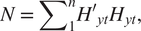
Recommender systems are a class of information filtering systems that aim to identify points of interest among large volumes of data (Burke et al., Reference Burke, Felfernig and Göker2011). Applications of recommender systems are increasingly common on e-commerce platforms such as Amazon and streaming services such as Netflix. In the case of e-commerce, platforms use recommender systems to identify which products among the often millions on offer would be most attractive to users based on users’ purchase, rating, and search history. In the case of streaming services, platforms use recommender systems to suggest movies or shows that users would like based on their viewing and rating history. From 2006 to 2009, Netflix helped accelerate research on recommender systems by offering a $1,000,000 prize to the team that could produce recommendations 10% more accurate than the company’s existing recommender system (Hallinan and Striphas, Reference Hallinan and Striphas2014). We use the approach of one of the top submissions for the so-called Netflix Prize (Roberts, Reference Roberts2010). Recommender systems are used increasingly for purposes other than product recommendation, such as fraud identification in the insurance and tax sectors, but their application for anomaly detection is novel. This paper intends to share this translational application with the broader audience of data and policy practitioners so that other sectors, beyond global health, can adopt recommender systems approaches to anomaly detection. Figure 1 summarizes our recommender system approach to anomaly detection in HIV data specifically.
Figure 1. Recommender systems approach for anomaly detection. In the illustrative flow, an HIV data set is linked to the tool, which has no previous knowledge of the data. The tool examines data points and learns which variables correlate with other variables. The tool then calculates a covariant value for each that describes the relationship between indicators. Based on the relationship, the tool predicts values based on other values observed for the facility. The tool compares its predictions for each value to the actual value in the original data set and detects instances where the two differ greatly.
The two common approaches to recommender systems are collaborative filtering and content-based filtering. Collaborative filtering models assume that user–product relationships that held in the past will hold in the future—that users will like the kinds of products and films that they liked in the past (Koren and Bell, Reference Koren and Bell2015). If our objective is to recommend a film to a viewer, we can identify other viewers who gave similar ratings to films watched commonly by all. Then, we can identify what other films the group rated highly that this viewer has not yet watched and recommend those films.
One of the advantages of collaborative filtering is that we do not need to know information about the class of movie, whether a romance or comedy. The latent features generated by matrix factorization learn the relevant classes from observed ratings. We only need to know what viewers liked and did not like and extend recommendations on that basis. Ways of learning what films or products people like are often grouped as explicit and implicit data collection. An example of explicit data collection is asking customers to rate products they have used. An example of implicit data collection is tracking users’ viewing history.
Content-based filtering models characterize items or products and recommend items to users that are similar to items they have liked previously (Thorat et al., Reference Thorat, Goudar and Barve2015). For example, content-based models will explicitly categorize films in an inventory by theme, cast, language, or other dimensions. To recommend films, content-based models will identify the types of movies rated highly by users in the past and recommend movies with common characteristics. For example, if a user previously rated the film Rocky highly, a content-based model might associate the film with a category called “Feature films starring Sylvester Stallone” and recommend Rambo, in turn. The collaborative filtering model may make the same recommendation, but the underlying logic would differ: the model would essentially say “users who rated Rocky highly also rated Rambo highly,” without trying to compare the content or characteristics of the films.
Content-based algorithms can be quite powerful but require many data elements to execute. Whereas collaborative filtering models require only user IDs, movie names, and the ratings assigned by users to movies (in the case of Netflix), content-based filtering requires additional information about each movie or product. The algorithm then identifies for each user what characteristics matter and how.
Given that our data set does not have the explicit labels needed for content-based models, our challenge in developing the Data.FI tool was closest to the realm of collaborative filtering. Collaborative filtering is often implemented using matrix factorization, in which a sparse matrix is approximated by the product of two rectangular matrices. By a sparse matrix, we mean that most user-item pairs are missing, and that most users have not purchased or rated most of the millions of products or movies available, but that some users have rated some items. Matrix factorization generates latent features—characteristics that can be used to group similar users or items and then to extrapolate from observed ratings the likely ratings for unobserved user-item pairs. These approaches have been shown to work quite well.
In his Netflix Prize submission, Roberts applied a third approach to product recommendation, using estimates of the mean and covariance of the data to generate minimum mean squared error (MMSE) predictions of missing user-item values (Roberts, Reference Roberts2010). Roberts initialized estimates of the mean as the arithmetic average of present values and the covariance matrix using four methods. Roberts applied a gradient descent algorithm and expectation maximization (EM) algorithm to estimate parameters of the covariance.
Roberts compared performance of this approach against the well-known collaborative filtering methods on the Netflix data. Roberts found that MMSE prediction outperformed collaborative filtering, as measured by root mean squared error. The best-performing model initialized the covariance matrix using the positive semidefinite correlation matrix of the move ratings (R03 in Roberts) and applied EM for parameter estimation. Although EM improved performance, the process required 19 iterations to achieve convergence, with 2 hr per iteration. Given our intended application to analyze data for anomalies on a quicker basis, we adopted Roberts’s method without EM. Instead, we used the R04 method for estimation of the covariance matrix, which is the initialization method found by Roberts to perform best on the Netflix data set when not enhanced with EM.
We adapted Roberts’s model specification to our challenge. We adapted his variables as follows (keeping his notation). Whereas  $ {Z}_t $ in his work represents movie ratings of the tth user, we used $ {Z}_t $ to denote the matrix of MER indicators for the tth health facility, t = 1,2,…,n. Whereas k is the mean vector of movie ratings in Roberts, k here was the mean vector of MER indicators. R was the k × k covariance matrix of $ {Z}_t $. $ {Y}_t $ denoted the kt-dimensional sub-vector of $ {Z}_t $ that consisted of the present MER indicators reported by the tth facility, recognizing that not all facilities report all indicators (kt < k). By contrast, $ {X}_t $ denoted unreported MER indicator values. $ {H}_{yt} $ was the kt × k submatrix of the k × k identity matrix I that consisted of the rows corresponding to the index of the present values in $ {Y}_t $.
We followed Roberts’s adoption of Little and Rubin’s suggestion to estimate the mean vector as the arithmetic mean of the MER indicators. We let N be the k × k diagonal matrix given by equation (1). The mean vector was estimated in equation (2). For the covariance matrix R, we began by defining the positive semidefinite matrix S, in equation (3). R was then computed from S using equation (4). Finally, for each reported value, we treated the value as missing and predicted, using conditional means, the remaining present values as  $ {R}_{xt yt}{R}_{yt}^{-1}({y}_t-{\mu}_{yt})+{\mu}_{xt} $ (equation (5)). Thus, for a given facility t, we predicted each reported value yt from 1 to kt as a function of the estimated mean of all MER indicators, the estimated covariance of all MER indicators, and the other values reported by a facility:
 $$ N\hskip0.35em =\hskip0.35em {\sum \limits}_1^nH{\prime}_{yt}{H}_{yt}, $$
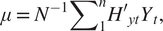 $$ \mu \hskip0.35em =\hskip0.35em {N}^{-1}{\sum \limits}_1^nH{\prime}_{yt}{Y}_t, $$
 $$ S\hskip0.35em =\hskip0.35em {\sum \limits}_1^n{H}_{yt}^{\prime}\left({y}_t-{H}_{yt}\mu \right)\left({y}_t-{H}_{yt}\mu \right)^{\prime }{H}_{yt}\mathrm{x}, $$
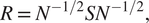 $$ R\hskip0.35em =\hskip0.35em {N}^{-1/2}S{N}^{-1/2}, $$
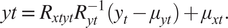 $$ yt\hskip0.35em =\hskip0.35em {R}_{xt yt}{R}_{yt}^{-1}({y}_t-{\mu}_{yt})+{\mu}_{xt}. $$
3.2. Time series anomaly detection
From a time series perspective, anomalous data points are those that differ significantly from the overall trend and seasonal patterns observed. An effective time series anomaly detection model would capture the parameters of the time series and identify those points that are statistically significantly distinct from the data.
Time series anomaly detection models can be grouped in three types of approaches, though there are additional methods not discussed here. The first type is that used by the DQR tool and referred to as a probability-based approach. This approach can be quite effective in identifying global outliers, or data points that are extreme compared to all other data points in a data set. In this approach, analysts compute parameters such as mean and standard deviation and identify points that are several standard deviations above or below the mean. (The DQR tool labeled as “extreme” deviations of three standard deviations and as “moderate” deviations of two standard deviations.) A benefit of this approach is that it is straightforward to execute and easy to interpret. However, this type of approach may neglect to identify local anomalies: data points that are atypical in light of surrounding data points.
A second approach is to use unsupervised techniques such as K-means clustering to identify data points that have a high distance to the nearest centroid—the center of a group of data points. One common limitation in K-means is that a user must define the number of clusters (the “K” in K-means). Other limitations are that clusters in K-means have a spherical shape, which may not be appropriate given seasonal trends in a time series, and that the approach does not generate probabilities when assigning samples to clusters that can be used to set thresholds to determine which values are extreme.
Methods that overcome the limitations of unsupervised techniques exist. Gaussian mixture models do generate probabilities when assigning points to clusters and can associate points with multiple clusters. Density-based spatial clustering of applications with noise identifies the number of clusters without user intervention by first identifying core points with more than a minimum number of observations within a user-determined distance and then extends each cluster iteratively to include points within that distance of a point that is already part of a cluster. Any point that is not eventually included in a cluster is considered anomalous.
A third approach is to use forecasting models to generate prediction(s) for later points in a time series based on preceding points and to compare predictions to reported values. For each prediction, a prediction interval is computed and data points outside the interval are identified as anomalous. One benefit of this approach is that it can be deployed in a supervised manner, meaning that one can assess the fits of models with numerous parameter combinations and select the model(s) with the empirically best fit.
We rejected the probability-based approaches because of the limitation described above in identifying local outliers. Although we also opted not to use unsupervised techniques because they are difficult to interpret and might struggle given the generally short length of series analyzed in our application (typically 20 data points), we believe these approaches should be further explored. Instead, in our tool we applied the third approach—the one based on forecasting techniques—to time series anomaly detection.
We applied three forecasting models in our tool. The first was a commonly used forecasting model: auto-regressive integrated moving average (ARIMA) (Hyndman and Khandakar, Reference Hyndman and Khandakar2008). ARIMA models data as a function of immediately preceding values (the AR term), as a function of the residual error of a moving average model applied to preceding values (the MA term), and with differencing of series to induce stationarity (the I term).
The second model we used was error, trend, seasonal (ETS), also referred to as Holt–Winters exponential smoothing (Holt, Reference Holt1957). In exponential smoothing, forecasts are generated as the weighted sum of preceding values. Whereas ARIMA models weigh all predictors equally, ETS models apply an exponential decay function to preceding values, so that preceding values of smaller lags have more influence than preceding values with larger lags do. We applied two additional smoothing parameters for trend and seasonality, respectively, summing to three smoothing parameters overall.
This third model we applied in the Data.FI tool is called seasonal and trend decomposition using Loess (STL) (Cleveland et al., Reference Cleveland, Cleveland, McRae and Terpenning1990). With STL, we used locally fitted regression models to decompose a time series into trend, seasonal, and remainder components. The trend and seasonal components combined to generate a forecast interval, leaving aside the unexplained remainder component (though another approach used remainders from historical data to flag the largest remainders as anomalies).
3.3. Tool overview
The tool applied both recommender systems and time series models for anomaly detection. The tool was packaged using packrat, an R package manager, to avoid library incompatibilities. Once installed, or “unbundled,” to use packrat’s terminology, a user would run the tool via R. There would be two scripts to source: one to run the recommender model and one to run the time series model. Each script would have a set of user-adjustable parameters that could be adapted. When the models completed their run, output would be saved to an Excel workbook with a variety of summary and detailed views of the findings.
To run the tool, a user would provide as input a data set containing MER indicators that was consistent with the standard format used for MER data. We set up the tool this way so that users would not have to perform any data manipulation to format MER data but instead could input data in the same form in which they accessed MER data sets currently. Examples of deidentified MER data sets and guides to MER indicators are available on the PEPFAR Panorama website. Only a subset of fields were required to run the tool, including fields to identify unique observations, such as the name of a facility, sex, and age range; the fiscal year and quarter of the data reported; and the names, values, and other characteristics of the actual MER indicators.
Several cleaning steps were applied. First, we removed rows that were aggregations of other rows. These included aggregations across health facilities as well as aggregations across age ranges for a facility. Next, we removed observations that relay indicator targets, which analysts use in comparison with reported values to monitor progress. For the sex variable, we created a third category for transgender patients, and a separate variable to indicate whether data reported were for a key population.
3.4. Tool application using recommender systems
We introduced a few additional data processing steps to support the tool’s application of the recommender model. Data transformations were performed to obtain a disaggregate-level data structure in which unique observations would be defined by the combination of facility name, age (5-year age bands), sex, and key population status. MER indicator data for each unique combination of these four variables were converted from long to wide format so that each indicator would have its own column. We created a second version of this data set aggregated at the facility level. Each row represented a facility and each column a MER indicator, with values summed across all age, sex, and key population disaggregates for the facility.
One of the benefits of the recommender system approach was its flexibility to work with sparse data. However, some MER indicators were found to be too sparsely reported and their inclusion violated the requirement to have a positive semidefinite matrix to generate the covariance matrix. These indicators were therefore removed. On some occasions, pairs of indicators were exactly, or close to, collinear, also violating the requirement for a positive semidefinite matrix. We removed indicators iteratively until there was no remaining collinearity. Finally, we removed any indicator with zero variance.
3.4.1. Calculating mean vector and covariance matrix
As in Roberts, we computed an estimated mean vector and covariance matrix. The estimated mean vector was the sum of present values, by indicator, divided by the number of present values, by indicator. We then followed the steps in Roberts to compute the covariance matrix. Table 1, below, is an example covariance matrix for a set of four MER indicators, represented as a heatmap of the variance. The diagonal of the matrix represents the sparse variance of each variable, and the off diagonals represent the sparse covariances. With respect to the variance, the higher variance for V1 (2628.9) as compared to V2 (13.1) means that the range of non-anomalous values for V1 is much greater than for V2. Even a small deviation for V2 may signal an anomaly whereas for V1, a very large deviation would be required.
Table 1. Covariance matrix with variance heatmap
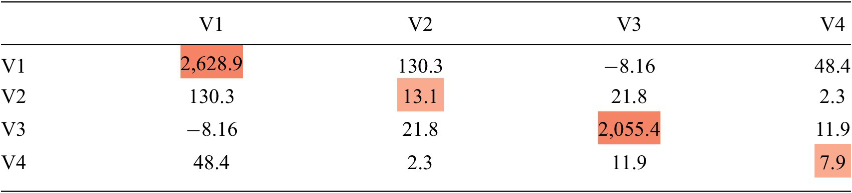
Table 2 is an example of the same covariance matrix for a set of four MER indicators, represented as a heatmap of the covariance. The off diagonals represent the sparse covariance. If two MER indicators have a high covariance, like V1 and V2 in Table 2, then those two variables have a strong relationship, and when we estimate V1 based on V2, the value for V2 will have a large impact on our estimate of V1.
Table 2. Covariance matrix with covariance heatmap
3.4.2. Calculating Mahalanobis distance
Next, we used these parameters to perform two types of calculations. First, we computed the Mahalanobis distance for each observation (Geun Kim, Reference Geun Kim2000). Mahalanobis distance is a distance metric for finding the distance between a point and a multivariate distribution. Mahalanobis distance is calculated with the following formula (equation 6), where C represents the covariance matrix, X p1 is the vector of observed values, and X p2 is the vector of corresponding estimates of the mean:
 $$ {D}^2\hskip0.35em =\hskip0.35em {\left({X}_{p1}-{X}_{p2}\right)}^T\times {C}^{-1}\times \left({X}_{p1}-{X}_{p2}\right). $$
Mahalanobis distance takes into consideration covariances between variables, which means it is useful for identifying multivariate outliers. Given the sparse nature of these data, we used the Mahalanobis distance for data with missing values (MDmiss) function from R’s “modi” package (Hulliger, Reference Hulliger2018). MDmiss omits missing dimensions before calculating the Mahalanobis distance and includes a correction factor for the number of present MER indicators. After calculating the Mahalanobis distance, we then used the quantile function for a chi-squared distribution (qchisq) to generate a threshold value, above which we identified observations as anomalous. Even though Mahalanobis distance identifies which observations are anomalous, PEPFAR stakeholders indicated that it would be programmatically beneficial to know which indicator(s) as reported drive the determination that an observation is anomalous. To this end, we applied the recommender approach.
3.4.3. Generating recommender systems predictions
Next, to identify the values driving the determination that an observation is anomalous, we used Roberts’s conditional mean approach. We iterated through each observation and through each reported value and computed the conditional mean based on other values reported by the observation, the estimated means of those corresponding values, and a subset of the covariance matrix in which the row corresponded with the MER indicator to predict, and the columns corresponded to the other MER indicators reported by the facility.
The tool’s output was the model’s prediction. If we had had 1,000 observations that reported 10 variables on average, we would have conducted this calculation 10,000 times and generated 10,000 predictions. This is output as a table, where the rows are the facilities and the columns are the variables. Each cell displays the predicted value for a given variable, which is calculated based on the relationship between that variable and the other variables, as described above. Our model predicted only values reported by facilities. It did not predict values for MER indicators that were not reported by facilities. This is the case in any cell below with the value missing.
Finally, we compared predictions against values as reported by facilities. We took the difference and normalized the deviations by dividing by the sample variance so that they would be comparable across indicators. To help users identify which variables drive the determination that an observation is anomalous, we provided two types of indications. First, for each anomaly, we added a column to the Excel workbook output that reports the MER indicator with the greatest normalized deviation. The frequencies of these were summarized on another tab so that users could see which MER indicators were most commonly driving anomalies. Second, as a visual aid, we shaded in red cells with the greatest normalized deviations.
3.4.4. Presenting the recommender systems outputs
The tool applied the recommender model to the post-processed MER data set using facility-age-sex identifiers and facility-aggregated values. First, using data disaggregated by facility, sex, and age, the tool followed the steps in the previous section to compute patterns, estimate values, and identify anomalies. Each facility-sex-age combination was represented by a single row, so there could be as many as 40 rows representing each facility. Then, the tool split the data by sex and by age and ran the analysis for each subgroup. Using sex as an example, the tool split the data into observations for female patients, male patients, and transgender patients. The tool computed three sets of patterns across indicators and facilities, using aggregate female patient data only, aggregate male patient data only, and aggregate transgender patient data only, respectively. To then estimate values and identify anomalies, aggregate female patient data were evaluated using patterns computed from aggregate female patient data only, and so on. The reason to run the analysis this way was that an observation might appear anomalous when compared to all others, but would seem more typical when compared only to observations of the same sex or age group.
Next, the tool applied the same techniques at the facility level. The tool split the data by administrative unit and facility type (e.g., hospital, clinic, maternity), calculated patterns separately for each unit and facility type, and evaluated each facility against the patterns observed only among facilities of the same unit or facility type. The hypothesis behind this approach was that while a facility might appear anomalous when compared with all other facilities, it might appear typical when compared only with a subset of facilities having common characteristics.
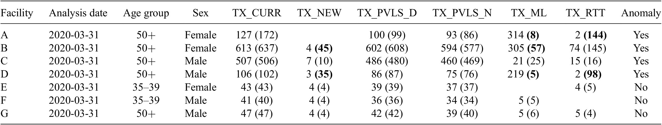
For each observation, each of these analyses would provide users with expected values, deviations of the expected values from reported MER data, the calculated Mahalanobis distance, and the determination of the observation to be anomalous or not based on the value of this distance. Table 3 shows example outputs.
Table 3. Example output of actual and predicted values
3.5. Tool application using time series
For time series applications, additional data processing steps were applied. First, we required a minimum of 12 quarterly observations to run an analysis. We removed any facility-indicator combination with fewer than 12 observations. (This was because we wanted at least two full years of data to compute a seasonal component and one full year to evaluate model forecast accuracy.) Second, we removed any indicators that were reported on a semi-annual or annual basis, rather than on a quarterly basis. Third, definitions of some MER indicators had changed over time. We removed any indicators whose definition had changed in recent years.
Rather than convert data to a wide format, as was done for the recommender model, we kept data in a long format. Each row in the data set consisted of the facility, MER indicator, fiscal year, quarter, and value.
3.5.1. Fitting time series models
The tool iterated through each facility-MER indicator combination and trained ARIMA, STL, and ETS models. We used functions from R’s forecast package, developed by Rob Hyndman, to train models and generate forecasts (Hyndman, Reference Hyndman, Athanasopoulos, Bergmeir, Caceres, Chhay, O’Hara-Wild, Petropoulos, Razbash, Wang and Yasmeen2021). For ARIMA, we used the auto.arima function with a maximum order of three to train and test several parameter combinations to identify the lags that minimized Akaike information criterion error. For STL and ETS, we used the seasonal and trend decomposition using Loess forecasting (stlf) function, also from R’s forecast package.
For each model and for each facility-MER indicator combinations, we fitted the model using the data series up until the most recent quarter reported, and then generated a 99% forecast interval for the most recent quarter. For each observation, we identified as anomalies those where the value for the most recent quarter was outside the forecast interval.
3.5.2. Presenting the time series outputs
Outputs were structured similarly as for the recommender model. As shown in Table 4, below, following identifying fields, the output showed the reported value with the 99% forecast interval in parentheses. The time series values as reported for previous quarters were displayed to the right. Observations with anomalous values in the most recent quarter had a 1 in the outlier column; otherwise, they had a 0. The number of columns displayed in this table as been truncated for presentation sake.
Table 4. Example time series output
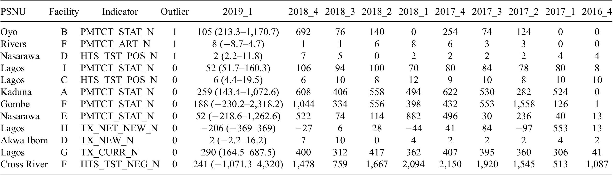
Abbreviation: PSNU, priority subnational unit.
4. Model Results
We validated both recommender and time series anomaly detection results with in-country experts such as data analysts and strategic information officers as well as against DQAs conducted in the past. All communication with experts was done through emails or online meetings.
4.1. Validation with experts
The anomaly detection results were validated with two experts in Papua New Guinea (PNG) and four experts in Nigeria. We provided these experts with Excel workbooks that contained data for the 10 most and 10 least anomalous observations for each type of the analysis (by sex, age, PSNU, facility type, ARIMA, ETS, STL) and asked them to review the reported values and define each of these observations as anomalous or not, based on their expert knowledge. For each expert, and for each analysis type, we calculated the percentage of agreement between experts and anomaly detection results.
Overall, the agreement on non-anomalous observations was higher than the agreement on the anomalous observations and the agreement on time series results was higher than the agreement on the recommender approach results. On the recommender approach, 144 from the 255 anomalous observations under review were identified by experts as anomalous (56% agreement) and 231 from 242 non-anomalous observations were identified by experts as non-anomalous (95% agreement). Experts’ agreement on anomalies was highest on the analysis that did not include all disaggregations (82%) and lowest on the analysis that included disaggregation by region (Reference Hulliger8%). Experts’ agreement on non-anomalies ranged from 87 to 100% (See Table 5).
Table 5. Results of the experts’ validation of the recommender results
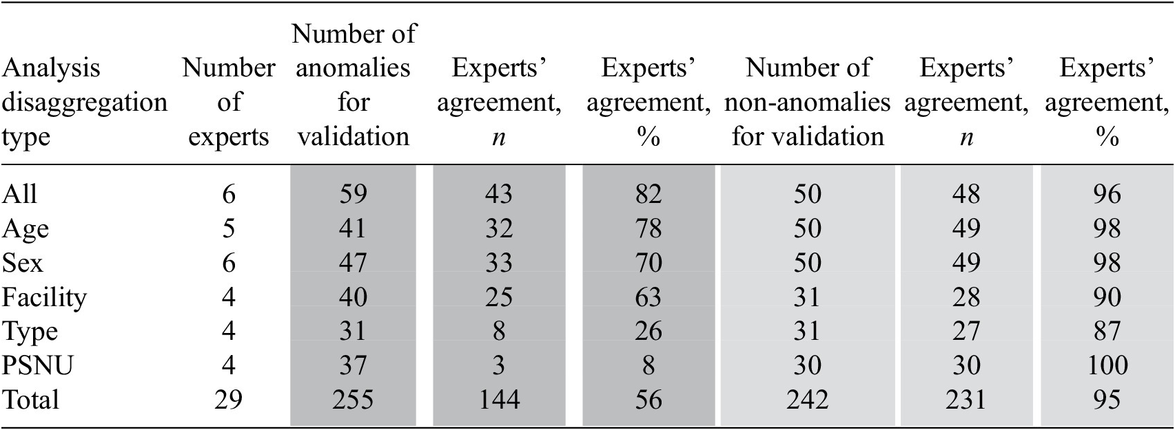
Abbreviation: PSNU, priority subnational unit.
On the time series approach, the agreement on anomalous and non-anomalous observations was over 90%. Thus, 122 from 134 anomalous observations were identified by experts as anomalous (91% agreement) and 193 from 202 non-anomalous observations were identified by experts as non-anomalous (96% agreement). Experts’ agreement on anomalies varied from 90 to 93% and on non-anomalies it varied from 92 to 99% (See Table 6).
Table 6. Results of the experts’ validation of the time series results
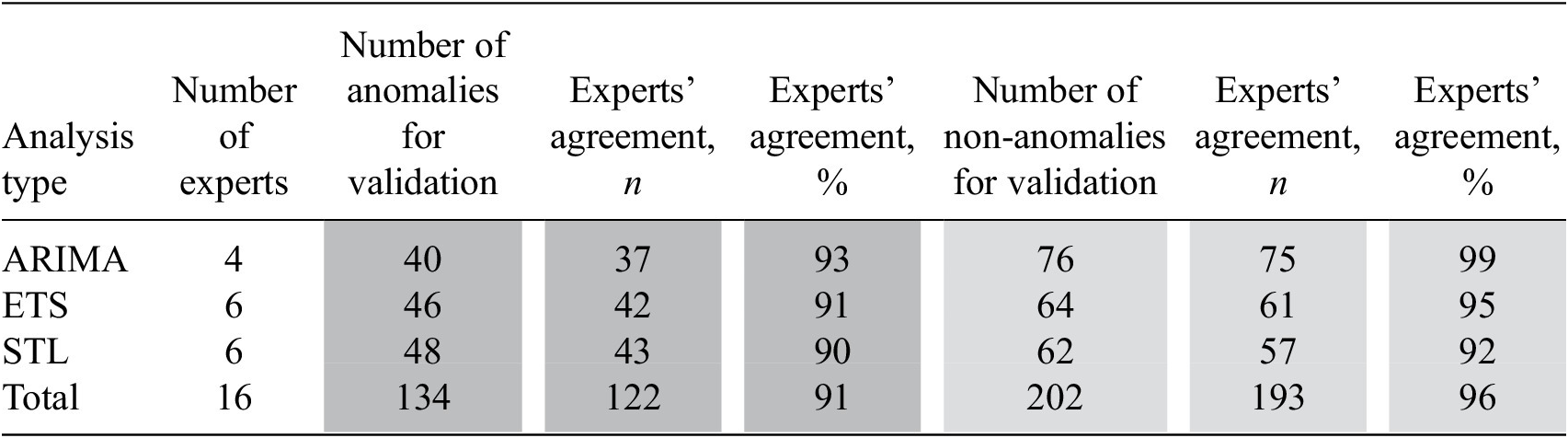
Abbreviations: ARIMA, auto-regressive integrated moving average; ETS, error, trend, season; STL, seasonal and trend decomposition using Loess.
As part of the validation process, we asked experts open-ended questions to understand their experiences reviewing the results and obtain suggestions on improving the content and user-friendliness of the results. All experts were satisfied with the results and found those to be useful in their daily work to improve the quality of data. Content-related suggestions from experts included presentation both of high- and low-performing facilities and adding data on implementing partners and regions in the results. Design-related suggestions included comments on colors and font sizes. We incorporated suggestions from experts on content and design in the final version of the tool.
4.2. Validation against DQAs
We used the results of the Papua New Guinea and Nigeria DQAs in validation of anomaly detection results against DQA. The Papua New Guinea DQA assessed the quality of data reported in Q1 FY20 and the Nigeria DQA assessed data reported in Q3 FY19. Two indicators were included in the Papua New Guinea DQA and six indicators were included in the Nigeria DQA. For the analysis, we prepared a data set that contained only facilities that had indicator data both on DQA and recommender model results.
To compare findings from anomaly detection with DQA findings, we followed several steps for each indicator included in the DQA: First, we defined each observation in the data set as anomalous or not based on the DQA findings. If the difference between the value reported in PEPFAR’s Data for Accountability, Transparency and Impact Monitoring (DATIM) system and the indicator value found at the health facility were greater than 5%, we defined this observation as anomalous. Otherwise, the observation was defined as non-anomalous. Second, we identified each observation as anomalous or not based on the recommender model findings. If the difference between the DATIM-reported value of an indicator and the value for that indicator estimated by the recommender model were greater than 5%, we defined this observation as anomalous. Otherwise, the observation was defined as non-anomalous. Third, we summarized and presented the results on the number and proportion of concordant pairs (DQA and recommender agree on the observation that a value is anomalous or not) and discordant pairs (DQA and recommender disagree on the observation that a value is anomalous or not). We provided results for all types of the analysis including sex, age, facility type, and region.
In the Papua New Guinea DQA, on average 82% of pairs were concordant across the facility (84%, N = 69), region (84%, N = 69), and facility type (78%, N = 37) analyses. On average, in about 13% of pairs an observation was defined as anomalous by the recommender model and as non-anomalous by DQA. In about 5% of pairs, an observation was defined as non-anomalous by the recommender model and as anomalous by DQA.
In the Nigeria DQA, on average 37% of pairs were concordant across the facility (40%, N = 75), region (27%, N = 52), and facility type (45%, N = 56) analyses. In most discordant pairs, an observation was defined as anomalous by the recommender model and as non-anomalous by DQA. On average, there were about 58% of this type of discordant pairs across the facility (55%, N = 75), region (69%, N = 52), and facility type (50%, N = 56) analyses. In 5% of pairs, an observation was defined as non-anomalous by the recommender model and as anomalous by DQA (see Table 7).
Table 7. Results on validation against DQAs
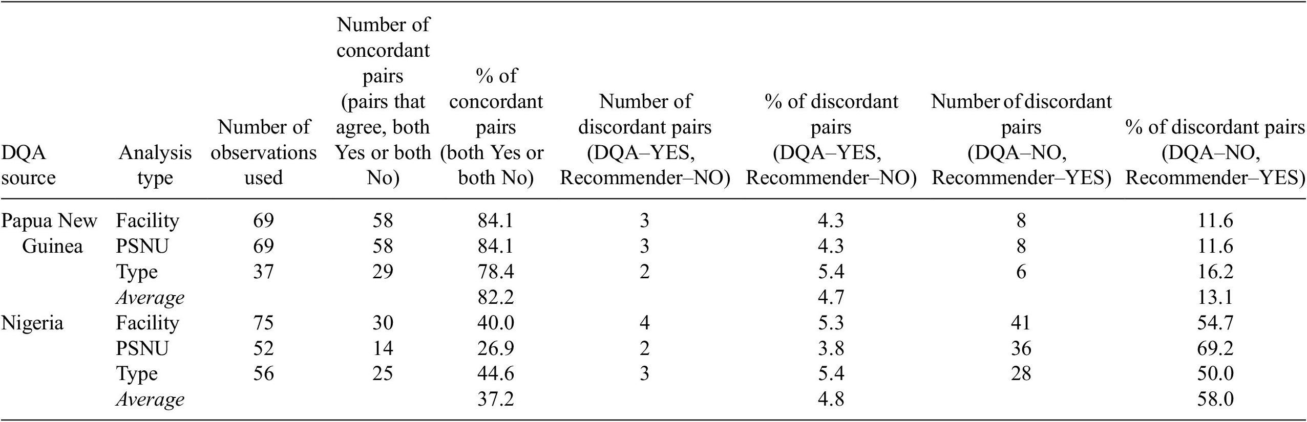
Abbreviations: DQA, data quality audit; PNG, Papua New Guinea; PSNU: priority subnational unit.
5. Discussion
The Data.FI anomaly detection tool applied innovative machine learning algorithms to improve the data quality of remote routine aggregate data at the health facility level. We developed the tool in R so that we could leverage machine learning libraries, but it is packaged so that it is easy to use without any expertise in R. The application of recommender systems (often used for commercial product recommendations) in the health space for the purpose of monitoring data quality is novel, to our knowledge. The multidimensional analysis reflected in this approach can be achieved only by using such a machine learning approach. For example, for a single quarter of Nigerian facilities, the tool captures parameters across approximately 770,000 data points covering 2,000 health facilities and 40 indicators. And whereas existing data quality tools in the global health space consider temporal trends, none uses time series modeling capable of capturing trends and seasonality in the data reported. Thus, our tool has advantages over existing tools, in that it enables remote monitoring of aggregate data, using sophisticated modeling for anomaly detection, in a standardized manner, and with quick execution times.
The tool performed well in signaling data anomalies as evaluated by PEPFAR experts and implementing partner stakeholders. The tool achieved 56% concurrence from experts on anomalies using recommender systems and 91% using time series models. On non-anomalies, the tool achieved 95% concurrence using recommender systems and 96% with time series models. These results are encouraging, because they show that the tool can help experts identify in a reliable manner facilities that require scrutiny. The tool will also allow users to monitor data quality over time to see if interventions positively impact reporting.
As the tool highlights indicators, sites, and partners that have potential anomalies, investigation of these anomalies by experts familiar with the program will confirm whether they are anomalous or have some programmatic explanation (e.g., temporary facility closure due to COVID-19 lock down). An anomaly signals that the data reported did not seem consistent with the expected/generally observed pattern. Among various other ones, one example of an anomaly can be “lower than expected numbers of clients currently on treatment.” This could be due to a change of the categories of clients served by the facility, a stock out issue, clients’ decision to get treatment somewhere else, or maybe the lower numbers are due to a data entry error. If clients are going elsewhere for treatment, further exploration could reveal whether the reason is associated with a service quality issue at the facility, suggesting a change in how to treat clients through staff training. If the potential data issues flagged are anomalous, then an appropriate intervention can be designed and implemented to reduce or eliminate the anomaly. Running the tool in the future will then help identify whether those data points are no longer anomalous, thus resolving the issue and confirming the interventions were a success.
Our work had several limitations. First, in our approach to validation, it would have been ideal to evaluate model accuracy against a data set with observations labeled as anomalous or non-anomalous, but we were unable to identify such a data set. Therefore, we relied on expert validation. Second, the tool achieved a lower rate of concurrence of anomalies using recommender systems than was achieved with time series models. One hypothesis, based on user feedback, was that it was difficult for users to review recommender predictions because that required considering up to 40 indicators simultaneously. Although multivariate analysis is a strength of the tool, it is a limitation in expert validation. Third, the rate of concurrence from the DQA comparison was lower than with expert validation. While we would have preferred to see a higher rate of concurrence, comparison against DQA was less important to us than was expert validation. This is because our tool was not intended to replace or replicate DQAs but to help analysts remotely identify issues that may warrant DQAs or other data quality interventions. The higher rate of concurrence with expert validation means that analysts can reliably use the tool to quickly identify the data points of interest for their purposes. The anomaly detection tool is designed to assess the quality of aggregate numbers reported for key indicators, whereas the DQA tool is based on analysis and recounting of specific parameters from individual client records.
Going forward, we would like to expand the number of countries and experts for validation of tool predictions. We also aim to add flexibility to the tool, both to make it applicable to other public health data sets and so that it can be used not only by PEPFAR and implementing partners but also by others, such as at the health facility level.
In addition to its contributions to the PEPFAR data quality tool landscape, this work contributes to the broader landscape of applied machine learning. The potential for applied machine learning approaches to improve the efficiency and effectiveness of resource-constrained sectors like health, education, and agriculture is immense. Recommender systems are consistently used in the technology and business sectors to improve product recommendations and increase sales. This work demonstrates a novel adoption of these recommender systems methods to the health sector. By using these methods to recommend which data points are most likely to be anomalous, the limited resources for data quality efforts can focus on these data points, in turn improving the efficiency with which these funds for data quality resources are allocated.
Acknowledgments
We thank the United States President’s Emergency Plan for AIDS Relief (PEPFAR) for funding the development of the anomaly detection tool. We are grateful for the leadership of counterparts in the United States Agency for International Development (USAID) Office of HIV/AIDS Strategic Information, Evaluation, and Informatics Division in the design, development, and testing of the tool. We also thank USAID Mission staff in Papua New Guinea, Nepal, and Nigeria, who provided the monitoring, evaluation, and reporting (MER) data sets for analysis and critical feedback on the presentation and validity of results. Specifically, we thank K. Hoang Bui, Percy Pokeya, and Shane Araga for their critical support for Papua New Guinea; Maria Au and Abena Amoakuh for their support for both Papua New Guinea and Nepal; and Amobi Onovo and David Onime for their support in Nigeria. This article was produced for review by the U.S. President’s Emergency Plan for AIDS Relief through the United States Agency for International Development under Agreement No. 7200AA19CA0004. It was prepared by Data for Implementation (Data.FI). The information provided in this article is not official US government information and does not necessarily reflect the views or positions of the US President’s Emergency Plan for AIDS Relief, US Agency for International Development, or the United States Government.
Funding Statement
This study was funded by the President’s Emergency Plan for AIDS Relief through the United States Agency for International Development via the Data for Implementation Project under Agreement No. 7200AA19CA0004.
Competing Interests
J.F. is a senior technical advisor for data science at Data.FI, Palladium. Z.A. is a senior technical advisor for monitoring and learning at Data. FI, Palladium. A.F. is a senior associate in data science at Data.FI, Palladium. J.W. is a program and data quality advisor in the Office of HIV/AIDS at USAID. A.D. is a data science advisor in the Office of HIV/AIDS at USAID.
Author Contributions
J.F.: Conceptualization, methodology, project administration, writing—original draft, writing—review and editing. Z.A.: Project administration, validation, writing—original draft. A.F.: formal analysis, writing—original draft, writing—review and editing. J.W.: Data curation, project administration, writing—original draft. A.D.: Data curation, validation, writing—original draft.
Data Availability Statement
The data that support the findings of this study can be found on the PEPFAR website at https://data.pepfar.gov/dashboards, navigating to “MER Downloadable Datasets.” The code for the tool can be shared for replication purposes upon request.


 Open access
Comments
No Comments have been published for this article.