

Overview
This chapter reviews the types, use, production, accessibility and efficacy of data visuals contained in the assessments and special reports of the Intergovernmental Panel on Climate Change (IPCC), drawing upon available published literature. Visuals of different types are key to the communication of IPCC assessments. They have been subject to academic interest among social and cognitive scientists. Furthermore, wider societal interest in the IPCC has increased, especially since the publication of its Fifth Assessment Report (AR5). In response, the IPCC has revisited its approach to communication including visuals, which has resulted in a greater professionalisation of its visualisations – involving information designers and cognitive scientists – and in new forms of co-production between authors and users.
25.1 Introduction
IPCC visuals1 are integral to the communication of IPCC assessments, and have been the subject of academic research since the late 1990s. Visuals provide diverse representations of evidence, primarily in the form of graphs, maps, diagrams, tables, and more recently, icons and infographics, such as those in the Technical Summary of the IPCC’s Special Report on the Ocean and Cryosphere in a Changing Climate (IPCC, Reference rtner, Roberts and Masson-Delmotte2019f). The focus of research on this topic has broadly addressed four questions:
What types of visuals are used in reports, and how?
How have they changed over time and why?
How are visuals produced?
How well do they convey the messages they intend to, and how well are they understood by different audiences?
As societal interest in the work of the IPCC has expanded, the accessibility of IPCC communications has been scrutinised in more detail (see Chapter 26). Studies by social and cognitive scientists have explored the effectiveness of IPCC visuals and how they are interpreted and understood by a variety of users, including policymakers and non-experts. This chapter explores these aspects in detail, with reflections on how these intersect with the nature, role and authority of the IPCC and on its response to calls for change in its communication processes.
25.2 Types of IPCC Visuals
IPCC visuals are provided to communicate data and information, consonant with the tradition in scientific literature of illustrating specific evidence through visuals. Visuals are bespoke to Summary for Policymakers (SPM) reports, but typically evolve from figures contained in Working Group (WG) chapters or in Technical Summaries, which in turn may have their origins in published literature. The bespoke nature of SPM visuals reflects the purpose and format of IPCC assessments. Although visuals are embedded within the written narrative of the reports, there is a paucity of research exploring how readers use text and visuals in isolation or in relation to each other, and the effectiveness of these approaches.
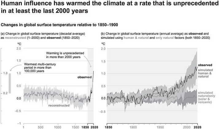
There is wide variation in the type and content of visuals used within and between reports and over time. Box 25.1 shows an example for the changing visualisation of observed global temperature between the First Assessment Report (AR1) in 1990 and the Sixth Assessment Report (AR6) in 2021. These differences are related in part to scientific and social advances – knowledge, modelling capacity, understanding of uncertainty, data availability – and partly to representational choices (discussed later). The visuals provide representations of a range of topics – for example, observational data (in time series format or geographically referenced), projections, processes, comparisons of change, model outputs, risk assessments – drawing upon a variety and diversity of data sources as well as expert judgement. Multiple aspects of climate change are often represented in a visual – for example the ‘burning embers’ diagram, discussed later – reflecting the need to synthesise information as part of an assessment. The media through which visuals in IPCC reports are disseminated has evolved over time – from print-only copies of the earlier assessments to more recent digital online availability supported by multimedia (for example WGI’s short video of its AR6 contribution, FAQs, an Interactive Atlas, Regional Fact Sheets, Data Access, and Outreach Materials).
These two visuals (Figures 25.1 and 25.2) – with original captions included – drawn from IPCC SPM reports in AR1 (1990) [top panel] and in AR6 (2021) [lower panel], show the evolution in the way IPCC has depicted observed trends in global temperature. The visual from the AR6 WGI SPM denotes the causes, as well as the changes, of recent warming. It uses titles and annotations to help guide the reader, and includes a detailed caption about the data presented. Reproduced here from AR1 WGI (IPCC, Reference Houghton, Jenkins and Ephraums1990a: SPM, p. 23, original greyscale), and AR6 WGI (IPCC, Reference Masson-Delmotte, Zhai and Pirani2021a: SPM, p. 6, original in colour).

Figure 25.1 Reproduction of Figure 11, plus original caption, from the IPCC SPM for AR1 WGI in 1990.

Figure 25.2 Reproduction of Figure SPM.1, plus original caption, from the IPCC SPM for AR6 WGI in 2021.
25.3 Presentation and Use of Visuals
The varied foci and key messages contained in visuals, as well as the need to convey these to multiple audiences effectively, can be challenging for their production. Doyle (Reference Doyle2011) and Nocke (Reference Nocke, Schneider and Nocke2014) mention that the production and presentation of visuals in the first four of the IPCC’s assessment reports were influenced by a focus at the time on datasets capturing global observations to monitor and project global change, facilitated by the emergence of institutions with a global remit. Observational data in early IPCC visuals is often presented in graphs showing temporal change on one axis, with environmental and ecological variation depicted as linear change, its complexity thus constrained by the representational medium used (see Doyle, Reference Doyle2011).
In maps, variation in ecological processes is expressed in spatial terms. These have until recently lacked regional specificities (Doyle, Reference Doyle2011; Nocke, Reference Nocke, Schneider and Nocke2014) and have been critiqued for removing the local relevance of change and connection to a sense of place. Temporal change was also more challenging to present in maps of earlier IPCC reports. It has been argued that the use of these formats denotes the power of western cartography in terms of which features are represented and how (see discussion in Doyle, Reference Doyle2011). To enhance the accessibility of visuals for wider audiences, choices were made in regard to presentation, style and aesthetics (Doyle, Reference Doyle2011: 57). For example, the graphs in the AR3 Synthesis Report included a wider range of colours; this was accompanied by specific choices for typeface and borders to draw attention to specific content.
Static visuals may be useful for presentational purposes, although these can be perceived as being simplistic (Nocke, Reference Nocke, Schneider and Nocke2014). More in-depth and comprehensive exploration of data can be enabled through interactive options, made possible through recent digital advances. Conversely, interactive data platforms can be challenging for users if they lack knowledge of how to navigate the complex datasets and portals available (Hewitson, et al., Reference Hewitson, Waagsaether, Wohland, Kloppers and Kara2017). In recognition of the potential for interactive data visual products displaying tailored information, the AR6 WGI assessment developed an Interactive Atlas (IPCC, 2021d). This enabled users to customise representations of regional information and access the underpinning data.
Studies have highlighted how the representation of visuals in IPCC reports is affected by the complex relationships between those who create, review, shape and use such visuals. Visuals may evolve over time, acquiring diverse social and political significance. One well-known visual that was produced to represent and convey the likelihood of future risk and uncertainty is the ‘burning embers’ diagram (see Figure 25.3; see also Chapter 21). Mahony’s (Reference Mahony2015) study of the origins and development of the visual examines how its representation of thresholds at which climate change may become dangerous was revisited, debated and embraced/rejected, through processes underpinned by a range of interpretations and ‘political objectives’ (Mahony, Reference Mahony2015: 153). These were, he concludes, indicative of tensions and debates among different knowledges and practices of sense-making. Recognising these differences opens up opportunities for further understanding the iterative creation of visual forms of knowledge through multiple disciplinary perspectives. Zommers et al. (Reference Zommers, Marbaix and Fischlin2020) note how lessons learnt from debates about the burning embers diagram have translated into more formalised processes – protocols, standardised metrics for risk thresholds – in recent IPCC reports that aim to increase transparency. Another contested visual is ‘the hockey-stick’ graph in AR3, showing a significant rise in temperatures in the twentieth century in the context of the last thousand years. Its visual presentation and the statistical methods used to represent the data (Walsh, Reference Walsh2010) received criticism, in part fomented by the rise of internet communications (Zorita, Reference Zorita2019).

Figure 25.3 Risks associated with Reasons For Concern at a global scale are shown for increasing levels of climate change.
Research on visuals has mainly focused on the physical science of climate change, typically reports produced by WGI. As a point of departure, Wardekker and Lorenz (Reference Wardekker and Lorenz2019) evaluated the content and framing of visuals in WGII from AR1 to AR5. Their work shows that the majority of the over 700 visuals examined focus on impacts (problems), but few on solutions and adaptation. The authors point to the importance of understanding how visual information is framed (presented), given its influence on how information is interpreted, perceived and used in decision-making. Wardekker and Lorenz (Reference Wardekker and Lorenz2019) also acknowledge the potential for debating the visual framing of information in internal IPCC processes. Such debates can be highly politicised with competing interests at stake. The aforementioned authors note how opportunities may arise for tailoring visuals – for example more specific national and regional foci in regional chapters or increased interaction across drafting teams earlier in the SPM process – and for learning from the use of visuals in other contexts, for example on climate adaptation by national agencies.
25.4 Accessibility and Efficacy of Visuals
Studies have examined how individuals cognitively interpret visuals, providing insights into their comprehensibility and usefulness. Understanding a data visual involves the direction of visual attention to specific visual features, and the sense-making of features using prior knowledge. Hence, comprehension is influenced both by visual aspects – for example format, colour, text – and by user characteristics, for example the reader’s goal, knowledge of graphs, knowledge of the content (Harold et al., Reference Harold, Lorenzoni, Shipley and Coventry2016). McMahon et al. (Reference McMahon, Stauffacher and Knutti2015) examined representation and understanding of two types of uncertainty – scenario uncertainty and climate response uncertainty – through interviews with people similar to the IPCC target audience. This was presented in the IPCC AR4 WGI SPM visual of modelled global surface temperatures according to various scenarios. Their work indicated that individuals often attributed most of the uncertainty to climate models – the participants interpreted the visual using their own prior assumptions – whereas scenario uncertainties were largely unnoticed; this was due to the design choices included in the visual which were not interpreted in the same way by the scientists creating the figure and the readers viewing it. The findings point to the need for involving users during the process of designing visuals to identify different interpretations, and to inform how the communication of information might be improved.
A more recent study on AR5 WGI SPM visuals identified a tension between the need to retain scientific accuracy in visuals – as expressed by the IPCC authors – and the desire for increased accessibility (Harold et al., Reference Harold, Lorenzoni, Shipley and Coventry2020). Non-specialists found the more complex figures more difficult to understand, which the IPCC authors also recognised. The authors of this study suggested that visuals be evaluated for complexity and be co-designed and tested with users. This may provide opportunities to produce visuals that could better enable the different goals of scientific accuracy and user accessibility to be constructively considered and possibly balanced. A further consideration is the perceived association of the format of a visual with expectations of scientific content and ‘authority’. McMahon et al. (Reference McMahon, Stauffacher and Knutti2016) showed that visuals perceived to be more scientific – graphs, maps and so on – were more closely associated with the authority of a scientific source. Both McMahon et al. (Reference McMahon, Stauffacher and Knutti2015) and Harold et al. (Reference Harold, Lorenzoni, Shipley and Coventry2020) propose that IPCC visuals are created with input from the stakeholders for whom they are devised, and tested for comprehensibility at various opportunities during the drafting process.
An important recent development that has affected IPCC communications is the exponential evolution of societal interest in visual communication over the past 30 years and extensive use of social media for discussion and exchange. IPCC reports have regularly received print and television media attention. More recently, their communication has also increasingly occurred through social media – either through direct recirculation of IPCC materials or through indirect reference to the IPCC visuals themselves. The IPCC has also had to keep up with such visualisation trends (see Section 25.5). When analysing the media coverage and framing of IPCC AR5 reports – both text and visuals – O’Neill et al. (Reference O’Neill, Williams and Kurz2015) found that the ‘newsworthiness’ of the WGIII report was lower than that of WGI and WGII. The authors suggest this may be due in part to the visuals in the WGIII report – despite some visually attractive images – not speaking to the requirement of dramatisation and personalisation, which news outlets frequently draw upon for presenting their stories. To inform future IPCC assessments, O’Neill et al. (Reference O’Neill, Williams and Kurz2015) advocated co-produced research by academics and media outlets about the place of visuals in the production of news, and research into how audiences interact with media narratives and visuals, expanding the work to non-English speaking nations.
The visual portrayal of climate change in legacy media may not make frequent use of IPCC visuals, even when reporting IPCC assessments. One study used a sample of print newspaper articles reporting the IPCC AR5 to show that accompanying visuals tended to be photographic material, even if consonant with the content of the related article text (Dahl & Fløttum, Reference Dahl and Fløttum2017). The authors indicated that selection of visuals continues to present a challenge for news producers. Imagery of human beings ‘taking action’ or ‘being impacted’ has the potential to engage audiences more than decontextualised representations which often characterise IPCC visuals – in other words imagery without an explicit human or geographical reference. Walsh (Reference Walsh2015) offers a similar perspective, arguing that the rhetorics embedded in, and associated with, IPCC graphics may be distancing people from engaging with climate change. Other (more local) forms of visualisation may therefore be more effective for inducing action on climate change. However, the contents of visuals used to communicate IPCC reports require careful attention. Nerlich and Jaspal (Reference Nerlich and Jaspal2014) analysed images of extreme weather in English-speaking media following the publication in 2011 of a draft IPCC report on extreme weather and climate adaptation. They found that the images studied may have ‘largely negative emotional meanings’ (Nerlich & Jaspal, 2013: 253) and conveyed some sense of helplessness; they may, therefore, disengage audiences from climate change.
25.5 Co-producing Visuals
The IPCC has pioneered new features to support improved communication, for example the use of headline statements to provide a concise summary of the overall assessment (Stocker & Plattner, Reference Stocker and Plattner2016: 637). However, despite such innovations, the accessibility of IPCC reports was critiqued following the publication of AR5 (2013/2014). In an Expert Meeting on Communication held in February 2016, the IPCC (Reference Lynn, Araya and Christophersen2016b) acknowledged ‘growing calls from policymakers and other users to do more with its communications’, having faced criticism that even its SPMs are ‘unreadable and inaccessible for non-specialists’ (for further context, see Chapters 6 and 26).
Starting with the AR6 cycle, co-production of visuals has taken centre stage within the IPCC SPM process. This is based on recognising the importance of co-developing scientifically accurate and rigorous visuals and of meeting the needs of ‘users’, even if there are challenges in such co-production (Morelli et al., Reference Morelli, Johansen and Pidcock2021). This approach was pursued in both the Special Report on Global Warming of 1.5 ºC (2018) (SR15) and the Special Report on Climate Change and Land (2019) (SRCCL), where visuals were collaboratively produced and guided by design and cognitive psychology principles. These principles were to establish and agree upon a clear intent (message) of the visual (see Box 25.1) as a main reference point. The visual could then be built iteratively with chapter authors as the content and focus of the IPCC report became better defined and with consideration of feedback elicited through user testing.
Concurrent with the growing social attention to visuals, visual design within the IPCC has also been professionalised, for example through collaboration with designers and recruitment of graphics officers within Technical Support Units (TSUs). This professionalisation supports authors in their preparation of visuals and also enhances the efficacy of the resulting visuals in terms of reach and understanding. The visuals featured in the AR6 WGI SPM are therefore substantially different from visuals in previous reports, both in terms of the cognitive insights adopted to convey data and information, and their visual presentation and format. Having been coordinated by the IPCC, co-created by professional designers in association with authors and cognitive experts, and refined through testing with policymakers, they may turn out to be more ‘usable’, ‘intuitively understood’ and ‘enhance climate literacy’ (Gaulkin, Reference Gaulkin2021).
25.6 Achievements and Challenges
Published research increasingly recognises the role of visuals in IPCC reports as key components of communication, in association with and complementing relevant text. Concurrently, the IPCC has acknowledged the relevance of its reports to audiences much more diverse and broader than the policymakers to whom its SPMs are explicitly addressed. The context within which the IPCC operates has also evolved, with now much wider societal interest in novel tools for digital and instant communication. The IPCC has responded to critiques by embarking upon innovative co-design for some visuals included in its reports, as part of a wider focus to improve its communications. The attention to the IPCC’s visuals in a variety of settings by a diversity of social actors reflects a development in IPCC processes. Co-production of visuals presents opportunities for widening participation and for more meaningful inclusion of diverse perspectives. However, new visual designs and formats raise questions about how these are evaluated by expert reviewers and national delegates.
There is a paucity of research on the effects of these new processes. Research is needed to understand how the SPM visuals in the AR6 reports have been reviewed and evaluated by national delegates, how they are received and used by policymakers, how they are communicated by print and social media, and how they are understood, used, and (re)circulated by different societal actors with an interest in communicating climate change. For example, to what extent are IPCC visuals circulating in other media and contexts, outside of the IPCC processes, perhaps detached from the original report in which they were included? This is especially relevant given the widespread use and accessibility of social media. Little is known about how public and media framing of IPCC visuals occurs and how this influences their circulation and reframing (O’Neill et al., Reference O’Neill, Williams and Kurz2015; Mahony, Reference Mahony2015; see also van Beek et al., Reference van Beek, Metze, Kunseler, Huitzing, de Blois and Wardekker2020b). Nor is much known systematically about the knowledges and perspectives that are highlighted or excluded as a visual is subsequently iterated, (re)used and recast across different media platforms.
Furthermore, in the context of media and user-generated content inspired by the IPCC communications, there is a need to understand how this downstream visual content expresses new or diverse meanings and perspectives around climate change, beyond those intended by the IPCC’s authors. Of relevance too is better understanding how key climate change messages are communicated. Do IPCC visuals circulate widely, and for which purposes? Or do its visuals have a limited efficacy in certain regions or amongst particular publics, for whom perhaps other visuals more effectively represent key messages on climate change? Expanding current understandings and drawing together existing work to inform and continue building on the reflections and new processes initiated within the IPCC could help its visuals, products and messages be relevant to those it wishes to reach.


 Open access