

Public policies are necessary to reduce the increasing public health, economic and social costs of non-communicable diseases( 1 , Reference Hawkes, Smith and Jewell 2 ). Considering that consumption of foods with high energy, fat, sodium and sugar content has been identified as one of the main causes of a considerable proportion of deaths associated with non-communicable diseases, policies aimed at encouraging people to make more healthful choices have the potential to reduce the global burden of these diseases( Reference Hawkes, Smith and Jewell 2 , 3 ).
Information provision has been regarded as a core policy to enable informed decisions and encourage changes in food habits( Reference Mazzocchi, Cagnone and Bech-Larsen 4 ). In this sense, nutrition information has been included on food labels to enable people to evaluate the nutritional quality of the foods they consume( Reference Storcksdieck genannt Bonsmann, Fernández Celemín and Larrañga 5 ). However, conventional nutrition labelling has been extensively reported to be difficult to find and interpret, and therefore to be seldom used by consumers when choosing the foods they eat( Reference Cowburn and Stockley 6 , Reference Grunert and Wills 7 ). For this reason, simplified front-of-pack (FOP) nutrition labels have been proposed as an effective alternative to improve consumers’ ability to find and understand nutrition information( Reference Hawley, Roberto and Bragg 8 ). Different FOP nutrition labelling schemes have been developed, which can be classified into three categories according to their ability to communicate how healthful a food is( Reference Hodgkins, Barnett and Wasowicz-Kirylo 9 ): (i) non-directive, which provide information about the content of key nutrients; (ii) semi-directive, which classify nutrient content in low/medium/high; and (iii) directive, which flag healthful or unhealthful products. Given the wide availability of products with unfavourable nutritional composition in the current food environment( 10 , Reference Monteiro, Cannon and Levy 11 ), directive FOP schemes that flag unhealthful products may raise consumers’ awareness about the negative health consequences associated with their overconsumption, which could potentially foster habit change( Reference Capacci, Mazzocchi and Shankar 12 ).
The inclusion of warnings on the package of unhealthful products has been proposed to discourage consumption of sugar-sweetened beverages( Reference Popova 13 ) or products with high content of key nutrients( Reference Corvalán, Reyes and Garmendia 14 , 15 ). Evidence of the efficacy of warnings exists in the public health literature, as they have been associated with greater knowledge and increased risk perception of the health harms of using tobacco products and alcohol, as well as with reduced consumption of these products( Reference Hammond 16 , Reference Wilkinson and Room 17 ). Warnings aim to provide information that enables people to understand the risks and consequences of a specific behaviour which, consequently, can enable them to make informed decisions( Reference Robinson 18 ).
In particular, warnings have been recently introduced in Chile as a directive FOP nutrition labelling scheme to highlight products with high content of energy, sugar, saturated fat and sodium( 15 ). One year after their compulsory implementation in Chile, preliminary studies confirm the efficacy of warnings: consumers report having modified their food purchases by selecting the products with fewer warnings( Reference Valdebenito Verdugo and Labrín Elgueta 19 ) and sales of chocolate and cookies have decreased by 8·0 and 1·2 %, respectively( Reference Orellana 20 ). In addition, recent research has reported advantages of warnings compared with other FOP nutrition labelling schemes. Arrúa et al.( Reference Arrúa, Machín and Curutchet 21 ) reported that warnings were superior to the Guideline Daily Amount (GDA) and traffic-light systems in terms of their ability to improve consumers’ capacity to find nutrition information on labels and to decrease healthfulness perception of products with high energy, fat, sugar and/or sodium content. In addition, warnings have been reported to be more effective than the traffic-light system in discouraging children’s choice of labels of snack products( Reference Arrúa, Curutchet and Rey 22 ). The superiority of warnings over the traffic-light system can be explained considering that the former highlights only those products with high content of key nutrients, whereas the latter classifies the content of each nutrient as low/medium/high. In this sense, research has shown that judging product healthfulness based on the simultaneous evaluation of the content of different nutrients is usually a complex task for consumers( Reference Black and Rayner 23 ).
According to the communication–human information processing model, the ability of warnings to catch people’s attention and clearly communicate their key concepts play a key role in their effectiveness( Reference Wogalter, Dejoy and Laughery 24 ). Current lifestyles do not allow consumers to take much time to select foods and to process all the information available on labels( Reference Maubach, Hoek and Mather 25 ). In this context, increasing the ability of warnings to rapidly and automatically catch consumers’ attention, even if they are not looking for them, can increase the likelihood of consumers noticing them and, in turn, taking them into account in their decision-making process( Reference Wogalter, Dejoy and Laughery 24 ). Once warnings are attended to, understanding is a key determinant of whether they can influence people’s food choices( Reference Grunert and Wills 7 ). Since consumers only have a few seconds to process the information included on warnings, the use of familiar warning signs can be an effective way of communicating key concepts( Reference Laughery, Young and Vaubel 26 ).
Warning design plays a key role in the ability of warnings to catch consumers’ attention and to communicate their intended meaning. Through repeated exposure to warnings people learn to associate design features of warnings with meanings( Reference Wogalter, Dejoy and Laughery 24 ). Although these associations may be influenced by culture, some warning signs are expected to be similarly understood due to the international uniformity of road signs and symbols( 27 ). For instance, a red octagon means ‘stop’ and a yellow triangle means ‘danger’ on traffic signs( Reference Fleyeh 28 ). Learned meanings of warning signs can influence behaviour, even below the level of conscious awareness( Reference Gawronski and Creighton 29 ).
Three main design features can be identified in warning signs: colour, a shaped border and textual information( Reference Mazis and Morris 30 ). Colour is probably one of the most important features of warnings as it influences risk perception and compliance behaviour( Reference Braun and Silver 31 ). The meanings conveyed by different colours are used to convey information when textual messages are limited( Reference Ng and Chan 32 ). Research has shown that different colours communicate different hazard information and that red colour is usually associated with the highest hazard( Reference Griffith and Leonard 33 – Reference Siu, Lam and Wong 36 ). In addition, red warning labels have been reported to be more noticeable than black signs( Reference Young 37 ).
Warnings are usually enclosed by borders with specific shapes, which influence risk perception( Reference Mazis and Morris 30 ). Shapes largely influence people’s first perception of products by metaphorically communicating their key characteristics( Reference Dichter 38 ). Riley et al.( Reference Riley, Cochran and Ballard 39 ) reported that pointed shapes tend to be more associated with danger than rounded shapes. In particular, these authors reported that the triangle on its vertex was the shape most associated with danger, followed by diamond, octagon, hexagon and pentagon. However, it should be taken into account that shaped borders are used inconsistently across warning systems( Reference Dewar 40 ).
Words are usually included in labels to convey information about the presence of a hazard and the level of danger involved (severity and probability)( Reference Mazis and Morris 30 ). In the context of nutrition labelling, different expressions can be used to communicate that the nutrient content of a product should be regarded as unhealthful. The traffic-light system refers to foods with high content of key nutrients( 41 ), whereas the nutrient profile of the Pan American Health Organization( 42 ) refers to products with excessive content of nutrients. Furthermore, one of the most common expressions for indicating an excessive consumption of a target nutrient is ‘too much’( Reference Dovey 43 , Reference Marturama 44 ). These three expressions (i.e. ‘high in...’, ‘excess of...’ and ‘too much...’) can convey different risk perception and could potentially affect the efficacy of warnings. Particularly, the expression ‘high in...’ may raise positive associations, as it is frequently used in health claims to highlight positive product characteristics (e.g. high protein, high monounsaturated fat, high polyunsaturated fat)( Reference Verhagen and van Loveren 45 ). For this reason, this expression may be less effective in communicating product unhealthfulness than the expressions ‘excess of...’ or ‘too much...’. In the specific case of Chile, nutritional warnings include the expression ‘high in...’( 15 ), although the expression ‘excess of...’ was deemed more appropriate by both researchers and the Ministry of Health( Reference Corvalán, Reyes and Garmendia 14 , Reference Marín Reboledo 46 ).
Apart from the design of warning signs, their relative size and position on the labels are also expected to influence their effectiveness as they have a direct impact on their ability to catch consumers’ attention( Reference Wogalter, Dejoy and Laughery 24 ). In this sense, the attentional capture of warnings is expected to increase with increasing size and a more salient position on the label( Reference Pieters and Wedel 47 ). The position of information about specific nutrients on the nutrition facts label has been reported to affect consumers’ attention: nutrient information located at the top of the label is viewed more frequently than that positioned at the bottom( Reference Graham and Jeffery 48 ). In addition, according to the latter authors, nutrition facts labels with a central location on the label received more attention than those located peripherally( Reference Graham and Jeffery 48 ).
Warning signs have been recently implemented in Chile as black octagonal signs featuring the expression ‘High in...’ (‘Alto en...’ in Spanish)( 15 ). However, no published study has been found analysing the influence of the design of this type of warning on consumers’ healthfulness perception and attentional capture to inform policy making. This type of information is important for policy makers in other countries considering the adoption of a similar scheme.
In this context, the aim of the present work was to evaluate the influence of design features of warnings as a FOP nutrition labelling scheme on consumers’ perceived healthfulness and attentional capture. For this purpose, five studies were carried out in the capital city of Uruguay (a Spanish-speaking country located in South America, between Argentina and Brazil). In the first study, the association of colour and perceived healthfulness was evaluated in an online survey. In the second study, the influence of colour, shape and textual information on the perceived healthfulness conveyed by the warnings was evaluated using choice-conjoint analysis. The third study focused on implicit associations between two design features (shape and colour) on perceived healthfulness. Finally, the fourth and fifth studies used a visual search paradigm to evaluate the influence of colour, size and position of the warnings on attentional capture.
Study 1
The first study aimed to evaluate the influence of colour on perceived healthfulness. In an online survey, participants had to rate the perceived healthfulness of coloured circles using a 9-point scale.
Materials and methods
A total of 100 people (18–60 years old, 50 % women) from Montevideo (Uruguay) participated in the study. Participants had middle/high socio-economic status and all had completed high school. They were recruited from the consumer database of the research group who authored the study, according to their interest and availability to participate.
Participants completed an online questionnaire, implemented using Compusense Cloud (Compusense Inc., Guelph, Canada). They were asked to evaluate eight coloured circles (green, yellow, red, black, grey, white, blue and violet) and to rate their perceived healthfulness using a 9-point scale (1=‘unhealthful’, 9=‘very healthful’). Circles were chosen as stimuli in the present study as they are not commonly used in warning signs, which minimizes potential interaction effects between colour and shape. The circles were presented one at a time, following a balanced presentation order (Williams’ Latin square).
ANOVA was used to compare the average perceived healthfulness scores of each colour. Tukey’s test was used for post hoc comparison of average values. A 5 % significance level was considered.
Results
Significant differences were found in the perceived healthfulness of the coloured circles (P<0·001). Grey and black received the lowest perceived healthfulness average scores, followed by red and violet (Fig. 1). On the contrary, green obtained the highest perceived healthfulness average score, followed by white, blue and yellow.
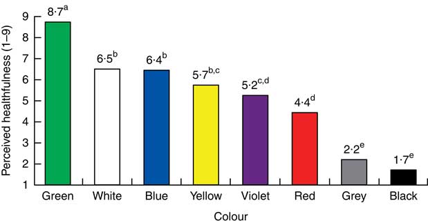
Fig. 1 Perceived healthfulness of coloured circles on a 9-point scale (1=‘unhealthful’, 9=‘very healthful’) in Study 1 completed by Uruguayan adults (n 100) aged 18–60 years. a,b,c,d,eMean values with unlike superscript letters were significantly different (P<0·05)
Based on results of Study 1, two colours were selected for the following studies: black and red. Black was considered as it received the lowest healthfulness score. In addition, although red received a higher healthfulness score, it is commonly used to convey danger associations in traffic signs (e.g. traffic lights, stop sign)( Reference Griffith and Leonard 33 ).
Study 2
In the second study, choice-based conjoint analysis was used to evaluate the influence of three design features of warning signs on perceived healthfulness: colour, shape and textual information. Conjoint analysis has been widely used in marketing research and consumer science for evaluation of the trade-offs that people make when evaluating specific aspects of products( Reference Louviere 49 ). This methodology is based on the evaluation of sets of alternatives selected following an experimental design( Reference Green and Srinivasan 50 ).
Materials and methods
A total of 212 people (18–60 years old, 75 % women) from Montevideo (Uruguay) participated in the study. Participants had middle/high socio-economic status and 95 % had completed high school (12 % had completed technical education and 36 % had a university degree). They were recruited from the consumer database of the research group who authored the study, according to their interest and availability to participate.
Eighteen warnings were designed following an experimental design with the following variables: colour (two levels: red and black), shape (three levels: triangle, triangle on its vertex and octagon) and textual information (three levels: ‘high in sugar’ (‘alto en azúcar’ in Spanish), ‘too much sugar’ (‘demasiada azúcar’ in Spanish) and ‘excess of sugar’ (‘exceso de azúcar’ in Spanish)). Colours were selected based on results from Study 1, whereas the selected shapes have been previously associated with increased risk perception and are commonly used in traffic signs( Reference Fleyeh 28 , Reference Riley, Cochran and Ballard 39 ). Regarding textual information, to simplify the task, focus was placed on one target nutrient (sugar). Three expressions commonly used to convey high content were selected: high in sugar, too much sugar and excess of sugar. Figure 2 shows an example of the warning signs considered in the study.

Fig. 2 Example of the warnings considered in the choice-conjoint task used in Study 2 to evaluate the influence of design features of warnings on perceived healthfulness. The Spanish texts included in the warnings correspond to the following English expressions (from left to right): ‘high in sugar’, ‘excess of sugar’ and ‘too much sugar’
Using the eighteen warning signs, a total of eighteen choice sets composed of two warning signs were generated using the mix-and-match procedure( Reference Johnson, Kanninen and Bingham 51 ). In each set, the two warning signs were placed one next to the other. The position of the warning sign (left or right) within each choice set was randomized across participants. Participants were instructed that they had to evaluate signs to be included on the label of food products. They were presented with the eighteen choice sets, one at a time, following a balanced complete block experimental design (Williams’ Latin square). For each choice set, participants were asked to look at two signs and to select the one they associated with a less healthful product if included on the label of food products. The task was implemented online using Compusense Cloud (Compusense Inc., Guelph, Canada).
Data were analysed using a conditional logit model( Reference McFadden 52 ). The probability of choosing a warning sign as the less healthful was modelled as a function of the design variables (colour, shape and textual information). The part-worth utility of one of the levels of each variable was taken as reference and was scaled to zero to calculate the effect of the other levels. The relative impact of each variable was estimated by calculating partial log-likelihoods, i.e. how much they contributed to the overall log-likelihood of the choice model( Reference Lancsar, Louviere and Flynn 53 ). This calculation was performed by systematically re-estimating a choice model without one of the attributes and recording the associated log-likelihood. The impact of each attribute was estimated as the difference between the log-likelihood of the full and reduced models( Reference Lancsar, Louviere and Flynn 53 ). These analyses were performed using the package support.CEs in R language( Reference Aizaki 54 ).
Results
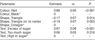
The estimates of the parameters of the conditional logit model are shown in Table 1. As shown, the estimated χ 2 values for likelihood ratio indicated that the three variables had a highly significant effect (P<0·001) on healthfulness perception. The relative importance of colour in the choice model corresponded to 64 %, whereas the relative importance of textual information and shape accounted for 34 and 2 %, respectively. As shown in Table 1, the warning design with the lowest healthfulness perception corresponded to red colour, octagonal shape and the expression ‘excess of sugar’. The two triangular shapes were perceived as less unhealthful than the octagon and did not differ significantly between them. Regarding the textual expressions used to convey product unhealthfulness, ‘excess of’ was perceived as the least healthful, whereas ‘high in sugar’ did not differ significantly from ‘too much sugar’.
Table 1 Estimates of the parameters of the conditional logit model performed on data from the choice-conjoint task in Study 2, about the influence of warning design on perceived healthfulness, completed by Uruguayan adults (n 212) aged 18–60 years
* The part-worth utility of one of the levels of each variable was taken as reference and was scaled to zero to calculate the effect of the other levels.
Study 3
The third study aimed to evaluate the implicit associations of two design features of warnings (colour and shape) on perceived healthfulness using an implicit association test. Implicit associations refer to associations stored in long-term memory that can influence our behaviour without conscious awareness( Reference Greenwald and Banaji 55 ). The implicit association test is a computer-based response-time test that measures the strength of associations between target concepts and categories( Reference Greenwald, McGhee and Schwartz 56 ). In this case, the strength of the association between healthfulness and two colours (red and black) and two shapes (octagon and triangle) were evaluated. The colours and shapes were selected based on results from Studies 1 and 2.
Materials and methods
The study was carried out with eighty-eight participants (18–63 years old, 59 % women) from Montevideo (Uruguay), recruited among students and workers of the School of Psychology, Universidad de la República, Uruguay based on their availability and interest to participate. All participants had completed high school and had medium/high socio-economic income.
Two words related to healthfulness were considered, ‘healthful’ and ‘unhealthful’ (‘saludable’ and ‘no saludable’ in Spanish, respectively), which were assigned to different colours (red and black) and shapes (octagon and triangle). As a result, these gave two combinations of words and colour (‘healthful’ in black v. ‘unhealthful’ in red, and ‘healthful’ in red v. ‘unhealthful’ in black) and two combinations of words and shapes (‘healthful’ within an octagon v. ‘unhealthful’ within a triangle, and ‘healthful’ within a triangle and ‘unhealthful’ within an octagon).
Participants had to sit in front of a notebook computer and were asked to complete the test as rapidly and accurately as possible. At the beginning of each block of trials, written instructions were presented on the screen. In each block, one stimulus (i.e. combination of word and colour or word and shape) was assigned to either the left or right response key, while the other stimulus was assigned to the other response key. Pictures of food were presented on the centre of the screen and participants were asked to classify them as healthful or unhealthful by pressing the appropriate key. A total of eight pictures were considered, four corresponding to unhealthful foods (cookies, French fries, milk chocolate and alfajor – a traditional Uruguayan sweet snack) and four to healthful foods (kiwi, apple, avocado and orange). The pictures were used to represent the concept of healthful and unhealthful foods and were selected based on results from a previous unpublished study in which participants were asked to classify food pictures as healthful or unhealthful. The pictures selected for the present work were classified as healthful or unhealthful by more than 80 % of the participants. Each picture was presented in duplicate. The order in which participants completed the blocks of trials, as well as the order in which pictures were presented, were randomized. Four pictures were used (whole bread, granola, chocolate-covered chocolate cake, peanuts) for practice before each of the blocks. No error feedback was given. The test was implemented in PsychoPy( Reference Peirce 57 ). Figure 3 shows an example of two of the screenshots of the test.
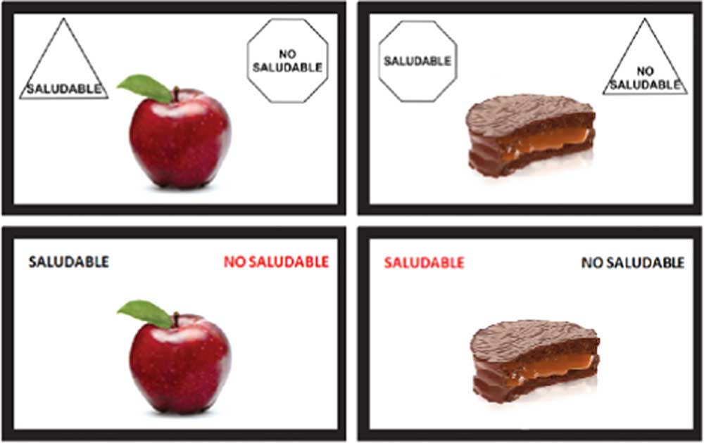
Fig. 3 Two of the screenshots of the implicit association test used in Study 3 for evaluating the association between colours (red and black) and the concept of health (bottom), and between shapes (octagon and triangle) and the concept of health (top)
In the implicit association test, the strength of the association between concepts is measured as the difference in response times in the two experimental conditions( Reference Greenwald, McGhee and Schwartz 56 ). In the present work, the association between healthfulness and the two colours was evaluated by comparing the average response times from all the trials in which participants classified food pictures as healthful or unhealthful when the response keys were associated with ‘unhealthful’/black and ‘healthful’/red and the average response times from all trials in which the response keys had the opposite association (‘unhealthful’/red and ‘healthful’/black). The same procedure was used to evaluate the association between the concept of healthfulness and the two shapes (octagon and triangle). Response times lower than 250 ms or higher than 2000 ms were considered outliers and were excluded from further analysis (1·2 % of the data)( Reference Veldhuizen, Oosterhoff and Kroeze 58 ). After exclusion of outliers, ANOVA was used to compare log-transformed response times in the two experimental conditions for each type of association (colour and shape). Condition was used as fixed source of variation, whereas participant was considered a random effect. A 5 % significance level was considered.
Results
Figure 4 shows average response times across participants in the implicit association test developed to evaluate implicit associations between colour, shape and perceived healthfulness. For ease of interpretation, average untransformed response times are discussed. ANOVA showed significant differences (P=0·006) between the response times obtained in the two experimental conditions in the blocks in which the association between shape and healthfulness was assessed. Participants needed less time to respond when the word ‘unhealthful’ was paired with the octagon (and ‘healthful’ with the triangle) compared with the experimental condition in which ‘unhealthful’ was paired with the triangle (and ‘healthful’ with the octagon): 746 v. 723 ms. This result indicates that the octagon has a stronger implicit association with unhealthfulness than the triangle.
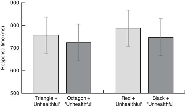
Fig. 4 Average response times (in ms) for trials in Study 4 with different combinations of words and shape (left) and words and colour (right) in the implicit association test* completed by Uruguayan adults (n 88) aged 18–63 years. Values are means with their standard deviations represented by vertical bars. *The figure shows the shapes and colours associated with the word ‘unhealthful’. The word ‘healthful’ was associated with the opposite shape or colour
Regarding colour, a significant difference between the experimental conditions was found (P=0·002). Participants responded significantly quicker when ‘unhealthful’ was black (and ‘healthful’ was red) compared with when the opposite pairing was considered: 786 v. 755 ms, which indicates a stronger implicit association between black colour and unhealthfulness compared with red.
Study 4
The influence of colour on the attentional capture of the warning signs was evaluated using two visual search tasks( Reference Bialkova and van Trijp 59 ). Participants were presented with sets of one and three labels on a computer screen and were asked to indicate whether labels with high salt content were present or absent.
Materials and methods
A total of thirty-five participants (eighteen males and seventeen females, age ranging from 18 to 50 years) from Montevideo (Uruguay) took part in the study. Participants were recruited from the consumer database of the research group who authored the study, based on their interest and availability to participate. All participants had normal or corrected-to-normal vision and full colour vision. Visual search tasks usually involve a small number of participants as they rely on fundamental attentional processes that are not expected to be largely influenced by individual differences( Reference Treisman and Gelade 60 ). The number of participants included in the present study was larger than the minimum sample size required according to power size calculations and larger than the number of participants included in several recent studies employing the visual search paradigm( Reference Bialkova and van Trijp 59 , Reference Bialkova, Grunert and van Trijp 61 – Reference Kovach and Adolphs 63 ).
Labels of different product categories (crackers, hamburgers, lasagne, chicken nuggets, fish nuggets, pan bread and instant soup) with three different graphic designs were used in the study. The labels were specially designed for the purposes of the study. For each label, two alternatives were considered: one with high salt content that included a warning, and another with low/medium salt content that did not include the warning. Octagonal warnings of two different colours were included, black and red, which contained the expression ‘high in salt’. The coloured octagon was surrounded by a white area to increase its saliency, as specified by Chilean regulations( 15 ). The design of the warning is presented in Fig. 5.
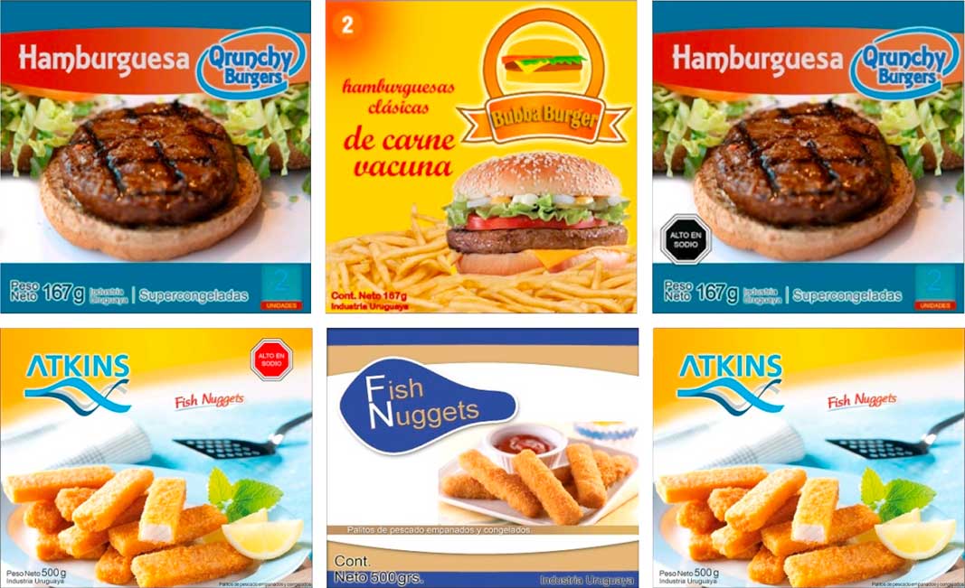
Fig. 5 Examples of two sets of three labels presented in the visual search task of Study 4 to evaluate the influence of colour (black and red) on the attentional capture of warnings
Participants completed two tasks, one consisting of individual labels and the other consisting of series of three labels of the same product category. In the first task, participants had to evaluate individual labels which could include the warning or not. In the latter, two types of series of three labels were created based on the presence or absence of a label with a warning indicating high salt content. To avoid consumer familiarization, within each series the label position on the screen was randomized. An example of one of the sets of labels is presented in Fig. 5.
The experimental session consisted of two blocks of trials: one for each type of warning (black and red). Each block consisted of a total of ninety-one trials and four dummy trials to familiarize participants with the task. Among the ninety-one trials of the experimental design, thirty-one consisted of individual labels, whereas the other sixty trials consisted of series of three labels. Trials were presented on a personal computer screen using the Direct RT software( Reference Jarvis 64 ). A Williams’ Latin square experimental design was used for trials’ presentation within each condition (single or series of three labels). Trials were displayed (one by one) until participants pressed a key to respond. During the task, participants were asked to indicate if there was any label with a warning sign for high sodium content on the screen by pressing the S key to respond ‘yes’ (‘sí’ in Spanish) and the N key to respond ‘no’. Participants were requested to respond as fast and accurately as they could. Participants’ responses as well as their response time were registered using the software. A 5 min break took place between blocks.
Participants’ response time and type of response (true v. false) were registered. Response times associated with incorrect answers as well as response times shorter or longer than 3 sd on an individual’s mean within each task were not considered for further analysis (2 % of the responses). ANOVA was performed on response times considering warning colour as fixed source of variation and participant as random effect. A significance level of 5 % was considered.
Results
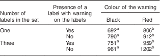
Participants’ ability to identify a label with a warning sign was evaluated using two tasks, involving the detection of the warning on sets of one and three labels. Lower response times were related with higher difficulty to find the warning and therefore lower attentional capture. As shown in Table 2, the time needed by participants to respond was significantly shorter when the black warnings were included on the labels compared with red warnings, regardless of the number of labels in the set. This result was observed for both sets of labels that included the warning and sets that did not include any label with warnings. The difference between black and red labels ranged between 112 and 241 ms, depending on the number and characteristics of the sets of labels (Table 2).
Table 2 Average response times (in ms) in the visual search task of Study 4, containing groups of one or three labels for trials with and without warning signs of different colour, completed by Uruguayan adults (n 35) aged 18–50 years
a,bMean values within a row with unlike superscript letters were significantly different according to Tukey’s test (P<0·05).
Study 5
The last study evaluated the influence of the size and position of warnings on the labels on attentional capture using a visual search task. Participants were presented with labels on a computer screen and were asked to indicate whether labels included a warning sign.
Materials and methods
A total of sixty-one participants (thirty-two males and twenty-nine females, age ranging from 18 to 53 years, medium/high socio-economic level) from Montevideo (Uruguay) took part in the study. Participants were recruited from the consumer database of the research group who authored the study, based on their interest and availability to participate. All participants had completed secondary school and had normal or corrected-to-normal vision and full colour vision. The number of participants included in Study 5 was justified by common practice in studies involving visual search tasks( Reference Bialkova and van Trijp 59 – Reference Kovach and Adolphs 63 ) and was higher than the minimum sample size estimated using sample size calculations.
Labels of three of the product categories included in Study 4 (crackers, chicken nuggets and pan bread) were used in Study 5. For each product, labels of two sizes were considered: 45 cm2 and 152 cm2. Octagonal black warnings with the expression ‘high in salt’ were included on the labels at four different positions: top left, top right, bottom left and bottom right. In addition, for each label size, warnings of three sizes were considered: 1·0 cm×1·0 cm, 1·5 cm×1·5 cm and 2·0 cm×2·0 cm for 45 cm2 labels and 2·0 cm×2·0 cm, 2·5 cm×2·5 cm and 3·0 cm×3·0 cm for 152 cm2 labels. Thus, a total of seventy-two labels with warnings were considered (three products×two label sizes×four warning positions×three warning sizes), plus six labels without warnings (three products×two label sizes).
Participants completed a visual search in which they were presented with labels and had to indicate if they contained a warning sign or not. During the task, participants were asked to indicate if there was any label with high sodium content on the screen by pressing the S key to respond ‘yes’ (‘sí’ in Spanish) and the N key to respond ‘no’. Participants were requested to respond as fast and accurately as they could. The task comprised a total of ninety trials, corresponding to the seventy-two labels with warnings and the eighteen labels without warnings (each of the six labels without warnings was presented in triplicate). Labels were presented following a Williams’ Latin square design on a personal computer screen using the Direct RT software( Reference Jarvis 64 ).
ANOVA was carried out separately on response times for each label size considering product, warning position, warning size and their interaction as fixed sources of variation. Response times associated with incorrect answers as well as response times shorter or longer than 2 sd on an individual’s mean within each task were not considered for further analysis (2 % of the responses). A significance level of 5 % was considered.
Results
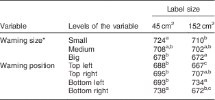
Participants’ ability to identify a label with a warning sign was significantly influenced by warning size and position (P<0·05), regardless of label size. As shown in Table 3, the time needed by participants to respond decreased significantly with increasing warning size. Medium and large warnings did not differ significantly in their attentional capture.
Table 3 Average response times (in ms) in the visual search task of Study 5, with labels of different size featuring warnings of different size and located in different positions of the label, completed by Uruguayan adults (n 61) aged 18–53 years
a,b,cMean values for levels of a variable within a column with unlike superscript letters were significantly different according to Tukey’s test (P<0·05).
* The size of the warnings varied with label size. For labels 45 cm2, warning size corresponded to 1·0 cm×1·0 cm (small), 1·5 cm×1·5 cm (medium) and 2·0 cm×2·0 cm (big). For labels of 152 cm2, warning size corresponded to 2·0 cm×2·0 cm (small), 2·5 cm×2·5 cm (medium) and 3·0 cm×3·0 cm (big).
The influence of warning position on response times in the visual search task depended on the size of the labels (Table 3). For labels of 152 cm2, the shortest response times were found when the warning signs were located on the top left and bottom right positions. Meanwhile, for labels of 45 cm2, response times differed significantly only when the warning signs were located on the bottom right position, showing the longest average response time. Therefore, warning signs located on the top left position showed one of the shortest average response times regardless of label size (Table 3).
Discussion
Warnings have been proposed in the public health literature as a way to communicate the risks associated with consumption of specific products, such as tobacco, alcohol and sweetened beverages, and, in turn, enable consumers to make informed choices( Reference Hammond 16 , Reference Wilkinson and Room 17 , Reference Roberto, Wong and Musicus 65 , Reference VanEpps and Roberto 66 ). In addition, warnings have been recently implemented as a directive FOP nutrition information scheme to facilitate the identification of unhealthful products with high energy, sugar, fat and sodium content( Reference Corvalán, Reyes and Garmendia 14 , 15 ). This scheme has been reported to be superior to the GDA and the traffic-light systems in terms of goal-directed attentional capture, ability to decrease healthfulness perception of products with high sugar, fat and sodium content, and to discourage choice of unhealthful products( Reference Arrúa, Machín and Curutchet 21 , Reference Arrúa, Curutchet and Rey 22 ). The potential of warnings to foster changes in eating patterns has been highlighted by preliminary studies conducted one year after their compulsory implementation in Chile( Reference Valdebenito Verdugo and Labrín Elgueta 19 , Reference Orellana 20 ).
The effectiveness of warnings depends on their ability to catch consumers’ attention and clearly communicate their key message( Reference Laughery, Young and Vaubel 26 ). The design of warning signs plays a key role in increasing the likelihood of consumers taking them into account when making their food choices( Reference Mazis and Morris 30 ). In this context, the present study evaluated the influence of design features of warning signs on consumers’ perceived healthfulness and attentional capture.
Colours have been shown to have strong healthfulness associations( Reference Braun and Silver 31 ). Results from Study 1 showed that black and grey were the colours with the strongest association with unhealthfulness, followed by red and violet. In addition, in Study 3 black showed a stronger implicit association with unhealthfulness than red, in agreement with previous studies that reported that black colour was associated with the words ‘fatal’ and ‘poison’( Reference Chapanis 67 ), as well as with the concepts of dirt and toxicity( Reference Siu, Lam and Wong 36 ). Colour was the most important design feature influencing perceived healthfulness of warnings in Study 2, red being significantly more associated with an unhealthful product than black. Therefore, although black had a stronger implicit association with unhealthfulness than red, the opposite trend was found in the context of warning signs. This result suggests an interaction effect between shape and colour, which may be explained by learned associations through repeated exposure to warning signs, as red signs are frequently included in traffic signs to convey danger or risk (i.e. STOP traffic sign)( Reference Fleyeh 28 ). Further research should investigate the influence of interaction effects between shape and colour on healthfulness perception of warning signs.
Regarding the influence of colour on the attentional capture of the warnings, results from Study 4 showed that black signs were easier to find on labels than red signs. Contradictory results on the influence of colour on the attentional capture of logos have been reported in the literature. Braun and Silver reported that black increased the perceived saliency of warnings compared with red( Reference Braun and Silver 31 ). Similarly, Bialkova and van Trijp reported that the attentional capture of monochromatic directive FOP nutrition labelling schemes (choice logos) was higher compared with polychromatic logos( Reference Bialkova and van Trijp 59 ). On the contrary, Young( Reference Young 37 ) and Laughery et al.( Reference Laughery, Young and Vaubel 26 ) found that red warning labels were more noticeable than black labels. These contradictory results may be explained considering that the attentional capture of warnings strongly depends on the graphic design of the labels on which they are included, particularly their colour and label clutter( Reference Mazis and Morris 30 ). In this sense, one of the strengths of the present study was that labels with different background design were considered in the visual search task and, consequently, average response times considered part of the heterogeneity of food labels available in the marketplace. In addition, it should be taken into account that in the present study warnings were surrounded by a white area that could have increased their attentional capture. This strategy may increase the attentional capture of warning signs regardless of the graphic design of the labels. However, further research in this respect is necessary to confirm this observation.
The influence of colour on healthfulness perception suggests that policy makers should specify the colour of warnings. Results from the studies included in the present work suggest that black seems to be the best colour for nutrition warnings given its superior attentional capture and its implicit association with the concept of unhealthfulness, even if the red octagon was perceived as more unhealthful than the black octagon. This colour has been selected by Chilean authorities for the warnings included in the FOP nutrition labelling scheme( 15 ). However, warning labels recently proposed in the USA for inclusion on sugar-sweetened beverages are required only to be conspicuously included on the front of the package( 68 , 69 ).
Although shaped borders are used inconsistently across warning systems( Reference Dewar 40 ), in the present work the octagonal shape was consistently more associated with the concept of unhealthfulness than the triangle or the triangle on its vertex. This association may be explained by the learned association between octagonal shape and the concept of danger through repeated exposure to the STOP traffic sign. On the contrary, in the context of hazard perception, the triangle on its vertex has been reported to perceived as more dangerous than the octagon( Reference Riley, Cochran and Ballard 39 ). These results support Chilean regulations, which specify that FOP nutrition warnings should have an octagonal shape( 15 ).
Textual information included on the labels also influenced healthfulness perception. Warnings containing the expression ‘excess of...’ for referring to unhealthful products were perceived as less healthful than those containing the expressions ‘high in...’ or ‘too much...’. The concept of excessive amounts of key nutrients (sodium, free sugars, total fat, saturated fat and/or trans-fat) to identify products with unfavourable nutrient profile is included in the Nutrient Profile Model of the Pan American Health Organization( 42 ). Although this expression was preferred by Chilean authorities( Reference Corvalán, Reyes and Garmendia 14 , Reference Marín Reboledo 46 ), their current law specifies that nutrition warnings should include the expression ‘high in...’( 15 ).
The ability of warnings to rapidly catch attention can increase the likelihood of consumers taking them into account when making their food choices( Reference Wogalter, Dejoy and Laughery 24 ). In this sense, the size and position of the warnings on the labels are expected to have a large influence on attentional capture. Results from Study 5 showed that the size and position of the warnings on the labels significantly influenced the time needed by participants to identify a warning on the label. This suggests that policy makers should introduce compulsory requirements for these features in their regulations. Chilean regulations do not specify a compulsory location but suggest that warnings should be included on the upper right position of the labels( 15 ). However, results from the present work suggest that the upper left position should be preferred as it tended to have higher attentional capture, particularly in the case of the bigger labels. These results are in agreement with those reported by Graham and Jeffery( Reference Graham and Jeffery 48 ) and can be explained by the usual way of reading (from left to right) in occidental countries. Regarding warning size, attentional capture increased with increasing warning size, as expected. These results support the warning sizes included in Chilean regulations for labels of 45 and 152 cm2 ( 15 ).
In closing, the limitations of the present work should be highlighted. First, all studies were conducted in one country with a non-representative consumer population. Therefore, results may not be generalizable to other countries around the world. However, it is important to highlight that most of the results reported in the present work are based on learned associations from warning signs that are internationally uniform, such as the STOP sign( 27 ). Besides, results from the visual search tasks are based on fundamental attentional processes that are not largely influenced by individual characteristics( Reference Treisman and Gelade 60 ). Second, in the present study interaction effects between colour and shape were not studied. Further research should evaluate healthfulness perception of warning signs with different shapes and colours. Finally, the effect of warnings on consumers’ healthfulness perception of food products was not evaluated. All the studies focused on the comparative evaluation of warnings with different design features. Therefore, conclusions are not expected to be influenced by the perception of specific food products or nutrients. In this sense, further research should focus on the effect of warnings on healthfulness perception of different products with excessive content of different nutrients. Although preliminary evidence of the effectiveness of warnings exists( Reference Valdebenito Verdugo and Labrín Elgueta 19 – Reference Arrúa, Curutchet and Rey 22 , Reference Roberto, Wong and Musicus 65 , Reference VanEpps and Roberto 66 ), further research on their effect on consumers’ food choices is needed. In particular, it remains unclear how consumers react to the inclusion of nutrition warnings on the package of their usual products. A more in-depth exploration of changes in consumer behaviour caused by the implementation of nutrition warnings can provide relevant information regarding the effectiveness of warnings as a public policy aimed at shifting eating patterns.
Conclusions
Results from the experiments included in the present work provide recommendations for the design of warnings to identify products with unfavourable nutrient profile. Warning signs with octagonal-shaped borders including the expression ‘excess of...’ have the potential to maximize consumer unhealthfulness perception. Regarding colour, black octagons seem to be the best choice due to their high attentional capture. This design is similar to the one recently implemented in Chile, which differs only in the textual expression included in the warnings (‘high in...’)( 15 ). Recommendations for the selection of warning size and position on the labels for maximizing attentional capture were also generated. Policy makers are advised to specify compulsory design features of nutrition warnings in their regulations. Warning design based on consumer healthfulness perception and attentional capture have the potential to contribute to increasing the effectiveness of this type of public policy aimed at encouraging consumers to make more healthful choices.
Acknowledgements
Financial support: The authors are grateful to Comisión Sectorial de Investigación Científica and Espacio Interdisciplinario (Universidad de la República, Uruguay) for financial support. The funders had no role in the design, analysis or writing of this article. Conflict of interest: None. Authorship: All authors contributed to the development of the research. M.C., L.M., A.A. and L.A. carried out data collection. G.A., L.A. and L.M. analysed the data and wrote the paper. Ethics of human subject participation: This study was conducted according to the guidelines laid down in the Declaration of Helsinki and all procedures involving human subjects were approved by the Ethics Committee of the School of Chemistry of Universidad de la República (Uruguay). Written informed consent was obtained from all participants and formally recorded.


