


For oral presentations at technical conferences, slides are just as important as the speech itself. Making informational and easy-to-read slides is a critical skill for researchers. While preparing my slides for my first conference in graduate school, I realized that creating slides is much more than copying and pasting figures and adding text. To help fellow researchers make better slides, I would like to share six lessons that I acquired during my graduate school years.
1. Use consistent and correct formatting
To some, the formatting of slides may appear to be a purely aesthetic issue. However, consistent formatting conveys a sense of organization, attention to detail, and professionalism. Take time to align images, unify font type and font size, and double-check grammar, punctuation, and word capitalization. Typos and minor mistakes distract the audience from the content. (It is human nature to look for more typos after seeing one.) Additionally, black text on white backgrounds (with red text for highlighting) is the easiest for the audience to read. I recommend a sans-serif font (e.g., Calibri, Arial) no smaller than 18 points, so the audience at the back of the room can read the text easily.
(a) This slide needs better formatting. (b) Consistent formatting creates a professional look.
2. Use verbs to make titles more meaningful
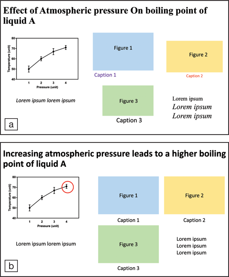
A slide title usually has the largest font size and instantly grabs the audience's attention. A simple title such as “Effect of atmospheric pressure on boiling point of liquid A” is straightforward and technically correct. However, such a title wastes limited slide space and provides little information. Instead, use a complete sentence in active voice: “Increasing atmospheric pressure leads to a higher boiling point of liquid A.” This new title is informational and captures the essence of the slide. The rest of the slide can describe the experimental procedure, show plots, and present detailed conclusions.
3. Use widescreen slides
A widescreen 16:9 slide can accommodate more material than a standard 4:3 one. With more content on one slide, the speaker can display more context. For example, on each page describing results, there could be a photo of the experimental apparatus or a list of parameters on the side to remind the audience.
4. Include only necessary figures
Including more figures does not necessarily improve the audience's understanding. The figures that are not being discussed in the oral presentation should be removed. I have seen many slides that showed a cluster of six or more figures in one slide, and the speaker only mentioned one in the talk. The unmentioned figures include too many details and distract the audience from the talk.
5. Do not use unnecessary animations
Although animations may seemingly make a presentation more interesting or creative, they often end up being risky and distracting. Think twice before adding a line of text that flies in or a figure that bounces. If an animation is not essential to the presentation, it is merely a distraction and may even be a recipe for disaster. A malfunctioning animation may not ruin the presentation, but it certainly puts pressure on the speaker and may confuse the audience. When presenting information sequentially, use two slides instead of using animation in one slide. For example, the first slide could ask a question to spark interest from the audience, and the next slide could have both the question and answers. Simply click to move onto the second slide, rather than using an “appearing” effect.
6. Show the conclusion slide during the Q&A session
After concluding the talk and making the proper acknowledgments, show the conclusion slide again for the Q&A session. If the speaker does not refer back to the slides to help answer questions, this conclusion page will be displayed for three to five minutes. Everyone in the audience can benefit. Some may identify a question to discuss with the speaker. Members of the audience who are not interested in the questions of others can read the conclusions again for their own gain. This conclusion page provides take-home messages for the audience.
For me, creating informational presentations has not come naturally. It took six oral presentations at international technical conferences in seven years to practice and hone my skills. Presenting at a conference is a valuable opportunity to practice one's own skills, learn from great presenters, and observe mistakes to avoid. It's important to note that my lessons here are only for reference and may not apply to every situation. For example, some conferences may allow only standard 4:3 slides for compatibility with the projectors and screens. Although my tips are not universal, the goal of pres-entation slides remains unchanged: provide just the right amount of information in a precise and clean way so that the audience can learn as much as possible.
