Article contents
Race and the Territorial Imaginary: Reckoning with the Demographic Cartography of the United States
Published online by Cambridge University Press: 21 December 2020
Abstract

- Type
- Photoarticle
- Information
- Copyright
- Copyright © The Author(s) 2020. Published by Cambridge University Press
Footnotes
For their constructive comments and encouragement of image-driven argument, I thank Brooke Blower, Daniel Immerwahr, and the journal's three anonymous reviewers.
References
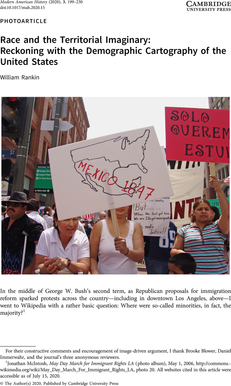
1 Jonathan McIntosh, May Day March for Immigrant Rights LA (photo album), May 1, 2006, http://commons.wikimedia.org/wiki/May_Day_March_For_Immigrant_Rights_LA, photo 20. All websites cited in this article were accessible as of July 15, 2020.
2 Both the 2000 and 2010 censuses asked if a respondent was Hispanic, Latino, or Spanish. Census publications for 2000 used “Hispanic” almost exclusively, while 2010 publications more frequently used “Hispanic or Latino.” Map from Trudy A. Suchan, Marc J. Perry, James D. Fitzsimmons, Anika Juhn, Alex Tait, and Cynthia Brewer, Census Atlas of the United States (Washington, DC, 2007), 33. The maps on Wikipedia in 2006 were taken from the multiagency “National Atlas” online, which used graphics similar to the Census atlas released the next year. The first Census maps for 2000 were released in 2001, also with similar graphics. I use a 2007 Census map here for clarity. The online National Atlas was created in 1997 and discontinued in 2014.
3 Census categories are famously problematic. In particular, the census defines Hispanic as an “ethnicity,” while the other categories are “races.” Respondents are asked to self-identify using both terms. In 2000, confusion over the distinction led 42 percent of Hispanic/Latino Americans to racially self-identify as “some other race.”
4 My first maps used census tracts for the 48 contiguous states. I later posted new maps using zip codes for all inhabited U.S. territory. In hindsight, I'd say that the data classes are somewhat too coarse, especially “5–50%.”
5 Comments from Martial Law and Kasreyn on “Talk: 2006 United States Immigration Reform Protests,” Wikipedia, May 3 and May 5, 2006, http://en.wikipedia.org/wiki/Talk:2006_United_States_immigration_reform_protests?#Wow. The specific webpages referenced here no longer seem to be online.
6 Incog Man, “The Real Immigration Deal,” likely May 2008, http://incogman.net/the-real-immigration-deal. This site is now offline, but the page is available through archive.org (earliest capture Jan. 25, 2012).
7 On the 2000 census, 52 percent of Hispanic Americans reported Mexican as their “specific origin.” (Official Census reports gave a value of 58 percent, but this excludes Puerto Rico.) In Census data from 2012–2016, the value for the United States as a whole had increased to 59 percent.
8 Schulten, Susan, “The Cartography of Slavery and the Authority of Statistics,” Civil War History 56, no. 1 (Mar. 2010): 5–32CrossRefGoogle Scholar. The map was produced at the U.S. Coast Survey and Schulten attributes it to the draftsman, Erwin Hergesheimer. New evidence shows that the author was in fact the more prominent William Ricketts Palmer. See William Rankin, Radical Cartography: Visual Argument in the Age of Data (New York, forthcoming).
9 Gannett, Henry, Statistical Atlas of the United States Based upon Results of the Eleventh Census (Washington, DC, 1898)Google Scholar, plates 10–11, compare to plate 6. I use “immigrants” to include whites of foreign parentage.
10 William Rankin, “The Visual Epistemology of Population and the Politics of Blobs and Dots After 1919,” in Redrawing the World: 1919 and the History of Cartography, ed. Peter Nekola (Chicago, forthcoming).
11 E. A. Goldenweiser in O. E. Baker, ed., Atlas of American Agriculture (Washington, DC, 1917–1935). The report on population was published Aug. 1, 1919, but it was not included in the final atlas of 1936.
12 Charles O. Paullin, Atlas of the Historical Geography of the United States (Washington, DC, 1932); Scott Nesbit, “Let's Look for the Great Migration,” Farther Afield: Thoughts on Historical Maps and Mapmaking, Feb. 7, 2014, http://dsl.richmond.edu/fartherafield/lets-look-for-the-great-migration.
13 U.S. Bureau of the Census, Fifteenth Census of the United States: 1930; Population, vol. 2, General Report; Statistics by Subjects (Washington, DC, 1933), 27. For native-born whites the value was 58 percent; for whites of mixed native and foreign parentage it was 73 percent. “Urban” was defined as any town over 2,500. From Table 23 (ibid., 67–73), we can calculate that 53 percent of foreign-born whites lived in cities over 100,000.
14 Emmanuel de Martonne, ed., Travaux du comité d'études, Tome II: Questions européennes […] Atlas (Paris, 1919); Emmanuel de Martonne, “Essai de carte ethnographique des pays roumains,” Annales de géographie 158 (15 mars 1920): 81–98; Gilles Palsky, “Emmanuel de Martonne and the Ethnographical Cartography of Central Europe (1917–1920),” Imago Mundi 54, no. 1 (2002): 111–9. See also Jeremy Crampton, “The Cartographic Calculation of Space: Race Mapping and the Balkans at the Paris Peace Conference of 1919,” Social & Cultural Geography 7, no. 5 (2006): 731–52; and Guntram Henrik Herb, Under the Map of Germany: Nationalism and Propaganda, 1918–1945 (New York, 1996).
15 John K. Wright, “Problems in Population Mapping,” in Notes on Statistical Mapping, With Special Reference to the Mapping of Population Phenomena, ed. John K. Wright (New York, 1938), 7.
16 See Fifteenth Census of the United States, Table 24. I have used Wright's own data breaks from the Historical Atlas, except for the additional demographic break at 3 percent.
17 U.S. Geological Survey, The National Atlas of the United States of America (Washington, DC, 1970), 255–8.
18 The census started collecting data on (some) American Indians in 1870 and on Chinese and Japanese populations in 1880, but at the time these groups never seem to have been mapped at all. Mexicans were counted in 1930, and Hispanic surnames were tabulated in 1960, but it wasn't until the 1970 census—after the preparation of the National Atlas—that something like today's Hispanic/Latino category was created.
19 American Indians and Alaska Natives were also shown in cities, using the same graphics. Suchan et al., Census Atlas of the United States, 39.
20 Before the 1960s, the term cartogram referred to a much broader array of statistical maps. For brief historical overviews, see Daniel Dorling, “Area Cartograms: Their Use and Creation,” Concepts and Techniques in Modern Geography 59 (Bristol, UK, 1996); Waldo Tobler, “Thirty-Five Years of Computer Cartograms,” Annals of the Association of American Geographers 94, no. 1 (Mar. 2004): 58–73; and Sabrina Nusrat and Stephen Kobourov, “The State of the Art in Cartograms,” Computer Graphics Forum 35 (June 2016): 619–42.
21 Guy-Harold Smith, “Changed Political Map Awaits Census of 1930,” New York Times, Feb. 17, 1929, 17. Smith was a geographer at Ohio State known for his dot-and-sphere population maps. The Post map is “Grundy's Map of the United States,” Nov. 3, 1929, in Tobler, “Thirty-Five Years of Computer Cartograms,” 59; I cannot locate the original. See also W. E. B. Du Bois, Color and Democracy: Colonies and Peace (New York, 1945), 89, which distorts regions according to congressional representatives per capita.
22 For this and other examples, see Willard C. Brinton, Graphic Presentation (New York, 1939), 238–42.
23 “Truman Sweeps; The Election Returns: A Mathematical Map,” New York Times, Nov. 7, 1948, E1. For clarity, large map taken from David Greenhood, Down to Earth: Mapping for Everybody (New York, 1951), 236.
24 Chauncy D. Harris and George B. McDowell, “Distorted Maps, a Teaching Device,” Journal of Geography 54, no. 6 (Sept. 1955): 286. This map was paired with one that scaled states according to the number of tractors, but this “farm view” did not make “cities disappear” as the authors claimed; it just made it impossible to compare urban and rural at all, and the overall emphasis was still on the Midwest. Both maps originally published in Chauncy D. Harris, “The Market as a Factor in the Localization of Industry in the United States,” Annals of the Association of American Geographers 44, no. 4 (Dec. 1954): 315–48.
25 W. S. Woytinsky and E. S. Woytinsky, World Population and Production: Trends and Outlook (New York, 1953), 1008–9.
26 Ibid., 88. The map was paired with one for immigrants that contradicted the text even more severely.
27 Matthew E. Levison and William Haddon, Jr., “The Area Adjusted Map: An Epidemiologic Device,” Public Health Reports 80, no. 1 (Jan. 1965): 55–9. This was not the first health cartogram, but an earlier example for Iowa in 1926 did not gain much traction, and cartogram-like diagrams for Scotland in 1962 were very abstract. See J. W. Wallace, “Population Map for Health Officers,” American Journal of Public Health 16, no. 10 (1926): 1023, and I. N. Sutherland, “Representations of National, Regional, and Local Statistics,” British Journal of Preventive and Social Medicine 16, no. 1 (Jan. 1962): 30–9.
28 T. H. Hollingsworth, “The Political Colour of Britain by Numbers of Voters,” The Times, Oct. 19, 1964, 18.
29 Cover of Paris Match, Mar. 11, 1967. For clarity, cartogram from Arthur Lockwood, Diagrams: A Visual Survey of Graphs, Maps, Charts and Diagrams for the Graphic Designer (London, 1969), 97.
30 Colin A. Hughes and E. E. Savage, “The 1955 Federal Redistribution,” The Australian Journal of Politics and History 13, no. 1 (May 1967): 8–20, map on 20.
31 L. Skoda and J. C. Robertson, Isodemographic Map of Canada (Ottawa, 1972), facing 2.
32 A. S. Härö, “Area Cartogram of the SMSA Population of the United States,” Annals of the Association of American Geographers 58, no. 3 (Sept. 1968): 452–60.
33 John M. Hunter and Melinda S. Meade, “Population Models in the High School,” Journal of Geography 70, no. 2 (1971): 96, 99.
34 Ibid., 100, 95.
35 Waldo Tobler, “A Continuous Transformation Useful for Districting,” Annals of the New York Academy of Sciences 219, no. 1 (1973): 215–20.
36 “Running Out of Food?” Newsweek, Nov. 11, 1974, 58; “The Big Sweep: What Now?” Newsweek, Nov. 18, 1974, 26. Both were drawn by the graphics firm of Fenga & Freyer.
37 Michael Gastner, Cosma Shalizi, and Mark Newman, “Maps and Cartograms of the 2004 US Presidential Election Results,” Nov. 6, 2004, http://www-personal.umich.edu/~mejn/election/2004; Gastner, Michael T. and Newman, M. E. J., “Diffusion-Based Method for Producing Density-Equalizing Maps,” Proceedings of the National Academy of Sciences 101, no. 20 (May 18, 2004): 7499–504CrossRefGoogle ScholarPubMed.
38 M. E. J. Newman, “Images of the Social and Economic World,” Feb. 16, 2006, http://www-personal.umich.edu/~mejn/cartograms. The Worldmapper site also dates from 2006, led by Danny Dorling (see http://archive.worldmapper.org/about_us.html). The book is Daniel Dorling, Mark Newman, and Anna Barford, The Atlas of the Real World: Mapping the Way We Live (London, 2008).
39 The diameter of each circle is proportional to population raised to the power of 0.24. There's nothing magical about this exponent, and other values will work better for different scales and different datasets. A “pure” scaling would use an exponent of 0.5; Flannery's perceptual exponent is 0.5716. But my goal is not accuracy in the psychophysical sense of quantitative estimation, but in the humanistic sense of qualitative representation. See James Flannery, “The Graduated Circle: A Description, Analysis, and Evaluation of a Quantitative Map Symbol” (Ph.D. diss., University of Wisconsin Madison, 1956).
40 On a map of white Americans as percent of total, American Indian reservations and trust lands are also obvious. A map of white population density is hard to distinguish from a map of overall population density.
41 Rankin, William, “How the Visual Is Spatial: Contemporary Spatial History, Neo-Marxism, and the Ghost of Braudel,” History and Theory 59, no. 3 (Sept. 2020): 311–42CrossRefGoogle Scholar; Bertin, Jacques, Semiology of Graphics [1967; trans. 1983] (Redlands, CA, 2010)Google Scholar.
42 I published a racial dot map of Chicago in Bill Rankin, “Cartography and the Reality of Boundaries,” Perspecta 42 (Spring 2010): 42–5, which I also posted (Apr. 25, 2010) at http://radicalcartography.net/chicagodots.html. I published maps of other cities in William Rankin, “Urban Legends,” Boston Review 35 (Nov/Dec 2010): 5–6. Maps by Eric Fischer, citing mine, were posted in September 2010 at http://www.flickr.com/photos/walkingsf/sets/72157624812674967/detail. The New York Times published a national version in December 2010 at http://projects.nytimes.com/census/2010/explorer, and Dustin Cable created another national version in 2013 at http://demographics.virginia.edu/DotMap.
- 3
- Cited by


